Designing complex systems requires more than just code; it demands a clear vision of how components interact within an infrastructure. A deployment diagram serves as the blueprint for this vision, specifically mapping out the physical or virtual hardware nodes and the software artifacts that reside upon them. When working within cloud environments, where resources are elastic and distributed, understanding the topology becomes critical for stability and performance.
This guide provides a structured approach to creating deployment diagrams tailored for cloud workflows. We will explore the essential elements, the relationships between nodes, and the best practices for maintaining clarity. By the end of this document, you will have the knowledge to visualize your architecture effectively without relying on specific proprietary tools.
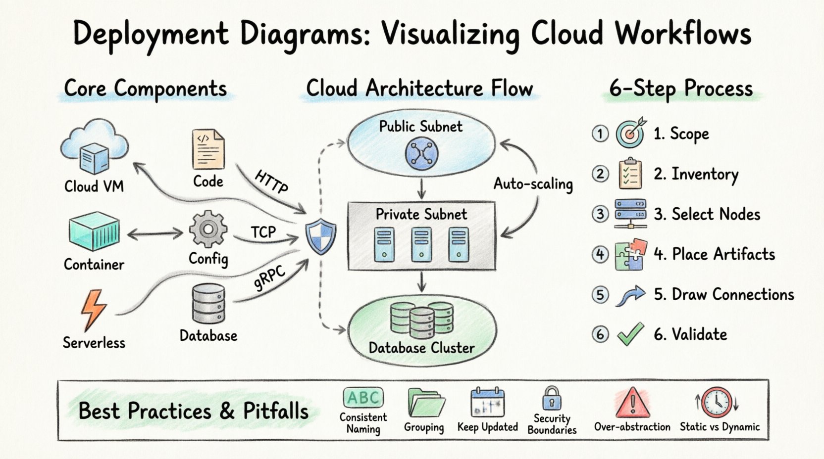
📐 Understanding the Deployment Diagram
A deployment diagram is a type of structural diagram used in software engineering to describe the physical architecture of a system. Unlike a sequence diagram that shows interactions over time, or a class diagram that shows static structure, a deployment diagram focuses on the hardware and the software running on that hardware. It answers the question: Where does the software live?
In a cloud context, this definition expands. Physical servers are often replaced by virtual instances, containers, and serverless functions. The diagram must reflect these abstractions to remain accurate. It bridges the gap between the logical design of your application and the physical reality of your hosting environment.
Why This Matters for Cloud Workflows
Cloud workflows introduce complexity that traditional on-premise setups do not possess. Resources are not static. They can scale up or down based on demand. They can be moved across regions for latency or compliance reasons. A deployment diagram helps manage this complexity by providing a snapshot of the intended state.
- Clarity in Distribution: It shows which services are colocated and which are distributed across different nodes.
- Security Boundaries: It highlights firewalls, subnets, and security groups visually.
- Resource Allocation: It helps estimate the compute and storage requirements for specific components.
- Dependency Mapping: It reveals how services communicate, reducing the risk of latency bottlenecks.
🧩 Core Components of a Deployment Diagram
To construct a meaningful diagram, you must understand the building blocks. Every element represents a tangible or logical entity within your infrastructure. Here is a breakdown of the standard components you will encounter.
1. Nodes
A node represents a physical or virtual computing resource. It is the container for artifacts. In a cloud setting, nodes take various forms.
- Computing Nodes: These are virtual machines, containers, or serverless execution environments. They process the logic of your application.
- Network Nodes: These include routers, gateways, load balancers, and firewalls. They manage traffic flow.
- Storage Nodes: These represent databases, object storage buckets, or file systems. They hold persistent data.
2. Artifacts
Artifacts are the software items deployed onto the nodes. They are the code and configuration files that make the system function.
- Executable Files: The compiled binaries or scripts that run on the computing node.
- Configuration Files: YAML, JSON, or properties files that define how the software behaves.
- Databases: Schema definitions or data files residing on storage nodes.
- Libraries: Shared dependencies required by the executable.
3. Connections
Connections depict the communication paths between nodes. They define how data moves through the system.
- Communication Paths: These show the protocols used, such as HTTP, TCP/IP, or gRPC.
- Deployment Relationships: These show that a specific artifact is installed on a specific node.
- Dependency Links: These indicate that one node relies on another to function correctly.
☁️ Cloud-Specific Elements and Abstractions
When visualizing cloud workflows, standard hardware icons are often insufficient. Cloud architectures rely heavily on logical abstractions. You must adapt your diagram to reflect the dynamic nature of the cloud.
Virtualization and Containers
In traditional diagrams, a server is a box. In cloud diagrams, a server might be a fleet of instances behind a load balancer. You need to decide whether to show individual instances or aggregate them into a logical group.
- Virtual Machines: Represented as a node with an operating system layer.
- Containers: Represented as smaller artifacts running within a container orchestration node.
- Serverless Functions: Represented as event-triggered nodes that lack persistent storage.
Network Topology
Cloud networks are segmented. Security is paramount. Your diagram should reflect the segmentation of your environment.
- Public Subnets: Areas accessible from the internet. Typically house load balancers.
- Private Subnets: Areas isolated from the internet. Typically house application servers and databases.
- VPC Peering: Connections between different virtual private clouds to allow communication without traversing the public internet.
Storage and Data Flow
Data persistence is a critical component of cloud workflows. You must distinguish between ephemeral storage and persistent storage.
- Ephemeral Storage: Temporary storage attached to a compute node, lost when the node terminates.
- Persistent Storage: Distributed storage systems that survive node failures.
- Caching Layers: In-memory data structures used to speed up read operations.
📊 Component Comparison Table
Understanding the distinction between different infrastructure elements helps in drawing accurate diagrams. The table below contrasts common cloud infrastructure types.
| Element Type | Primary Function | Diagram Representation | Typical Usage |
|---|---|---|---|
| Load Balancer | Distributes traffic | Node with fan-out icon | Front-end entry point |
| Virtual Machine | Compute processing | Box with server icon | Application hosting |
| Database Cluster | Data persistence | Cylinder icon group | Primary data store |
| Object Storage | File retention | Cylinder or Bucket icon | Media, backups, logs |
| Message Queue | Async communication | Buffer or Queue icon | Event processing |
| API Gateway | Request routing | Gateway or Door icon | External API entry |
🛠️ Step-by-Step Guide to Creating the Diagram
Creating a deployment diagram is a systematic process. It requires analysis, abstraction, and validation. Follow these steps to ensure your diagram is accurate and useful.
Step 1: Define the Scope
Before drawing, determine what you are trying to show. Are you mapping the entire enterprise infrastructure, or just a specific microservice? Defining the scope prevents the diagram from becoming cluttered and unreadable.
- Identify the boundaries of the system.
- Decide the level of detail required (high-level vs. detailed).
- Identify the stakeholders who will read this diagram.
Step 2: Inventory the Components
List all the software artifacts and hardware nodes involved. This inventory should come from your infrastructure as code files or your existing architecture documentation.
- List all application services.
- List all database instances.
- List all external dependencies (third-party APIs).
- Identify the networking requirements (firewalls, gateways).
Step 3: Select the Nodes
Map your inventory to physical or virtual nodes. Group related components together. For example, place the web server and the application server on the same compute cluster if they are deployed together.
- Draw the computing nodes first.
- Draw the storage nodes next.
- Add network infrastructure nodes last.
Step 4: Place the Artifacts
Drag and drop your software artifacts onto the appropriate nodes. Ensure that the relationship is clear. Does the database run on the storage node? Does the application run on the compute node?
- Use distinct icons for different artifact types.
- Label artifacts clearly with version numbers if relevant.
- Group related artifacts on the same node visually.
Step 5: Draw the Connections
Connect the nodes to show data flow. Use arrows to indicate the direction of traffic. Label the connections with the protocol or data type if it adds clarity.
- Draw lines between load balancers and application servers.
- Draw lines between application servers and databases.
- Draw lines between external services and your API gateway.
Step 6: Review and Validate
Check the diagram against your actual infrastructure. Ensure that the paths shown are physically possible. Check for single points of failure that might need redundancy.
- Verify that all required ports are open.
- Check that security zones are respected.
- Ensure no circular dependencies exist.
🎨 Best Practices for Clarity and Maintenance
A diagram is only useful if it can be understood. Cluttered diagrams lead to confusion and errors. Follow these guidelines to maintain high-quality visual documentation.
1. Maintain Consistent Naming Conventions
Use standard naming for all nodes and artifacts. Avoid abbreviations that might not be understood by all team members. If you use an acronym, define it in a legend.
- Use full names for services (e.g., “User Service” instead of “US”).
- Use consistent prefixes for clusters (e.g., “Prod-Web-01”).
- Standardize the color coding for different environments.
2. Use Hierarchy and Grouping
Complex systems are best viewed in layers. Use frames or boxes to group related nodes. This reduces visual noise and highlights logical boundaries.
- Group all frontend components in one zone.
- Group all backend services in another zone.
- Group all data stores in a third zone.
3. Keep It Up to Date
Cloud environments change frequently. A diagram that is outdated is worse than no diagram at all. Establish a process for updating the diagram whenever infrastructure changes.
- Update the diagram during the deployment phase of CI/CD pipelines.
- Review the diagram during architectural retrospectives.
- Version the diagram files alongside your code repositories.
4. Focus on Critical Paths
Not every connection needs to be drawn. Focus on the paths that are critical for understanding the system’s behavior. If a connection is internal and trivial, omit it to save space.
- Show the main request flow.
- Show the data write flow.
- Show the failover path.
🚧 Common Pitfalls and How to Avoid Them
Even experienced architects make mistakes when documenting infrastructure. Being aware of common errors can save you time and prevent miscommunication.
Pitfall 1: Over-Abstraction
Grouping too many components into a single box makes it impossible to see specific details. If a box contains ten services, you lose the ability to troubleshoot individual issues.
- Solution: Create multiple views. One high-level overview, and one detailed view for complex subsystems.
Pitfall 2: Ignoring Security Boundaries
Cloud security relies heavily on network segmentation. If your diagram does not show firewalls or subnets, it fails to communicate the security posture.
- Solution: Always include network zones and explicitly draw firewall boundaries.
Pitfall 3: Static Representation of Dynamic Systems
Cloud systems scale. A diagram showing a single server might mislead the team into thinking the system cannot handle load.
- Solution: Use annotations to indicate scaling rules, such as “Auto-scaling Group” or “Horizontal Scaling”.
Pitfall 4: Ambiguous Connections
Lines crossing each other without clear labels create confusion about which node connects to which.
- Solution: Use orthogonal lines (90-degree angles) rather than straight diagonal lines. Label every line with the protocol.
🔄 Integration with Continuous Delivery
Modern development practices integrate deployment diagrams with automation. This ensures that the documentation evolves alongside the code.
Automated Diagram Generation
Instead of manually drawing diagrams, some teams use tools to generate them from infrastructure definitions. This reduces the risk of human error.
- Parse Infrastructure as Code (IaC) files.
- Render the nodes and connections automatically.
- Output the diagram in a standard image format.
Documentation as Code
Treat your diagrams as part of the codebase. Store the source files for your diagrams in the same repository as your application code. This allows for version control and peer review.
- Commit diagram changes with infrastructure changes.
- Require diagram updates in pull requests.
- Use diff tools to track architectural drift.
🔍 Troubleshooting Ambiguity
When reviewing a deployment diagram, you might encounter ambiguity. This usually happens when the diagram does not match the mental model of the team. Here is how to resolve it.
- Check the Legend: Ensure all symbols are defined. If a shape is used without explanation, add a legend.
- Verify Protocols: If a connection line is unlabeled, assume it is generic. Add labels for HTTP, gRPC, or SQL.
- Clarify Ownership: If a node is shared, indicate which team owns it. This helps with accountability.
- Update the Date: Always stamp the diagram with a revision date. This manages expectations about freshness.
📈 Scaling the Visualization
As your system grows, a single diagram may become insufficient. You may need to adopt a hierarchical approach to visualization.
Layered Diagrams
Break the system into logical layers. Each layer represents a different aspect of the deployment.
- Layer 1: Network Topology. Focus on subnets, gateways, and routing.
- Layer 2: Compute Resources. Focus on servers, containers, and functions.
- Layer 3: Data Storage. Focus on databases and object stores.
Regional Views
If you deploy globally, you need to show how regions interact. Use a high-level map view to show cross-region traffic.
- Draw a circle for each region.
- Connect regions with wide lines to indicate high-bandwidth links.
- Annotate latency expectations between regions.
🛡️ Security Considerations in Diagrams
Security is not an afterthought in cloud deployment. Your diagram should reflect the security controls in place.
- Encryption: Mark connections that use TLS or SSL.
- Authentication: Indicate where authentication happens (e.g., at the API Gateway or within the service).
- Isolation: Use dashed lines to show logical isolation between environments (Dev, Test, Prod).
By incorporating these security markers, you provide a clearer picture of the risk posture of the system. This is vital for compliance audits and security reviews.
📝 Final Thoughts on Visualization
Creating a deployment diagram is an exercise in communication. It translates complex technical details into a visual language that stakeholders can understand. Whether you are onboarding new engineers, planning a migration, or debugging a production issue, a well-drawn diagram is an invaluable asset.
The cloud environment is fluid. Your diagrams must be flexible enough to adapt to change. By following the steps and best practices outlined here, you can build a documentation strategy that supports your architecture without becoming a burden. Focus on clarity, accuracy, and maintenance. This approach ensures that your visual documentation remains a trusted source of truth for your team.
Start small. Document one service. Then expand. With practice, visualizing your cloud workflows will become a natural part of your architectural process. Remember, the goal is not perfection, but understanding.