In the complex ecosystem of software development, the physical arrangement of code often remains a mystery until something breaks. While developers spend significant time writing logic and designing interfaces, the infrastructure that hosts this logic frequently lacks a clear visual representation. This is where deployment diagrams play a pivotal role. They bridge the gap between abstract software architecture and concrete physical reality.
A deployment diagram is a static structural diagram that describes the hardware and software architecture of a system. It visualizes how software components are mapped onto physical nodes. Without this mapping, teams operate in the dark, guessing how services interact across servers, networks, and storage devices. This guide explores the essential nature of these diagrams and how they contribute to operational stability and system reliability.
Understanding the Core Concept 🧠
At its foundation, a deployment diagram answers specific questions about the system’s runtime environment. It does not focus on the internal behavior of classes or the flow of data over time. Instead, it focuses on the topology. Who is hosting what? How are they connected? Where does data travel?
Consider a scenario where a new microservice is introduced. The architecture team needs to know which server will host it, what ports it requires, and how it communicates with the database. A deployment diagram provides this map. It transforms a list of requirements into a visual layout that stakeholders can review.
Key Distinctions from Other Diagrams
It is common to confuse deployment diagrams with component diagrams or sequence diagrams. Each serves a different purpose within the modeling lifecycle:
- Component Diagrams: Focus on the organization of code modules and their dependencies within the software application itself.
- Sequence Diagrams: Focus on the timing and order of interactions between objects over time.
- Deployment Diagrams: Focus on the physical hardware, nodes, and artifacts running on that hardware.
Understanding these distinctions ensures that you use the right tool for the right problem. A deployment diagram is not about logic; it is about location and connectivity.
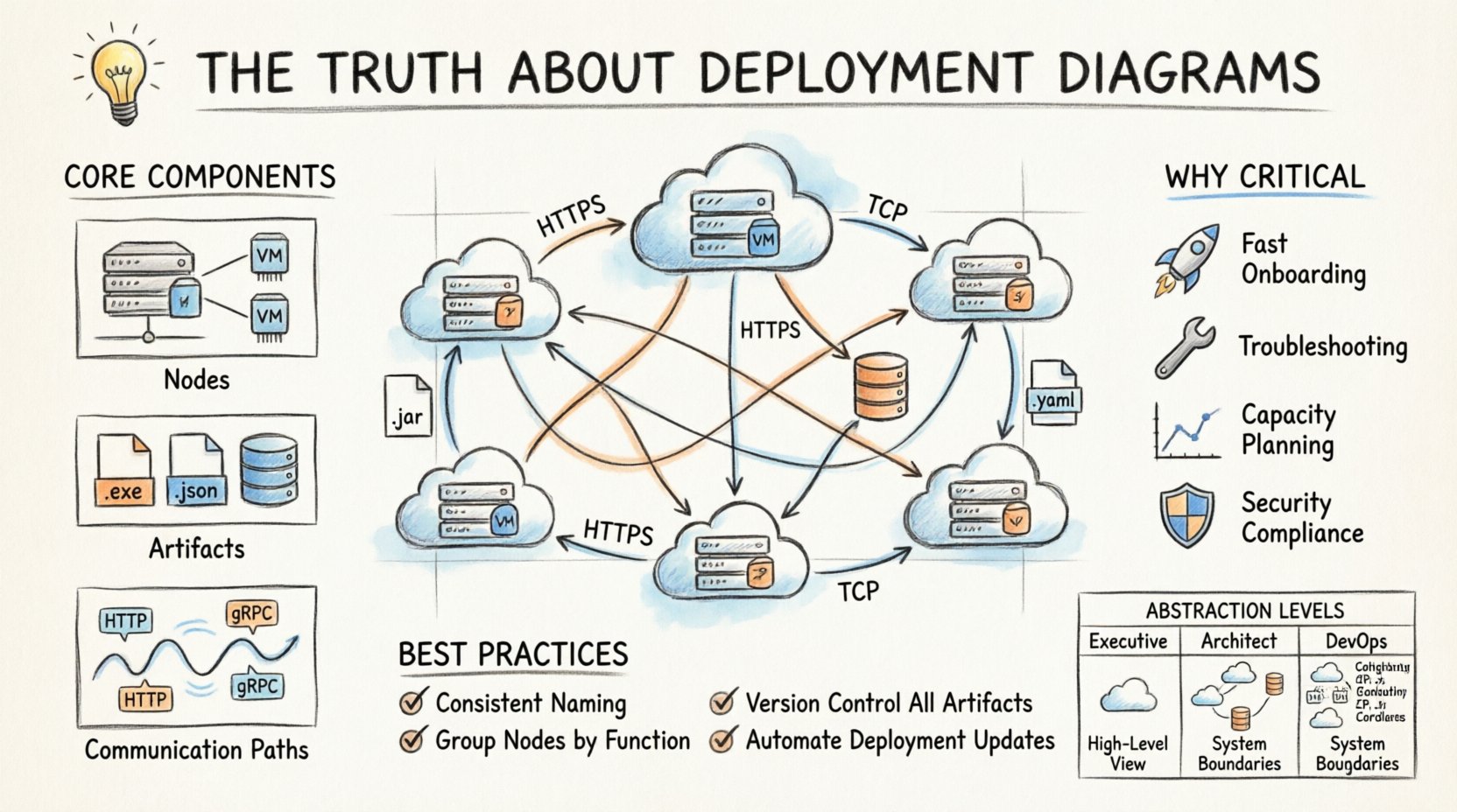
Breaking Down the Components 🧱
To create an effective diagram, one must understand the standard elements used to represent infrastructure. These elements remain consistent regardless of the modeling tool used.
1. Nodes (The Hardware)
Nodes represent the physical or virtual computing resources. They are the containers for the artifacts. There are generally two types of nodes to consider:
- Execution Environment: The software environment where the code runs. This could be a Java Virtual Machine, a Python runtime, or a container orchestration engine.
- Computational Node: The physical machine or virtual instance. This could be a physical server, a cloud virtual machine, or a mobile device.
When drawing nodes, clarity is key. Do not clutter the diagram with every single server rack in a data center. Focus on the logical boundaries. Grouping nodes by function or region is often more useful than listing every individual instance.
2. Artifacts (The Software)
Artifacts represent the physical realization of a component. These are the files that actually get deployed. Examples include:
- Executable files (.exe, .jar, .war)
- Configuration files (.yaml, .json, .properties)
- Databases and database schemas
- Static assets (images, scripts)
Artifacts must be shown residing on nodes. If a configuration file is missing from the diagram, it implies it does not exist in the deployment process, which is a critical error. Every file that is shipped to production needs a home on the diagram.
3. Communication Paths (The Network)
Artifacts do not exist in isolation. They communicate. Communication paths represent the network connections between nodes. These paths should specify:
- Protocol: HTTP, HTTPS, TCP, UDP, or gRPC.
- Port: The specific port number used for the connection.
- Security: Indication of encryption (SSL/TLS) if applicable.
Being specific about protocols helps security teams identify potential vulnerabilities. If a diagram shows a database connection over plain HTTP, that is a red flag that needs addressing before deployment.
Why These Diagrams Are Non-Negotiable 🛡️
Some teams skip the documentation phase to save time. However, this approach often leads to technical debt that accumulates over years. Here is why deployment diagrams are critical for long-term success.
1. Accelerated Onboarding
When a new engineer joins a project, the first question is often, “Where is the system?” Reading code is difficult without context. A deployment diagram provides immediate context. It shows the entry points, the database connections, and the external dependencies.
Instead of spending weeks tracing logs to understand the architecture, a new hire can look at the diagram and understand the system landscape in hours. This reduces the learning curve significantly.
2. Incident Response and Troubleshooting
When a service goes down, panic often ensues. A deployment diagram acts as a map during a crisis. It helps the on-call engineer determine:
- Which server is affected?
- Are there redundant copies of this service?
- What are the dependencies that might be causing the cascade failure?
Having a visual reference reduces cognitive load during high-stress situations. It allows teams to focus on fixing the issue rather than trying to remember where the components live.
3. Capacity Planning
As traffic grows, infrastructure needs to scale. Deployment diagrams help architects visualize where bottlenecks might occur. If a specific node handles all write operations, it is a single point of failure. If a specific network link carries all traffic, it might saturate quickly.
By analyzing the diagram, teams can identify where to add load balancers, where to distribute database replicas, and where to increase bandwidth.
4. Security Compliance
Security audits require proof of infrastructure segregation. Deployment diagrams show how different environments (Production, Staging, Development) are isolated. They demonstrate where firewalls are placed and how sensitive data flows.
Without this documentation, proving compliance with standards like SOC2 or ISO 27001 becomes an administrative nightmare. The diagram serves as evidence of the security posture.
Common Pitfalls to Avoid ⚠️
Creating a deployment diagram is an art that requires discipline. There are common mistakes that render these diagrams useless quickly.
1. The “Living Document” Trap
A diagram is useless if it is not updated. If the architecture changes but the diagram remains static, it becomes a source of misinformation. Teams often treat diagrams as a one-time task. Instead, they should be treated as part of the code.
- Solution: Integrate diagram updates into the deployment pipeline. If a new server is provisioned, the diagram must be updated in the same pull request.
2. Over-Abstraction
Conversely, some diagrams are too vague. Showing a single box labeled “Cloud” provides no value. It hides the complexity that needs to be managed.
- Solution: Include enough detail to guide implementation. Show load balancers, application servers, and database clusters as distinct entities.
3. Ignoring the Network
Many diagrams focus solely on the servers and ignore the network topology. However, network segmentation is often where security and performance are defined.
- Solution: Include subnets, virtual private clouds, and firewall rules in the visual model.
4. Mixing Levels of Abstraction
Do not mix logical and physical views in a single diagram. A logical view shows what the system does. A physical view shows where it runs. Combining them creates confusion.
- Solution: Keep separate diagrams for logical architecture and deployment architecture.
Best Practices for Effective Modeling 📐
To ensure deployment diagrams remain valuable assets, follow these established practices.
- Use Consistent Naming: Ensure that names in the diagram match the names in the configuration files and the infrastructure code.
- Group Related Nodes: Use containers or frames to group nodes by function (e.g., “Frontend”, “Backend”, “Data Layer”).
- Define Connection Types: Clearly label whether connections are synchronous or asynchronous.
- Version Control: Store diagram files in the same repository as the application code. This ensures they are versioned alongside the software.
- Automate Where Possible: If possible, generate diagrams from infrastructure-as-code (IaC) configurations to reduce manual updates.
Integration with DevOps and CI/CD 🔄
In modern development environments, deployment diagrams are not just static pictures. They inform the automation pipelines. The Continuous Integration and Continuous Deployment (CI/CD) process relies on knowing the target environment.
When a pipeline triggers a deployment, it reads the configuration to know which nodes to update. If the deployment diagram is accurate, the pipeline configuration is easier to maintain. It reduces the risk of deploying code to the wrong environment.
Furthermore, monitoring tools can be linked to the diagram. When a node turns red in the monitoring dashboard, the operator can click through to the diagram to see its neighbors and dependencies. This creates a feedback loop between operations and architecture.
Comparison of Abstraction Levels 📊
Different stakeholders require different levels of detail. A deployment diagram can be tailored to the audience. The table below outlines the typical levels of detail.
| Level | Target Audience | Detail Level | Example Content |
|---|---|---|---|
| High-Level | Executive Stakeholders | Minimal | Regions, Major Services, Data Centers |
| Architectural | System Architects | Medium | Load Balancers, App Servers, DB Clusters |
| Implementation | DevOps Engineers | High | Instance Types, Port Numbers, Specific IPs |
Producing multiple views of the same system ensures that the diagram serves its purpose without overwhelming the reader. Do not try to fit all details into one view.
Maintaining the Diagram Over Time 🔄
Maintaining a deployment diagram requires a strategy. It is not enough to draw it once and file it away. The infrastructure evolves. Services are deprecated. New regions are added. The diagram must evolve with the system.
1. Scheduled Reviews
Establish a quarterly review process where the architecture team validates the diagram against the current infrastructure. This catches drift before it becomes a problem.
2. Change Management
Link diagram updates to change requests. If a change request involves infrastructure, the diagram update is a mandatory requirement for closure.
3. Documentation Hygiene
Keep the diagram clean. Remove artifacts that are no longer used. If a server is decommissioned, remove it from the diagram. Cluttered diagrams are ignored diagrams.
Visualizing Security and Compliance 🔒
Security is a primary concern in modern architecture. Deployment diagrams are an excellent tool for visualizing security controls.
Use distinct shapes or colors to represent:
- DMZ (Demilitarized Zone): Servers exposed to the public internet.
- Internal Networks: Servers only accessible from within the private network.
- Encryption Zones: Areas where data is encrypted at rest or in transit.
This visual language helps auditors quickly assess the security posture. It highlights gaps where sensitive data might be exposed to untrusted networks. It also helps developers understand where they need to implement authentication and authorization.
The Impact on Cost Management 💰
Infrastructure costs can spiral out of control without visibility. Deployment diagrams provide a snapshot of resource allocation. By reviewing the diagram, finance and engineering teams can identify underutilized resources.
If a diagram shows five instances of a service that only needs one, the cost is clear. If a diagram shows a database in a premium region when it could be in a cheaper region, the savings opportunity is visible. The diagram becomes a tool for financial optimization.
Final Thoughts on Infrastructure Visualization 🌐
The complexity of modern software systems is undeniable. As applications become distributed across multiple clouds and regions, the risk of misconfiguration increases. Deployment diagrams are not just documentation; they are a safety mechanism.
They force teams to think about the physical reality of their software. They prevent the assumption that “it works on my machine” applies to production. They provide a shared language for developers, operations, and security teams.
Investing time in creating and maintaining accurate deployment diagrams pays dividends in reduced downtime, faster onboarding, and clearer security posture. It is a discipline that separates mature engineering organizations from those that struggle to keep their systems running.
Start by auditing your current architecture. Identify the gaps in your visual documentation. Update your diagrams to reflect the current state. Make them part of your standard workflow. The result will be a more resilient, understandable, and manageable system.