In the intricate world of software architecture, few artifacts bridge the gap between abstract design and physical reality quite like the deployment diagram. Yet, despite its fundamental importance, this specific type of visualization often suffers from neglect or over-complication. Engineers frequently encounter diagrams that are either too vague to be useful or so detailed that they become obsolete before they are even reviewed.
The goal of this guide is to strip away the fluff and focus on what truly matters: clarity, accuracy, and utility. Whether you are planning a migration, onboarding new team members, or troubleshooting a production issue, a well-crafted deployment diagram serves as a single source of truth for infrastructure. This article explores the practical application of these diagrams, moving beyond theory into the actionable steps required for effective system visualization.
📐 Understanding the Core Purpose
A deployment diagram is a structural representation of the physical architecture of a system. It depicts the hardware nodes, software artifacts, and the communication pathways that connect them. Unlike a sequence diagram that focuses on the flow of time, or a class diagram that focuses on code structure, the deployment diagram focuses on the environment where the code actually runs.
When engineers look at this diagram, they are asking specific questions:
- Where does this service live?
- What dependencies exist between nodes?
- How is traffic routed to the backend?
- What are the security boundaries?
If a diagram fails to answer these questions quickly, it has failed its primary purpose. It becomes a decorative element rather than a functional tool. The focus must remain on the infrastructure components and their interconnections, avoiding unnecessary cosmetic details.
🖥️ Key Components of a Deployment Diagram
To construct a diagram that holds up under scrutiny, one must understand the building blocks. These elements remain consistent regardless of the specific technology stack in use.
1. Hardware Nodes (Computational Resources)
Nodes represent the physical or virtual machines where software executes. They are the foundation of the diagram. In modern environments, these nodes can take many forms:
- Virtual Machines: Standard instances provisioned by cloud providers or internal hypervisors.
- Containers: Lightweight, isolated environments running on a host OS.
- On-Premise Servers: Physical hardware located within a corporate data center.
- Edge Devices: Hardware located at the periphery of the network, such as IoT gateways.
Each node should be labeled clearly. A generic “Server” label is often insufficient. Instead, specify the role, such as “Application Server Node 1” or “Database Cluster Master.” This distinction helps engineers identify specific points of failure or scaling opportunities.
2. Software Artifacts
Artifacts are the deployable units that reside on the nodes. These are the actual binaries, configuration files, or scripts that perform work. Visualizing artifacts helps in understanding deployment pipelines and versioning.
- Executables: The compiled code ready to run.
- Configuration Files: YAML, JSON, or INI files that define environment settings.
- Libraries: Shared dependencies required by the executable.
- Databases: Data stores residing on specific nodes.
Linking artifacts to nodes is critical. A diagram should explicitly show which application runs on which machine. This prevents the common error of assuming services are co-located when they are actually distributed across different regions.
3. Communication Paths (Connections)
Connections illustrate how nodes talk to one another. These paths represent network traffic, APIs, or data streams. The direction of the arrow is significant, indicating the initiator of the request.
- HTTP/HTTPS: Standard web traffic.
- gRPC: High-performance internal communication.
- Database Protocols: SQL or NoSQL connections.
- Message Queues: Asynchronous data transfer.
It is vital to indicate the security protocol used. A simple line is often not enough. Labeling connections with protocols like “TLS 1.3” or “IPSec” adds necessary context regarding data protection.
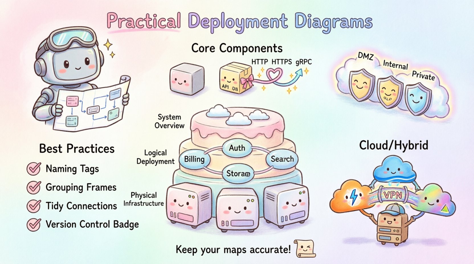
📊 Levels of Abstraction
One of the most common mistakes is trying to fit every detail into a single diagram. Systems are complex, and a single view rarely suffices. Instead, adopt a layered approach to abstraction. Different stakeholders need different levels of detail.
| Level | Focus | Target Audience | Detail Granularity |
|---|---|---|---|
| System Overview | High-level boundaries and major components | Stakeholders, Management | Low (Nodes, Regions) |
| Logical Deployment | Service topology and logical grouping | Developers, Architects | Medium (Services, Databases) |
| Physical Infrastructure | Specific hardware, IPs, and versions | DevOps, SRE | High (Servers, Ports, Configs) |
Maintaining these distinct views prevents confusion. An architect does not need to know the exact RAM of a node to understand the flow. Conversely, a site reliability engineer cannot troubleshoot a latency issue without knowing the network topology details.
🛡️ Security and Boundaries
Security is not an afterthought in infrastructure design. It must be visible in the diagram. Deployment diagrams often omit network segmentation, leading to security gaps during implementation.
Use boundaries to define trust zones. Common boundaries include:
- Public Internet: Where external traffic originates.
- DMZ (Demilitarized Zone): Intermediate zone for public-facing services.
- Internal Network: Restricted access for backend services.
- Private Cloud: Isolated environments for sensitive data.
Visualizing these zones helps in identifying where firewalls, load balancers, and gateways should be placed. If a diagram shows a database directly connected to the public internet without a boundary layer, it immediately signals a critical architectural flaw.
📝 Best Practices for Clarity
To ensure the diagram remains a useful asset, adhere to these guidelines during creation.
Consistent Naming Conventions
Use a standardized naming scheme for all nodes and artifacts. Avoid ambiguous names like “Server1” or “App.” Instead, use descriptive identifiers such as “Auth-Service-Node-01” or “Payment-Gateway-DB.” Consistency reduces cognitive load when reading the diagram.
Group Related Components
Use containers or frames to group components that belong together logically. This could be a microservice cluster, a data center rack, or a specific tenant environment. Grouping creates visual hierarchy and makes the diagram easier to scan.
Limit Connection Lines
Too many crossing lines create a “spaghetti diagram” that is impossible to follow. Use routing lines or orthogonal connections to minimize crossings. If the number of connections becomes unmanageable, consider splitting the diagram into sub-diagrams focusing on specific domains.
Version Control the Diagram
Just like code, diagrams change. Store diagram files in a version control system. This allows teams to track changes over time and revert to previous states if a deployment introduces unexpected topology changes.
🚫 Common Pitfalls to Avoid
Even experienced engineers can fall into traps when designing these diagrams. Being aware of these common issues helps in maintaining high standards.
- Over-Engineering: Including every minor configuration parameter. Focus on the topology, not the settings.
- Static Representation: Failing to show dynamic scaling. Modern systems scale up and down; a static diagram might mislead the team into thinking capacity is fixed.
- Ignoring Latency: Not indicating physical distance between nodes. A connection between two nodes in different regions implies different latency characteristics than a local connection.
- Lack of Legend: Using symbols without explanation. Ensure the diagram includes a key for any custom icons used.
🔄 Maintenance and Lifecycle
A deployment diagram is a living document. It requires maintenance to remain accurate. The most dangerous scenario is a diagram that looks beautiful but describes a system that no longer exists.
Establish a review process. During every major release or infrastructure change, the diagram should be updated. Ideally, this process should be automated where possible. Some tools can generate deployment visualizations directly from infrastructure code, ensuring the diagram matches the actual state.
Integration with CI/CD
Connect the diagram creation process to the Continuous Integration and Continuous Deployment pipeline. When a deployment script runs, it should ideally trigger a validation step to ensure the deployed topology matches the documented diagram. If the code changes the infrastructure, the diagram must update automatically or be flagged for review.
🧩 Troubleshooting and Incident Response
During an outage, time is critical. A deployment diagram becomes a map for navigation through chaos. It allows engineers to quickly isolate the affected component.
When troubleshooting, use the diagram to trace the path of failure:
- Identify the Node: Which hardware resource is failing?
- Trace the Path: Where does the traffic flow next?
- Check Dependencies: Are downstream services also impacted?
- Verify Redundancy: Is there a backup node ready to take over?
If the diagram is accurate, incident response times decrease significantly. Teams spend less time searching for information and more time fixing the issue.
🌍 Cloud and Hybrid Environments
Modern infrastructure is rarely purely on-premise or purely cloud-based. Hybrid and multi-cloud architectures are the norm. This adds complexity to the diagram.
When visualizing cloud environments, consider the following:
- Region Awareness: Clearly mark which geographic region each node resides in.
- Provider Boundaries: If using multiple providers, distinguish between them using color or distinct shapes.
- Managed Services: Represent managed databases or serverless functions appropriately, noting that you do not manage the underlying hardware.
Hybrid setups require careful labeling of the connection between the private network and the public cloud. Highlighting the gateway or VPN connection is essential for understanding the security perimeter.
📈 Scaling and Capacity Planning
Deployment diagrams also serve as the basis for capacity planning. By visualizing the nodes, engineers can estimate resource requirements.
When planning for scale, look at:
- Horizontal Scaling: How easily can new nodes be added?
- Vertical Scaling: Can existing nodes handle increased load?
- Bottlenecks: Are there single points of failure in the connection paths?
A clear diagram makes it obvious where the next bottleneck will occur as traffic increases. This foresight allows for proactive infrastructure investment rather than reactive panic.
🤝 Collaboration and Documentation
Finally, remember that these diagrams are communication tools. They bridge the gap between development, operations, and business teams.
For the diagram to be effective:
- Keep it Accessible: Store it where everyone can view it, not in a private folder.
- Use Standard Notation: Avoid custom symbols that only your team understands. Stick to widely recognized standards.
- Update Regularly: Schedule quarterly reviews to ensure accuracy.
When a new engineer joins the team, the deployment diagram is often the first thing they study to understand the ecosystem. A clear, accurate diagram accelerates the onboarding process significantly.
🏁 Final Thoughts on Infrastructure Visualization
Creating practical deployment diagrams is a skill that improves with practice. It requires a balance of technical accuracy and visual clarity. The effort invested in maintaining these diagrams pays dividends in reduced downtime, faster troubleshooting, and clearer communication across the organization.
By focusing on the nodes, artifacts, and connections that define your system, you create a valuable asset that supports the entire software lifecycle. Avoid the temptation to overcomplicate, and prioritize the information that engineers actually need to do their jobs. This disciplined approach ensures your documentation remains relevant and useful for years to come.
Remember, the diagram is a map. If the map is wrong, the journey is lost. Keep your maps accurate, and your infrastructure will remain stable.