In the fast-paced environment of continuous integration and continuous deployment, speed often takes precedence over documentation. Teams rush to ship code, automate pipelines, and scale infrastructure. However, beneath the surface of green build badges and successful deployments lies a critical artifact that is frequently overlooked: the deployment diagram. These visual representations of system architecture and data flow are not merely static illustrations for documentation repositories. When integrated correctly into modern workflows, they serve as a dynamic blueprint for stability, security, and operational clarity. 🛠️
This guide explores how deployment diagrams function within automated delivery pipelines, why they remain essential despite the rise of Infrastructure as Code, and how they bridge the gap between development velocity and operational reliability. We will examine the technical nuances of mapping infrastructure, the role of visualization in incident management, and the strategies for keeping these diagrams synchronized with reality.
🧐 Why Static Documentation Fails in Dynamic Environments
Traditional system architecture documents were often created once during the design phase and stored in a shared drive. They were rarely updated after the initial build. In modern distributed systems, this approach leads to a significant disconnect. By the time a developer reads a diagram, the infrastructure has likely changed multiple times due to automated scaling, refactoring, or dependency updates.
A deployment diagram that does not reflect the current state of the system is technically debt. It creates a false sense of security where engineers assume a service is located where the drawing indicates, only to find it has moved to a different region or subnet during a production incident. 🚫
The shift towards CI/CD introduces complexity through:
- Dynamic Scaling: Instances are created and destroyed automatically based on load.
- Microservices: Systems are broken into dozens of interconnected services rather than monolithic blocks.
- Cloud Abstraction: Underlying hardware details are hidden, making topology harder to visualize without explicit mapping.
- Multi-Region Deployment: Traffic is routed across geographically distributed data centers.
Without a current visual map, teams rely on mental models or fragmented logs. This increases the cognitive load during high-pressure situations. A deployment diagram acts as a single source of truth regarding connectivity and data flow, reducing the time required to understand how components interact.
🗺️ Visualizing the Pipeline: From Code to Production
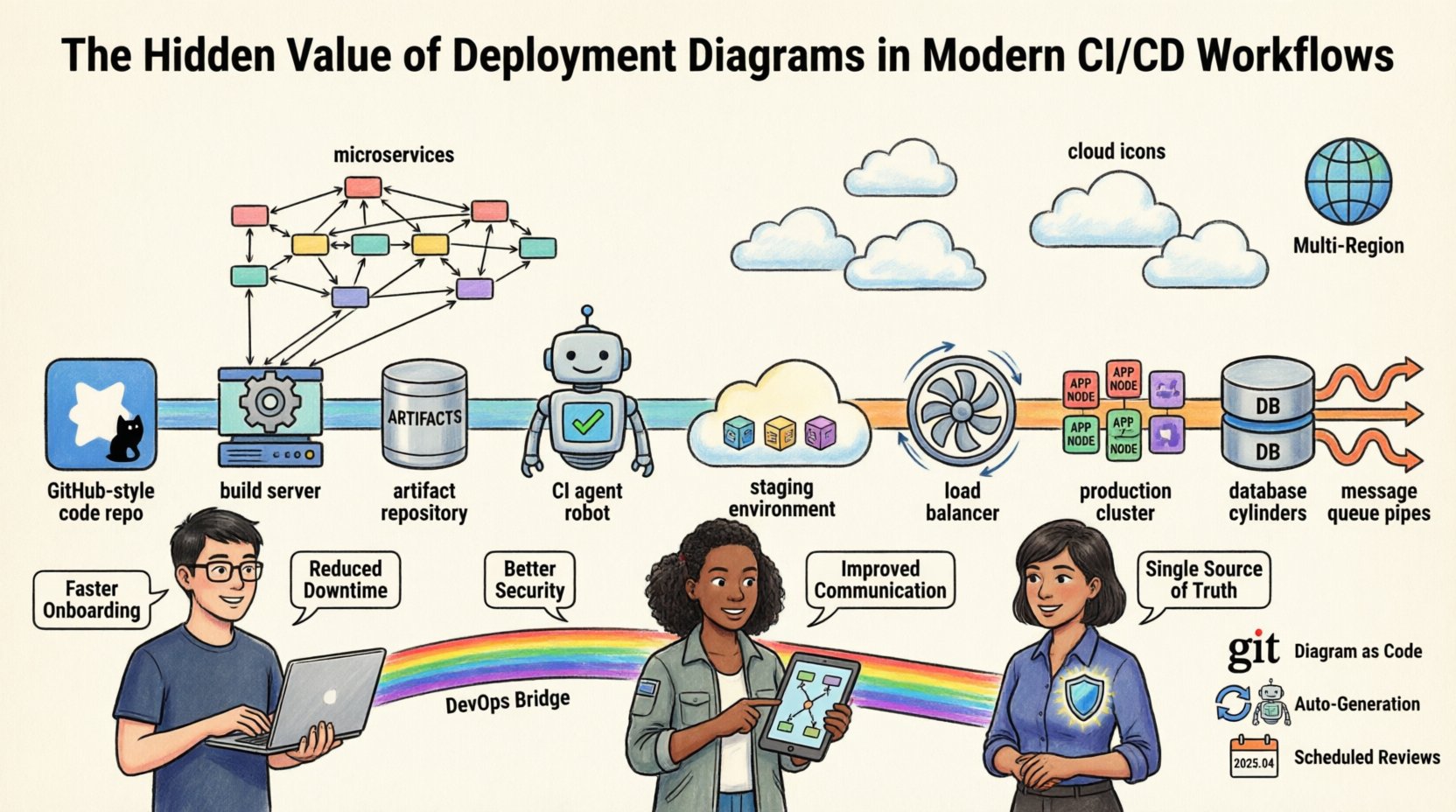
A deployment diagram in the context of CI/CD is not just about servers. It maps the journey of an artifact from the version control system to the production environment. It details the path data takes and the resources required to process it.
When constructing these diagrams for automation contexts, specific elements must be represented to ensure utility:
- Build Agents: Where code compilation and testing occur.
- Artifact Repositories: The storage location for compiled binaries and container images.
- Staging Environments: Mirrors of production used for validation before release.
- Production Clusters: The final destination where users interact with the system.
- Network Boundaries: Firewalls, load balancers, and subnets that control traffic flow.
- Data Stores: Databases, caches, and message queues that persist state.
Mapping these elements visually allows the operations team to see bottlenecks. For example, if a diagram shows all traffic routing through a single load balancer before reaching a database cluster, it highlights a potential single point of failure. This visual cue prompts architectural changes before they cause downtime.
🔗 Bridging Development and Operations
One of the primary challenges in modern software delivery is the cultural and technical divide between development and operations. Developers focus on features and logic. Operations teams focus on availability, performance, and security. A deployment diagram serves as a common language that transcends this divide.
When a developer needs to understand why a service is slow, they can look at the diagram to see if the issue lies in network latency between services or database contention. When an operations engineer needs to deploy a patch, the diagram shows which environments require updates and in what order. This shared understanding reduces friction and miscommunication.
Consider the following scenario regarding dependency management:
A developer modifies an API endpoint. The diagram reveals that three downstream services consume this endpoint. Without the visual map, the developer might miss one dependency, causing a regression in production. The diagram acts as a checklist for impact analysis.
Furthermore, security compliance teams rely on these diagrams to verify that sensitive data does not traverse unencrypted channels. By visualizing the connections, auditors can quickly identify if a database connection is exposed to an external network segment without proper encryption protocols.
🚨 Incident Response and Troubleshooting
During a production incident, every second counts. Engineers are often stressed, searching through logs and dashboards to pinpoint the root cause. A deployment diagram provides immediate context. It answers critical questions instantly:
- Which service is responsible for this error code?
- Is the database reachable from the application tier?
- Are we running out of capacity in the current region?
Instead of guessing, the team can trace the data flow. If a payment processing failure occurs, the diagram helps trace the path from the web server to the payment gateway. It clarifies the sequence of operations. If the diagram indicates a synchronous call to a third-party API, the team knows to check the latency of that external service immediately.
Effective incident management also requires understanding the dependencies. If a cache service fails, the diagram shows which application nodes will failover to the primary database. This knowledge allows engineers to predict system behavior rather than react to it blindly. It transforms troubleshooting from a guessing game into a systematic diagnosis.
🏗️ Integration with Infrastructure as Code (IaC)
Modern teams use Infrastructure as Code to manage resources. Tools automate the provisioning of servers, networks, and databases. While IaC provides reproducibility, it does not inherently provide visibility. A configuration file describes the *what*, but a diagram describes the *how* and *where*.
There is a growing trend of generating deployment diagrams automatically from IaC configurations. This ensures the documentation is never out of sync. If a resource is added to the configuration, the diagram updates to reflect it. This synchronization is vital for maintaining trust in the documentation.
However, automation cannot capture all semantic details. Manual annotations are often necessary to explain business logic that configuration code cannot express. For instance, a diagram might label a connection as “High Priority Traffic” or “Batch Processing” based on policy, even if the network configuration looks identical. This human context adds value that raw code cannot provide.
📋 Key Components of a CI/CD Deployment Diagram
To be effective, a deployment diagram must include specific components. The following table outlines the essential elements and their responsibilities within a CI/CD context.
| Component | Function | Example Representation |
|---|---|---|
| Build Server | Compiles source code and runs tests | Cylinder or Box with Gear Icon |
| Artifact Repository | Stores build outputs and containers | Database or Storage Tank Icon |
| CI Agent | Executes deployment scripts | Robot or Automation Icon |
| Load Balancer | Distributes incoming traffic | Fan or Distributor Icon |
| Application Node | Executes business logic | Server Rack or Container Icon |
| Database Cluster | Persists application data | Cylinder with Stack Icon |
| Message Queue | Handles asynchronous communication | Queue or Pipe Icon |
Ensuring consistency in iconography helps engineers scan the diagram quickly. A legend should accompany the visual to define any custom symbols used. This standardization reduces the learning curve for new team members and external auditors.
🔄 Maintenance Strategies for Living Diagrams
The biggest risk to a deployment diagram is obsolescence. A diagram that is not maintained becomes misleading. To prevent this, teams should adopt specific maintenance strategies that integrate diagram updates into the development lifecycle.
1. Diagram as Code
Store diagram definitions in version control alongside application code. This allows for pull requests to review changes to the architecture. It ensures that any change to the infrastructure is reviewed and documented simultaneously. It creates an audit trail of architectural evolution.
2. Automated Generation
Where possible, link the diagram generation process to the CI pipeline. When a deployment succeeds, a script can regenerate the diagram from the live environment or IaC state. This reduces the manual effort required to update visuals.
3. Scheduled Reviews
Even with automation, manual reviews are necessary. During sprint retrospectives, teams should briefly review the diagram to ensure it matches the current state. This keeps the architecture top of mind for the entire group.
4. Change Management Integration
Require that any infrastructure change ticket references the diagram. Before a change is approved, the diagram must be updated to reflect the new state. This enforces documentation as a gate in the deployment process.
🛡️ Security and Compliance Implications
Security teams rely on deployment diagrams to enforce policies and identify vulnerabilities. Visualizing the data flow helps in applying the principle of least privilege. If the diagram shows a web server directly connected to a database, the security team can flag this as a high risk and demand a firewall rule or network segment separation.
Compliance frameworks often require evidence of network segmentation and data protection. A deployment diagram provides this evidence efficiently. It demonstrates that sensitive data resides in isolated zones and that access is controlled through specific gateways. This is particularly relevant for industries handling sensitive personal or financial information.
Furthermore, diagrams help in planning disaster recovery. By visualizing the redundancy of components, engineers can calculate Recovery Time Objectives (RTO) and Recovery Point Objectives (RPO). If the diagram shows no secondary region for a critical database, the RTO is likely to be unacceptably high during a regional failure.
📈 Common Pitfalls to Avoid
While deployment diagrams are valuable, they can be misused. Common mistakes include:
- Over-Engineering: Creating diagrams that are too detailed for the intended audience. High-level architects need different views than junior developers.
- Static Snapshots: Creating a diagram once and never updating it. This is worse than no diagram at all.
- Ignoring Data Flow: Focusing only on servers and ignoring how data moves between them. The connections are often more important than the nodes.
- Lack of Legend: Using custom symbols without explanation. This creates confusion for new team members.
- Vendor Lock-in: Drawing diagrams that rely too heavily on specific proprietary tools. Focus on the logical components rather than the specific product names to ensure longevity.
By avoiding these pitfalls, teams can ensure their diagrams remain useful assets rather than cluttered artifacts.
🚀 Benefits of Visualizing Infrastructure
The value of a deployment diagram extends beyond simple documentation. It offers tangible benefits to the engineering organization. The following table summarizes the key advantages and the effort required to realize them.
| Benefit | Impact | Effort to Implement |
|---|---|---|
| Faster Onboarding | New hires understand the system in days, not months. | Medium (Initial setup) |
| Reduced Downtime | Faster diagnosis during incidents reduces Mean Time to Resolution. | Low (Maintenance) |
| Better Security | Identifies exposed endpoints and unencrypted paths. | Medium (Review process) |
| Accurate Planning | Capacity planning is based on actual topology, not assumptions. | Medium (Data collection) |
| Improved Communication | Stakeholders understand technical constraints visually. | Low (Visualization) |
Investing in these diagrams pays dividends over time. The initial effort is outweighed by the reduction in operational friction and the improvement in system reliability.
🔧 Best Practices for Implementation
To maximize the utility of deployment diagrams, teams should adhere to a set of best practices:
- Keep it High Level: Focus on the architecture, not the configuration of individual servers. Details can be found in configuration files.
- Use Standard Notation: Adopt a standard like UML or a specific cloud provider notation for consistency.
- Version Control Everything: Treat diagrams as code. Store them in the same repository as the application.
- Update on Change: Make diagram updates a requirement for closing infrastructure tickets.
- Share Widely: Ensure the diagrams are accessible to all relevant team members, not just architects.
- Focus on Flow: Emphasize the direction of data and dependencies over the physical location of hardware.
By following these guidelines, teams create a living documentation system that evolves with the software. This ensures that the visual map remains accurate and useful throughout the lifecycle of the product.
🌐 The Future of Architecture Visualization
As systems become more complex, the need for clear visualization will only grow. Emerging technologies are making it easier to generate these diagrams automatically from running systems. Machine learning algorithms may eventually suggest architectural improvements based on usage patterns visible in the topology.
However, human oversight remains crucial. Algorithms can map connections, but humans understand the business context. The diagram must reflect the business requirements, not just the technical implementation. This balance between automation and human insight is the key to successful architecture documentation.
Organizations that prioritize these visual assets will find themselves better equipped to handle the complexity of modern software delivery. They will experience fewer outages, faster deployments, and more confident decision-making. The deployment diagram is not a relic of the past; it is a vital tool for the future of engineering.
📝 Summary
Deployment diagrams are foundational to understanding complex CI/CD workflows. They provide clarity in a chaotic environment, enabling teams to visualize data flow, dependencies, and infrastructure topology. By integrating these diagrams into the development lifecycle and maintaining them rigorously, organizations can reduce risk and improve operational efficiency. The effort to create and update these visual assets is an investment in the stability and scalability of the entire system. 🏗️
Teams should view diagrams not as optional documentation, but as critical infrastructure components. Just as servers require maintenance, diagrams require updates. When kept current, they serve as a powerful asset for development, operations, and security. The hidden value lies in the clarity they bring to the invisible complexities of modern cloud-native architectures.
Start mapping your systems today. Ensure every change is documented. Build a visual foundation that supports your continuous delivery goals.