Modern infrastructure has evolved into a complex ecosystem of distributed services, dynamic scaling, and ephemeral resources. For platform teams responsible for the underlying engineering foundations, this complexity often translates into operational friction. When system topology is unclear, incident response slows, onboarding takes longer, and architectural drift becomes inevitable. The deployment diagram remains one of the most critical artifacts for bridging the gap between abstract design and physical reality. It serves as the visual contract that aligns developers, operations, and stakeholders around how software actually runs. This guide explores the structural integrity, maintenance strategies, and practical application of deployment diagrams within the context of platform engineering.
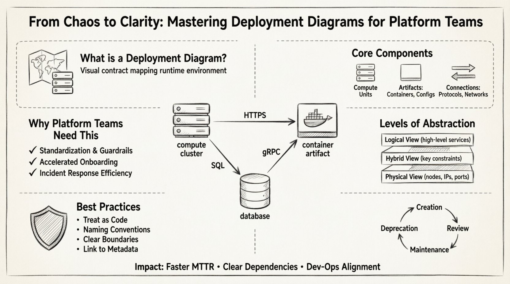
🗺️ What Defines a Deployment Diagram?
A deployment diagram visualizes the physical or logical arrangement of hardware and software components in a system. Unlike a component diagram which focuses on code structure, or a sequence diagram which focuses on interaction flow, the deployment diagram maps the runtime environment. It answers the question: Where does this application live, and how does it talk to the rest of the world?
For platform teams, this diagram is not merely a static image for documentation. It is a dynamic tool for validation and troubleshooting. It represents the target state of your infrastructure. When you deploy a new microservice, the deployment diagram should update to reflect the new node, the new network path, and the new dependencies. Without this clarity, teams rely on tribal knowledge, which is fragile and prone to error.
Key Characteristics of a Robust Deployment Diagram:
- Focus on Nodes: It identifies computing resources such as servers, containers, or virtual machines.
- Artifact Placement: It shows where software packages, binaries, or container images are deployed.
- Connectivity: It illustrates the communication paths between nodes, including protocols and network boundaries.
- Abstraction Level: It balances detail, showing enough information to be useful without becoming overwhelming.
🧩 Core Components of the Diagram
To build a diagram that stands the test of time, you must understand the fundamental building blocks. These elements form the vocabulary of your infrastructure visualization.
1. Nodes (The Computing Units)
Nodes represent the physical or virtual execution environments. In a cloud-native context, these might be:
- Compute Clusters: Groups of machines working together, often managed by an orchestration system.
- Individual Hosts: Specific virtual machines or bare-metal servers.
- Edge Devices: Localized processing units that handle data closer to the source.
2. Artifacts (The Software Payloads)
Artifacts are the deployable units placed onto the nodes. They include:
- Container Images: Packaged applications ready for execution.
- Configuration Files: Settings that define behavior at runtime.
- Database Schemas: Structure definitions stored on specific storage nodes.
- Static Assets: Frontend files served via a web server node.
3. Connections (The Traffic Flows)
Lines between nodes indicate communication. It is vital to specify the nature of these connections to aid in security and latency analysis.
- Internal Network: High-speed, private traffic within the cluster.
- External Gateway: Traffic entering from the public internet.
- Message Queue: Asynchronous communication channels.
- Database Connection: Direct data persistence links.
🏗️ Why Platform Teams Need This Specific Tool
Platform teams differ from traditional operations teams. They build internal developer platforms (IDPs) to empower product teams. The deployment diagram plays a unique role in this ecosystem.
1. Standardization and Guardrails
When every product team follows the same diagrammatic standards, the platform team can enforce consistency. If a new service requires a specific security node or a specific network tier, the diagram makes this requirement explicit. It acts as a blueprint that prevents ad-hoc architecture that violates security policies.
2. Accelerated Onboarding
New engineers often struggle to understand where their code runs. A clear deployment diagram provides immediate context. They can see the service they are modifying, the database it writes to, and the load balancer it sits behind. This reduces the cognitive load and speeds up the time-to-productivity.
3. Incident Response Efficiency
During an outage, seconds count. If an engineer knows the topology, they can quickly identify single points of failure. If a node goes down, the diagram shows which downstream services are impacted. This allows for faster root cause analysis and mitigation strategies.
📊 Levels of Abstraction
A common pitfall is trying to draw every server in the data center. A deployment diagram must be tailored to the audience. Below is a breakdown of the different levels of detail.
| Level | Focus | Best Used For |
|---|---|---|
| Logical View | High-level grouping of services and major components. | Architecture reviews, stakeholder communication, onboarding. |
| Physical View | Specific nodes, IPs, ports, and hardware specs. | Incident response, capacity planning, security audits. |
| Hybrid View | Combines logical grouping with key physical constraints. | Day-to-day operations, platform team documentation. |
Selecting the right level prevents information overload. A C-level executive needs the Logical View. A DevOps engineer fixing a latency issue needs the Physical View. The platform team should maintain a living document that links these views together.
🔍 Best Practices for Creation and Maintenance
Creating the diagram is only half the battle. Keeping it accurate is the real challenge. Infrastructure changes daily; a diagram created last month is often obsolete today.
1. Treat Diagrams as Code
Just as you version control your infrastructure configuration, version control your diagrams. Store them in the same repository as your code. This ensures that when a service is deprecated, the diagram updates in the same commit. It creates an audit trail of how the topology has evolved over time.
2. Enforce Naming Conventions
Consistency is key for readability. Avoid generic names like “Server-01”. Use descriptive names like “Payment-Processing-Node-01”. Adopt a standard naming scheme for artifacts, such as “service-name-version”. This allows engineers to infer the purpose of a component just by looking at the label.
3. Define Boundaries Clearly
Security zones matter. Use distinct visual cues to separate public-facing services from internal data stores. Clearly mark the DMZ (Demilitarized Zone) or the public internet boundary. This helps security teams identify potential exposure risks during design reviews.
4. Link to Metadata
Where possible, link diagram elements to live metadata. If you have an inventory system, the diagram should reflect the current state. If a node is decommissioned, it should be removed from the diagram immediately. This keeps the “source of truth” reliable.
⚙️ Integration with Infrastructure as Code
The most effective way to keep deployment diagrams accurate is to generate them from Infrastructure as Code (IaC) definitions. While manual drawing has its place for conceptual design, automated generation ensures accuracy.
By parsing your IaC templates, you can extract the node definitions and connection logic. This reduces the manual maintenance burden. However, be wary of the noise. IaC files often contain too much detail for a high-level diagram. You may need a transformation layer that aggregates low-level resource definitions into logical nodes.
Benefits of Automation:
- Accuracy: The diagram reflects the actual deployed state.
- Speed: Updates happen automatically when the pipeline runs.
- Consistency: Removes human error from the documentation process.
🚦 Common Mistakes to Avoid
Even experienced teams fall into traps when documenting topology. Being aware of these pitfalls helps you maintain a clean and useful artifact.
1. The “Big Ball of Mud”
Putting every single container and server on one page creates an unreadable mess. If the diagram is too complex, no one will read it. Use grouping to simplify. Cluster related services together visually. Use layers to separate concerns.
2. Ignoring Data Flow
Nodes and connections are not enough. You must indicate the direction of data. Does traffic flow one way or two? Is there a queue buffer between them? Understanding the flow is critical for performance tuning.
3. Static Documentation
Creating a diagram and storing it in a PDF that no one updates is a failure. The diagram must be accessible, searchable, and integrated into the daily workflow. If it sits in a disconnected wiki, it will rot.
4. Over-Engineering the Design
Do not try to capture every edge case in the initial diagram. Focus on the happy path and the primary architectural patterns. Detail can be added in specific runbooks or technical specifications later. Keep the main diagram high-level and clear.
📋 Checklist for Diagram Quality
Before publishing a deployment diagram, run it through this validation checklist. This ensures the artifact provides value to the platform team.
| Check | Question | Pass Criteria |
|---|---|---|
| Clarity | Is the layout intuitive? | A new engineer can understand the flow in 2 minutes. |
| Accuracy | Does it match the live environment? | Verified against current IaC state. |
| Completeness | Are all critical nodes included? | No major dependencies are hidden. |
| Maintainability | Is the file easy to update? | Stored in version control with clear ownership. |
| Security | Are security boundaries clear? | Public and private zones are distinct. |
🚀 Impact on Incident Response
The true value of a deployment diagram is often felt during an incident. When alerts trigger, engineers need to know the impact radius immediately.
Imagine a database cluster fails. Without a diagram, engineers might guess which services depend on it. With the diagram, they see a direct line connecting the database node to three specific API gateway nodes. They can immediately notify those product teams and prepare for potential latency issues. This proactive communication reduces the Mean Time To Acknowledge (MTTA) and Mean Time To Resolve (MTTR).
Furthermore, diagrams help in post-incident reviews. They provide a visual record of what the system looked like at the time of the failure. This aids in reconstructing the timeline of events and identifying architectural weaknesses that led to the outage.
🛠️ Tools and Visualization Strategies
You do not need proprietary software to create these diagrams. Standardized vector graphics or open-source diagramming tools are sufficient. The tool is less important than the discipline of maintenance. However, the tool must support collaboration.
When selecting a visualization strategy, consider:
- Collaboration: Can multiple engineers edit simultaneously?
- Versioning: Can you track changes over time?
- Export: Can you export to formats compatible with your documentation system?
- Integration: Can you embed the diagram directly into your wiki or code repository?
Focus on tools that allow you to define the diagram as text or code if possible. This makes it easier to review in pull requests and ensures that diagram changes are reviewed alongside code changes.
📈 Lifecycle Management
A deployment diagram is a living asset. It requires a lifecycle management strategy similar to the software it describes.
1. Creation Phase
Start during the design phase. Before writing code, draft the topology. This forces the team to think about infrastructure requirements early. Identify where you need storage, compute, and networking.
2. Review Phase
Include the diagram in architectural review boards. Have senior engineers validate the topology. Check for single points of failure, security gaps, and compliance issues.
3. Maintenance Phase
Assign ownership. Who is responsible for updating the diagram when a change occurs? This should be part of the Definition of Done for any infrastructure task. If you change a node, you must update the diagram. If you cannot update the diagram, the task is not finished.
4. Deprecation Phase
When a service is retired, remove it from the diagram. Do not leave “ghost nodes” that confuse future engineers. Marking a node as “Retired” with a date is better than leaving it active but unused.
🔗 Bridging the Gap Between Dev and Ops
Deployment diagrams act as a universal language between development and operations. Developers focus on logic and features. Operations focus on availability and performance. The diagram sits in the middle.
It allows developers to understand the constraints of their environment. They can see that their service requires a high IOPS disk or a specific network latency threshold. Conversely, it allows operations to understand the logic of the application. They can see that a service is stateful and requires sticky sessions, which impacts load balancer configuration.
This shared understanding reduces friction. It minimizes the back-and-forth questions during sprint planning and incident management. Everyone is looking at the same map.
🧭 Final Thoughts on Infrastructure Visualization
Building a platform is an act of managing complexity. The deployment diagram is a tool to tame that complexity. It transforms abstract code into a tangible system that can be reasoned about, tested, and improved. By adhering to best practices, maintaining version control, and integrating with your development lifecycle, platform teams can ensure their infrastructure remains visible and manageable.
Chaos in infrastructure is often a result of invisible dependencies. By making these dependencies visible through clear, maintained deployment diagrams, you create a foundation of clarity. This clarity empowers your team to move faster, with greater confidence, and with fewer disruptions. The goal is not perfection, but consistent visibility. Start small, iterate often, and keep the map updated.