In the landscape of software architecture, clarity is not just an aesthetic choice; it is a functional necessity. Deployment diagrams serve as the blueprints for infrastructure, mapping the physical realization of software systems onto hardware nodes. However, as systems scale, these diagrams often become unwieldy, cluttered, and difficult for stakeholders to interpret. This complexity hinders communication between developers, operations teams, and business analysts. This guide provides a structured approach to refining these diagrams, ensuring they remain accurate, readable, and useful for collaborative environments.
Understanding the Purpose of Deployment Diagrams 📐
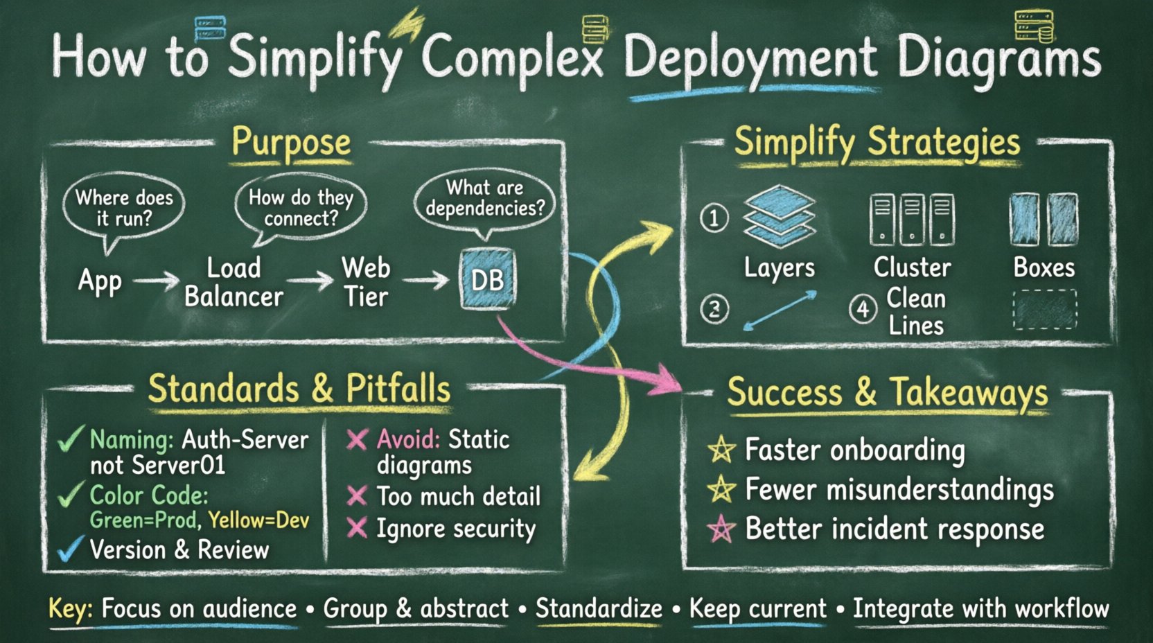
A deployment diagram visualizes the hardware and software architecture of a system. It illustrates the physical components, such as servers, databases, and network devices, and the software artifacts deployed on them. The primary goal is to show where components live and how they communicate physically.
When a deployment diagram is effective, it answers specific questions without ambiguity:
- Where does the application run? Identify the nodes hosting the application logic.
- How do components connect? Show the network pathways and protocols between nodes.
- What are the dependencies? Highlight external systems or services required for operation.
- How is security handled? Indicate firewalls, gateways, and secure communication channels.
When these elements are crowded with excessive detail, the diagram loses its utility. Stakeholders spend more time decoding the visual noise than understanding the architecture. Simplification is the process of removing this noise while retaining critical architectural information.
Identifying Sources of Complexity 🧩
Before simplifying, one must understand what creates the clutter. Complexity in deployment diagrams often stems from trying to show everything at once. The following factors contribute to visual overload:
- Over-Abstraction vs. Over-Specification: Showing every single container or server instance individually when they are identical clones creates repetition. Conversely, grouping them too broadly hides critical security or latency differences.
- Excessive Labels: Every port, protocol, and interface labeled on every line makes the web of connections unreadable.
- Mixing Concerns: Combining logical software architecture with physical infrastructure details in a single view confuses the distinction between code and hardware.
- Legacy Integration: Including outdated systems that are rarely touched or deprecated adds clutter without value.
- Lack of Hierarchy: Failing to group related nodes into clusters or regions forces the viewer to trace lines across the entire canvas.
Recognizing these patterns allows teams to target specific areas for reduction. The aim is not to hide information, but to organize it so it is accessible when needed.
Strategies for Simplification 🧹
Reducing complexity requires deliberate design choices. The following strategies help maintain clarity without sacrificing accuracy.
1. Utilize Multiple Levels of Detail 📊
One diagram cannot serve every audience. A high-level executive needs a different view than a site reliability engineer. Adopt a layered approach:
- System Context Diagram: Shows the application as a single box interacting with external systems. Focuses on boundaries.
- High-Level Deployment: Groups servers by function (e.g., “Web Tier”, “Data Tier”). Hides individual instance counts.
- Detailed Deployment: Used for specific troubleshooting. Shows individual containers, specific ports, and hardware specs.
By linking these views, teams can navigate from a broad overview to specific technical details without cluttering the main documentation.
2. Apply Abstraction to Homogeneous Nodes 🏗️
In modern infrastructure, it is common to have clusters of identical servers. Drawing ten separate web servers is unnecessary. Instead, represent them as a single node labeled with a count or a cluster name.
- Labeling: Use labels like “Web Server Cluster (5 instances)”.
- Grouping: Enclose similar nodes within a container or region boundary to indicate they share properties.
- Standardization: Ensure that nodes within a group follow the same configuration pattern. If a node deviates, it should be drawn separately to avoid confusion.
3. Reduce Line Density 📏
Connections between nodes are often the most confusing part of a deployment diagram. Too many lines create a “spaghetti” effect.
- Implicit Connections: If the architecture follows a standard pattern (e.g., all web servers connect to the load balancer), you do not need to draw a line for every single connection. A single representative line with a note indicating “All instances” is sufficient.
- Directionality: Use arrows to show data flow direction. If communication is bidirectional, use a double-headed arrow to save space and reduce visual clutter.
- Protocol Labels: Do not label every line with “HTTP” or “TCP”. Include a legend or place the label on the node if the protocol is consistent across the connection.
4. Leverage Grouping and Clustering 📦
Organizing nodes into logical groups helps the reader process the diagram in chunks. Use boundary boxes to represent:
- Network Segments: Public vs. Private networks.
- Geographic Regions: Different data centers or cloud regions.
- Functional Zones: Development, Staging, Production environments.
This spatial organization reduces the cognitive load required to understand the topology. It visually separates concerns and highlights potential bottlenecks.
Standardizing for Collaboration 🤝
Simplification is only effective if the team agrees on the standards. Without consistency, every engineer produces a different style of diagram, leading to confusion during reviews and handoffs.
1. Naming Conventions 🏷️
Consistent naming ensures that a diagram from one team can be understood by another. Establish rules for:
- Nodes: Use descriptive names like “Auth-Server” rather than “Server01”.
- Artifacts: Clearly label the application components (e.g., “API Gateway”, “Database Driver”).
- Connections: Use standard terms for protocols (e.g., “REST”, “gRPC”, “S3”).
2. Color Coding for Status and Type 🎨
While avoiding heavy visual styling, using color semantically can aid quick scanning. Define a palette:
- Production Nodes: Green or Neutral tones.
- Development/Testing Nodes: Yellow or Blue tones.
- External Systems: Gray or distinct border styles.
- Deprecated Components: Strikethrough or Red outline.
Ensure the legend is visible and updated whenever the color scheme changes. This prevents misinterpretation of the system state.
3. Versioning and Lifecycle Management 🔄
Deployment diagrams are living documents. They must evolve as the infrastructure changes. Implement a versioning strategy:
- Change Logs: Record when a diagram is updated and what infrastructure changed.
- Review Cycles: Schedule periodic reviews to ensure the diagram matches the actual deployed environment.
- Archiving: Keep older versions accessible for historical context, but clearly mark the current active version.
Common Pitfalls to Avoid ⚠️
Even with good intentions, teams often fall into traps that reduce the value of their diagrams. Avoid these common mistakes to maintain quality.
| Pitfall | Impact | Solution |
|---|---|---|
| Static Diagrams | Documentation becomes outdated quickly. | Integrate diagram updates into the CI/CD pipeline or release notes. |
| Too Much Detail | Readers cannot see the forest for the trees. | Apply the “Level of Detail” strategy to hide repetitive elements. |
| Inconsistent Notation | Confusion over what symbols mean. | Create a style guide and enforce it across all diagrams. |
| Ignoring Security | Security gaps are not visually apparent. | Explicitly mark firewalls and encryption points, even in simplified views. |
| Isolated Documentation | Diagrams are not linked to code or config. | Reference specific repositories or configuration files in the diagram notes. |
Collaboration Workflows 🔄
A simplified diagram is useless if the team does not engage with it. The goal is to foster collaboration through the documentation itself.
1. Collaborative Editing
Allow multiple stakeholders to contribute to the diagram definition. This ensures that operations, development, and security teams all validate the topology. Use shared workspaces where comments and annotations can be added directly to specific nodes.
2. Diagram as Code
Where possible, treat the diagram definition as code. Store the source files in version control alongside the application code. This enables:
- Pull Request Reviews: Changes to infrastructure are reviewed by peers.
- Automation: Scripts can validate that the diagram matches the actual infrastructure state.
- History: Full audit trails of who changed the architecture and why.
3. Regular Synchronization Sessions
Hold brief sessions where the current deployment state is reviewed against the diagram. This keeps the team aligned and highlights discrepancies early. If a node is missing from the diagram, it becomes a task to update the documentation immediately.
Measuring Success 📈
How do you know if your simplification efforts are working? Look for indicators of improved understanding and efficiency.
- Faster Onboarding: New team members grasp the architecture faster.
- Fewer Misunderstandings: Reduced tickets or questions regarding infrastructure layout.
- Improved Incident Response: Teams can locate the source of issues more quickly using the diagram.
- Higher Engagement: More team members actively maintain and update the diagrams.
Maintaining Long-Term Clarity 🔧
Simplification is not a one-time task. It requires discipline. As the system grows, the temptation to add detail increases. To combat this:
- Set Rules for Growth: Define thresholds for when a diagram should be split into sub-diagrams.
- Encourage Feedback: Ask users of the diagrams if they find them confusing. Their feedback drives necessary simplifications.
- Automate Where Possible: Use tools that can generate diagrams from infrastructure code to reduce manual maintenance.
- Document Decisions: Include a brief explanation for why certain architectural choices were made in the diagram notes.
By adhering to these principles, teams can transform deployment diagrams from confusing artifacts into powerful communication tools. The result is a shared understanding of the system that supports better decision-making and faster delivery.
Key Takeaways for Implementation 🚀
- Focus on the Audience: Create diagrams that serve the specific needs of the viewer, not just the technical reality.
- Group and Abstract: Hide repetition to reveal structure.
- Standardize Notation: Ensure everyone speaks the same visual language.
- Maintain Accuracy: Outdated diagrams are worse than no diagrams.
- Integrate with Workflow: Make diagram updates part of the development process.
Effective deployment diagrams bridge the gap between technical implementation and business understanding. By prioritizing simplicity and clarity, organizations can ensure that their infrastructure remains transparent, manageable, and aligned with their strategic goals. The effort invested in refining these diagrams pays dividends in reduced errors, smoother collaboration, and a more resilient system architecture.