Understanding how software lives in the real world is a critical skill for any engineer. While code runs on your machine, it eventually needs to exist in a structured, reliable environment to serve users. This is where the deployment diagram becomes an essential tool. It maps the physical hardware and software components that make up your system. For new engineers, mastering the visual representation of infrastructure is not about memorizing tools, but about understanding architecture.
This guide breaks down the deployment diagram. We will explore its purpose, its core elements, and how to construct one without relying on specific products. The goal is clarity. You will learn to visualize connections, hardware nodes, and data flows effectively.
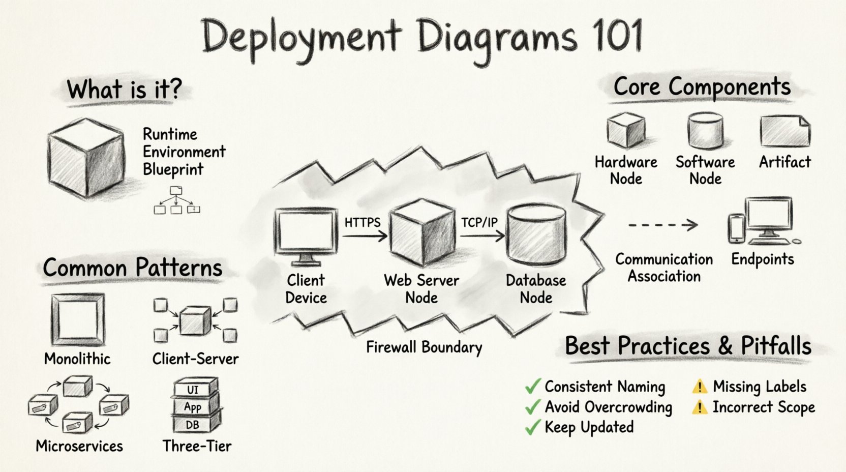
What is a Deployment Diagram? 📊
A deployment diagram is a type of Unified Modeling Language (UML) artifact. It describes the physical architecture of a system. Unlike class diagrams that focus on code structure, or sequence diagrams that focus on interaction timing, the deployment diagram focuses on the runtime environment.
Think of it as a blueprint for the data center or cloud environment. It shows:
- Nodes: The physical or virtual devices where software executes.
- Artifacts: The deployable units, such as libraries, executables, or containers.
- Connectors: The communication channels between nodes, such as networks or buses.
When you design a system, you must answer questions about placement. Where does the database live? Which server handles the user interface? How do they talk to each other? The deployment diagram answers these questions visually.
Core Components of the Diagram 🧩
To build a clear diagram, you must understand the vocabulary. Every element serves a specific purpose in the visual narrative.
1. Deployment Nodes
Nodes represent hardware or execution environments. They are typically drawn as 3D boxes or cylinders. You can categorize them into two main types:
- Hardware Nodes: Physical devices like servers, routers, or mobile phones. These represent the actual compute power available.
- Software Nodes: Execution environments like virtual machines, containers, or operating systems. These represent the software layer running on the hardware.
When drawing these, use labels to identify their function. For example, a node labeled “Web Server” tells the reader the role of that specific hardware.
2. Artifacts
Artifacts are the physical pieces of code or data deployed to nodes. They are usually depicted as small rectangles with a folded corner. Common artifacts include:
- Executable Files: Compiled code ready to run.
- Database Files: Schema definitions or data stores.
- Configuration Files: Settings that control application behavior.
- Libraries: Shared code dependencies.
An artifact is attached to a node to show where it resides. This clarifies which server holds which part of the application.
3. Communication Associations
Nodes do not exist in isolation. They must exchange information. Communication associations are lines connecting nodes. They represent:
- Network Protocols: HTTP, TCP/IP, or specialized messaging queues.
- Physical Links: Ethernet cables, fiber optics, or wireless signals.
Labeling these connections is vital. A line labeled “HTTPS” implies security, while “HTTP” implies unencrypted traffic. This distinction matters for security audits and troubleshooting.
4. Devices and Endpoints
Not every component is a server. Client devices are also part of the deployment. These include:
- Desktop computers
- Smartphones and tablets
- IoT sensors
These endpoints initiate requests. They are often the starting point of a data flow in the diagram.
Constructing a Deployment Diagram 🛠️
Creating a deployment diagram is a logical process. It requires you to think about the lifecycle of the software. Follow these steps to ensure accuracy.
Step 1: Identify Boundaries
Start by defining the scope. What is inside your control, and what is external? For example, you might control the application servers, but the internet service provider is external. Clearly separate your internal infrastructure from external dependencies.
Step 2: Define Layers
Most systems follow a layered approach. You should represent this hierarchy in the diagram:
- Client Layer: Where users interact with the system.
- Application Layer: Where business logic executes.
- Data Layer: Where information is stored and retrieved.
Placing these layers vertically or horizontally helps readers understand the flow of data from top to bottom.
Step 3: Map Infrastructure
Assign the artifacts to the nodes. If you have multiple web servers, draw multiple nodes. If you have a clustered database, represent that grouping. This step reveals redundancy and single points of failure.
Step 4: Draw Connections
Connect the nodes using the appropriate communication lines. Ensure that the direction of data flow is clear. Use arrows to show the primary direction of request and response.
Common Architectural Patterns 🔄
Different systems require different deployment structures. Recognizing these patterns helps you standardize your diagrams.
1. Monolithic Architecture
In a monolith, all components reside on a single node or a tightly coupled group of nodes. This is often the simplest deployment to diagram.
- All code lives together.
- Database and Application are often on the same machine.
- Single point of failure risk is higher.
2. Client-Server Architecture
This is the classic model. Clients request services, and servers provide them.
- Multiple clients connect to one or more servers.
- Load balancers often sit in front of the server group.
- Clear separation between the front-end and back-end.
3. Microservices Architecture
In modern systems, functionality is split into independent services. Each service might run on its own node or container.
- High complexity in the diagram due to many nodes.
- Requires clear communication paths between services.
- Often involves an API gateway to manage traffic.
4. Three-Tier Architecture
A standard model for web applications. It separates presentation, logic, and storage.
- Tier 1: User Interface (Web Browser).
- Tier 2: Application Server (Business Logic).
- Tier 3: Database Server (Data Storage).
Security and Infrastructure Considerations 🔒
A deployment diagram is not just about connectivity; it is about safety. You must represent security zones to show how data is protected.
Firewalls and Gateways
Use specific symbols or labels to denote firewalls. These are critical for showing where traffic is inspected. Public-facing nodes should be separated from internal nodes by a firewall boundary.
Data Encryption
Indicate where encryption happens. Is it at the network level (TLS)? Is it at the application level (AES)? Labeling connections as “Encrypted” or “SSL” provides immediate context for security reviews.
Redundancy and Failover
High availability systems require backup nodes. Show duplicate nodes for critical services. For example, if the primary database fails, a secondary node should take over. Representing this redundancy in the diagram helps engineers plan for disasters.
Best Practices for Clarity ✨
A diagram that is too complex is useless. Follow these rules to keep your diagrams readable.
1. Use Consistent Naming
Do not mix technical jargon with colloquial terms. If you call a node “Web Server,” do not call another one “Frontend Box.” Consistency reduces cognitive load.
2. Avoid Overcrowding
If a system is large, split it into multiple diagrams. Create a high-level overview and then detailed views for specific subsystems. A single diagram with fifty nodes is hard to read.
3. Keep It Updated
Infrastructure changes frequently. If you add a new server or change a protocol, update the diagram immediately. An outdated diagram is worse than no diagram at all.
4. Use Abstraction Wisely
Decide how detailed you need to be. Do you need to show every single database table? Probably not. Focus on the logical grouping of data rather than specific file paths.
Common Pitfalls to Avoid ⚠️
Even experienced engineers make mistakes. Be aware of these common errors.
| Pitfall | Impact | Solution |
|---|---|---|
| Missing Labels | Readers cannot identify protocols or roles. | Always label nodes and connections. |
| Incorrect Scope | Includes external systems not under your control. | Define clear boundaries early. |
| Static Representation | Does not account for scaling or dynamic nodes. | Use notation for groups or clusters. |
| Confusing Logic with Physical | Mixes code structure with hardware layout. | Keep deployment diagrams separate from class diagrams. |
Integration with Other Diagrams 🔗
A deployment diagram does not exist in a vacuum. It connects with other modeling artifacts to provide a complete picture.
- Class Diagrams: These show code structure. The deployment diagram shows where the code runs.
- Sequence Diagrams: These show how objects interact. The deployment diagram shows which nodes handle those interactions.
- Activity Diagrams: These show workflows. The deployment diagram shows the physical environment where the workflow executes.
When presenting a system design, use all these diagrams together. They complement each other to explain the full lifecycle of the software.
Maintaining the Diagram Over Time 📅
Software is never truly finished. As requirements change, the infrastructure changes. Here is how to keep your documentation relevant.
Version Control
Treat the diagram like code. Store it in a repository. This allows you to track changes over time. If a server configuration was changed last month, you can see when and why.
Automated Updates
Some modern infrastructure tools can generate diagrams automatically from configuration files. While manual drawing offers flexibility, automation ensures accuracy. Use tools that parse your configuration to update the visual map.
Review Cycles
Schedule regular reviews. During system design meetings, check the deployment diagram against the current state. This ensures that the documentation matches reality.
Conclusion on Infrastructure Visualization 🚀
Deployment diagrams are the bridge between abstract code and physical reality. They allow engineers to see the system as a whole. By focusing on nodes, artifacts, and connections, you create a map that guides deployment and troubleshooting.
For new engineers, this skill builds confidence. It demonstrates that you understand not just how to write code, but where it lives. Start small. Draw the components you know. Expand as the system grows. With practice, you will create diagrams that are accurate, clear, and valuable to the entire team.