Creating a visual representation of your system architecture is a critical skill for any technical professional. Among the various types of diagrams used in software engineering, the deployment diagram stands out for its ability to map the physical topology of a system. This guide walks you through the process of drawing your first deployment diagram, focusing on clarity, accuracy, and practical application. We will explore the core components, the step-by-step workflow, and the common pitfalls to avoid, ensuring you build a solid understanding without unnecessary confusion.
What is a Deployment Diagram? 🤔
A deployment diagram is a specialized type of UML (Unified Modeling Language) diagram. It depicts the physical architecture of a system, showing how software components are deployed onto hardware infrastructure. Unlike class diagrams that focus on code structure or sequence diagrams that show interaction flow, this diagram answers the question: “Where does everything live?”
It serves as a blueprint for the runtime environment. It details the nodes, which represent physical hardware or execution environments, and the artifacts, which are the software modules deployed on those nodes. Understanding this distinction is the first step toward effective system design.
Key Distinctions from Other Diagrams
- Class Diagram: Focuses on static structure and relationships between classes in code.
- Sequence Diagram: Focuses on dynamic behavior and message passing over time.
- Deployment Diagram: Focuses on physical hardware, network topology, and software installation points.
By isolating the physical layer, you can identify potential bottlenecks, single points of failure, and scalability issues before writing a single line of code for the infrastructure.
Why You Need This Visualization 📊
Visualizing the deployment topology is not just a documentation exercise; it is a strategic necessity. When multiple teams are involved in building a system, a shared mental model of the infrastructure prevents misalignment. It clarifies responsibilities and dependencies.
Benefits of Accurate Diagramming
- Communication: Provides a common language between developers, operations engineers, and stakeholders.
- Planning: Helps estimate resource requirements, such as memory, CPU, and network bandwidth.
- Security: Allows you to visualize network boundaries and firewall rules visually.
- Maintenance: Serves as a reference for troubleshooting issues in production environments.
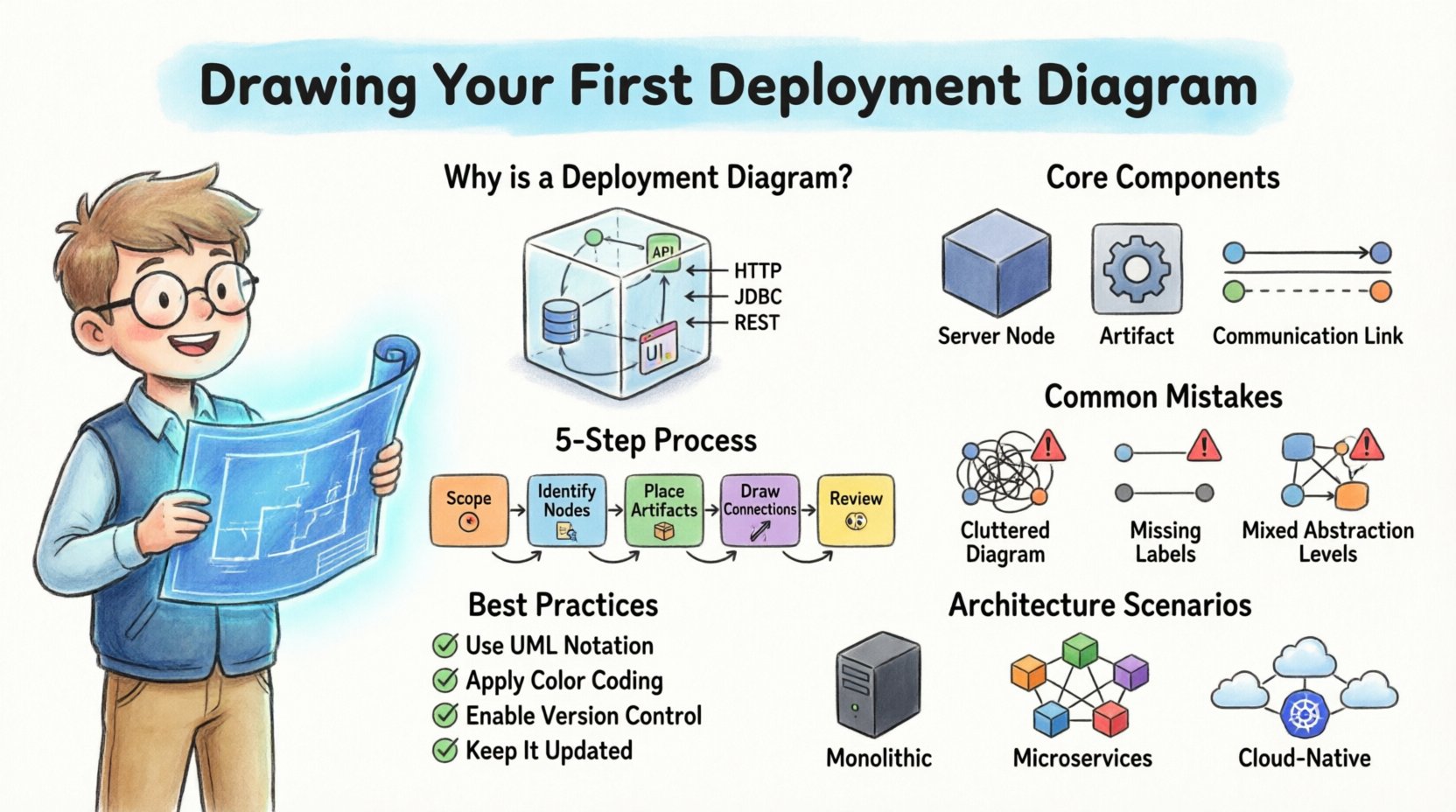
Core Components Explained 🧱
Before drawing lines and boxes, you must understand the fundamental building blocks. A deployment diagram is constructed using specific symbols that have standardized meanings. Confusion here often leads to diagrams that are technically inaccurate.
1. Nodes 🖥️
A node represents a physical computing resource. It is typically depicted as a 3D cube or a simple box. There are generally two types of nodes:
- Processing Nodes: These represent hardware devices capable of executing software. Examples include servers, workstations, mobile devices, or embedded systems.
- Communication Nodes: These represent network infrastructure like routers, switches, or firewalls that facilitate data flow between processing nodes.
2. Artifacts 📦
Artifacts are the software units deployed onto the nodes. They are usually shown as rectangles with a specific icon or stereotype. Common examples include:
- Executable Files: The compiled code that runs on the server.
- Libraries: Shared code modules required by the executable.
- Databases: Instances of data storage systems.
- Configuration Files: Settings that define how the application behaves.
3. Connections 🔗
Connections represent the communication paths between nodes. These can be physical cables, wireless links, or logical network protocols. The nature of the connection often dictates the performance and security characteristics of the system.
| Component | Visual Representation | Purpose |
|---|---|---|
| Node | 3D Cube or Box | Represents hardware or execution environment |
| Artifact | Rectangle with Icon | Represents software component or data |
| Association | Solid Line | Represents a direct connection or deployment relationship |
| Dependency | Dashed Line with Arrow | Represents a usage relationship between artifacts |
Step-by-Step Guide to Creation 🛠️
Creating a deployment diagram can become overwhelming if you try to capture every detail at once. A structured approach ensures you maintain focus and produce a useful artifact. Follow these steps to build your diagram methodically.
Step 1: Define the Scope 🎯
Start by deciding what part of the system you are modeling. Are you documenting the entire enterprise infrastructure or just a specific microservice cluster? Defining the boundary prevents scope creep. It is often better to create multiple diagrams for different layers of the system rather than one massive, unreadable chart.
- Identify the primary system being modeled.
- Determine the level of abstraction required (high-level vs. detailed).
- List the key hardware and software components involved.
Step 2: Identify the Nodes 🖥️
Place the nodes on your canvas first. These are the anchors of your diagram. You should categorize them by their function:
- Client Layer: Devices used by end-users (browsers, mobile phones).
- Application Layer: Servers hosting the business logic.
- Data Layer: Databases and storage systems.
- External Services: Third-party APIs or legacy systems.
When drawing nodes, use labels that clearly identify the hardware type. For example, label a node as “Web Server” or “Database Cluster” rather than just “Server”.
Step 3: Place the Artifacts 📦
Once the nodes are in place, draw the artifacts inside them. This shows what software is running on which hardware. Ensure that the artifact is clearly contained within the node boundary. If an artifact spans multiple nodes, such as a distributed application, indicate this clearly with a stereotype or a note.
- Map each executable to its host.
- Group related artifacts together (e.g., place the web server software and its configuration files on the same node).
- Indicate databases explicitly, noting the type (e.g., Relational, NoSQL).
Step 4: Draw the Connections 🔗
Connect the nodes and artifacts to show data flow. Use solid lines for physical connections and dashed lines for logical dependencies. Label the lines with the protocol being used, such as HTTP, TCP/IP, or SQL.
- Ensure every node that needs to communicate has a path drawn.
- Check for loops or circular dependencies that might indicate design flaws.
- Indicate security zones if the connections cross network boundaries.
Step 5: Review and Refine 👀
After the initial draft, review the diagram for clarity. Ask yourself: “Can a new engineer understand this system from this image?” If the diagram is cluttered, simplify it. Use grouping boxes to cluster related nodes together.
- Remove unnecessary details that do not add value.
- Ensure all labels are legible and consistent.
- Verify that the diagram matches the current state of the system.
Common Mistakes to Avoid 🚫
Even experienced practitioners can fall into traps when designing diagrams. Being aware of these common errors helps you maintain high quality and accuracy.
1. Over-Engineering the Diagram
It is tempting to include every single server and dependency. However, a deployment diagram should be a map, not a GPS log. If you include too many details, the diagram becomes unreadable. Focus on the logical grouping of systems rather than individual physical machines unless specific redundancy is a key concern.
2. Ignoring Network Boundaries
Security is a critical aspect of deployment. Failing to show firewalls, DMZs, or internal networks can lead to security vulnerabilities. Always indicate where sensitive data flows across public networks versus internal networks.
3. Mixing Levels of Abstraction
Do not mix high-level infrastructure nodes with low-level file system details in the same view. Keep the diagram consistent in its granularity. If you are showing server clusters, do not also show individual jar files unless necessary for a specific deployment pattern.
4. Neglecting Labels
A diagram without labels is useless. Every line, node, and artifact should have a clear name. Use standard naming conventions to ensure consistency across your documentation.
Best Practices for Clarity ✅
To ensure your deployment diagram is effective, adhere to these established best practices. These rules help maintain consistency across your team and make the diagram easier to maintain over time.
- Use Standard Notation: Stick to UML standards for shapes and lines. This ensures anyone familiar with the standard can read your work immediately.
- Color Coding: Use color to distinguish between environments (e.g., Development, Staging, Production) or security zones (e.g., Public, Private). However, ensure the diagram remains readable in black and white.
- Version Control: Treat your diagram files as code. Store them in version control to track changes over time.
- Keep it Updated: A diagram that is outdated is worse than no diagram. Update the diagram whenever the infrastructure changes.
- Use Grouping: Use partitioning boxes to group related components. This reduces visual noise and improves comprehension.
Integrating with Other Diagrams 🔗
A deployment diagram does not exist in isolation. It connects with other views of your system architecture. Understanding these relationships helps you create a cohesive documentation set.
Relationship with Component Diagrams
Component diagrams show the logical structure of software. Deployment diagrams show where those components run. The artifacts in the deployment diagram correspond to the components in the component diagram. This traceability is vital for understanding how logic maps to infrastructure.
Relationship with Sequence Diagrams
Sequence diagrams show the flow of messages. Deployment diagrams show the physical endpoints of those messages. When troubleshooting a performance issue, you can cross-reference a slow message in a sequence diagram with the network path in the deployment diagram.
Real-World Scenarios 🌍
Let us look at how these principles apply to different architectural styles. This helps contextualize the theory.
Scenario 1: Monolithic Application
In a monolithic setup, a single artifact contains all the logic. The deployment diagram typically shows a single application server node connected to a database node. The focus is on the resources required by that single large node, such as CPU and memory capacity.
Scenario 2: Microservices Architecture
Microservices split the logic into many small services. The deployment diagram becomes more complex, showing multiple application server nodes. It often includes load balancers and service discovery mechanisms. The diagram highlights the distributed nature of the system and the need for robust networking.
Scenario 3: Cloud-Native Deployment
Cloud environments introduce virtual nodes. The diagram might show instances managed by an orchestration platform. It often abstracts the physical hardware to focus on the service instances. Security groups and virtual private clouds become key elements to represent.
Conclusion
Mastering the art of drawing deployment diagrams requires practice and attention to detail. By focusing on the core components, following a structured creation process, and avoiding common pitfalls, you can create diagrams that truly add value to your projects. These visualizations serve as a bridge between design and implementation, ensuring that your infrastructure supports your software goals effectively.
Remember that the goal is clarity. A diagram that is easy to understand is more valuable than one that is technically perfect but confusing. Start with the basics, iterate often, and keep your documentation aligned with the reality of your system.