In the fast-paced world of software delivery, clarity is the currency of trust. When teams move from development to production, the path must be mapped, understood, and reliable. This is where deployment diagrams play a critical role. However, these visual artifacts often become outdated, overly complex, or disconnected from reality, leading to friction in DevOps pipelines. 📉
A well-crafted deployment diagram does more than just show where code goes. It acts as a contract between infrastructure, operations, and application logic. It answers the question: “What happens when we push the button?” Without a clear visual guide, teams risk misconfigurations, downtime, and wasted hours troubleshooting environment discrepancies. This guide explores how to structure, maintain, and leverage deployment diagrams to streamline your delivery process.
Understanding the Deployment Diagram 📊
A deployment diagram is a static representation of the physical architecture of a system. Unlike logical architecture diagrams that focus on data flow or functionality, deployment diagrams focus on hardware, software instances, and their relationships. In a DevOps context, this diagram serves as the blueprint for automation scripts and infrastructure configuration.
When building these diagrams, consider the following core objectives:
- Visibility: Providing a clear view of how components connect across the network.
- Traceability: Linking specific artifacts to the nodes where they execute.
- Scalability: Showing how the architecture handles load or redundancy.
- Security: Identifying boundaries, firewalls, and access points.
If a diagram fails to capture these elements, it becomes a decorative wall chart rather than a functional tool. The goal is to create a source of truth that developers, operations engineers, and security auditors can all reference without ambiguity.
Core Components and Relationships 🔧
To avoid confusion, you must standardize the symbols and elements used within the diagram. Consistency reduces the cognitive load for anyone reading the document. Every element should have a defined purpose and meaning.
Key elements typically include:
- Nodes: Represent physical or virtual computing resources. These could be servers, virtual machines, or container clusters.
- Artifacts: The software packages deployed to nodes. This includes binaries, libraries, configuration files, and database schemas.
- Communication Paths: The connections between nodes. These indicate protocols, ports, and encryption standards.
- Dependencies: External services required for the application to function, such as authentication providers or data stores.
When mapping these components, avoid clutter. A diagram with too many micro-details becomes unreadable. Instead, group related elements. For example, a cluster of application servers should be grouped under a single logical node label rather than drawing every individual instance unless the architecture is specifically non-homogeneous.
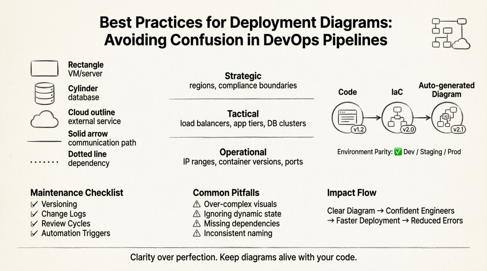
Best Practice: Use distinct shapes for different types of nodes. A standard rectangle for a virtual machine, a cylinder for a database, and a cloud shape for external services. This visual shorthand allows engineers to scan the diagram and instantly recognize the nature of the infrastructure.
Levels of Abstraction 📉
One of the most common sources of confusion is mixing levels of abstraction in a single view. A diagram meant for high-level architecture review should not contain the same detail as a diagram meant for debugging a specific server issue. Different stakeholders require different levels of information.
Consider using a layered approach to documentation. Below is a comparison of how abstraction levels should differ based on the audience.
| Level | Audience | Detail Focus | Example Content |
|---|---|---|---|
| Strategic | Management, Architects | High-level topology, cost centers | Regions, major service zones, compliance boundaries |
| Tactical | DevOps, SREs | Component interaction, network flow | Load balancers, app tiers, database clusters |
| Operational | Support, Engineers | Instance details, configuration specifics | IP ranges, container versions, specific ports |
By segregating these views, you prevent the operational team from being overwhelmed by strategic decisions, and you prevent management from getting bogged down in port numbers. Each diagram serves a specific communication need.
Aligning Diagrams with Pipeline Logic 🔄
In a modern DevOps environment, the deployment diagram is not static. It represents the dynamic state of your delivery pipeline. If the pipeline changes, the diagram must change. A disconnect between the visual map and the automation script is a recipe for disaster.
To ensure alignment, follow these guidelines:
- Code-First Approach: Treat the diagram as documentation derived from the infrastructure configuration. If you change the infrastructure as code (IaC), regenerate the diagram automatically if possible.
- Environment Parity: Ensure the diagram reflects the staging environment accurately. If production looks different from staging, the diagram should show the distinction clearly. Never assume environments are identical.
- Deployment Artifacts: Clearly label which version of the software is deployed to which node. This helps in rollback scenarios where you need to know exactly what code is running where.
- Network Segmentation: Show how the pipeline interacts with network security groups. If a pipeline step requires a specific port open, the diagram should reflect that permission.
When the pipeline updates, the diagram update should be part of the same change request. This ensures that the visual record is always in sync with the technical reality. A diagram that is one release behind is essentially a lie.
Maintenance and Version Control 📝
Documentation rot is a real phenomenon. Diagrams become obsolete quickly in agile environments. To combat this, you must implement a maintenance strategy similar to code versioning.
Key strategies include:
- Versioning: Assign version numbers to diagrams just like software releases. This allows teams to reference the specific architecture used for a given deployment.
- Change Logs: Maintain a log of who updated the diagram and why. This provides context when a change is made, helping new team members understand the evolution of the system.
- Review Cycles: Schedule quarterly reviews of the architecture diagrams. Even if no major changes occurred, a review ensures that the notation and labels remain consistent.
- Automation Triggers: Where possible, link diagram updates to CI/CD events. If a new service is added to the build, trigger a notification to update the diagram.
Without a dedicated owner for the diagram, it will drift. Assign a specific role, such as a Site Reliability Engineer or a Solution Architect, to be responsible for the accuracy of the visual documentation. This accountability ensures that the diagram remains a trusted resource.
Common Pitfalls and How to Avoid Them 🛑
Even experienced teams fall into traps when creating deployment diagrams. Recognizing these pitfalls early can save significant time during audits or incident response.
Pitfall 1: Over-Engineering the Visuals
Trying to make the diagram look perfect often leads to it becoming too complex. Focus on clarity over aesthetics. Use simple lines and boxes. If a line is curved, it adds confusion. Use straight lines for connections.
Pitfall 2: Ignoring Dynamic State
Deployment diagrams are static, but infrastructure is dynamic. They do not show auto-scaling groups expanding and contracting. Use annotations or legends to indicate where scaling occurs. For example, add a note stating “Instances scale based on load” near the cluster node.
Pitfall 3: Missing External Dependencies
Teams often forget to document third-party services. If your application relies on an external payment gateway or email service, it must be shown. This is crucial for understanding failure modes when external APIs go down.
Pitfall 4: Inconsistent Naming Conventions
If one section calls a server “App-Server-01” and another calls it “Web-Node-A”, confusion will follow. Establish a naming standard and enforce it across all documentation.
Collaboration and Communication 🤝
The value of a deployment diagram extends beyond the technical team. It is a communication tool that bridges the gap between engineering, product, and security.
When presenting a diagram to stakeholders:
- Focus on the Flow: Start with the entry point (e.g., the load balancer) and follow the request path to the database. This narrative helps non-technical stakeholders understand the journey of data.
- Highlight Critical Paths: Use bold lines or colors to indicate the primary paths that affect user experience. This helps prioritize where to focus optimization efforts.
- Identify Single Points of Failure: Clearly mark components that, if they fail, will take down the whole system. This drives conversations about redundancy and backup strategies.
- Include Security Boundaries: Show where data encryption happens and where access controls are enforced. This is vital for compliance audits and security reviews.
When onboarding new engineers, use the diagram as a primary training tool. A new hire can look at the diagram and understand the ecosystem faster than reading a wiki page. This accelerates time-to-productivity.
A Checklist for Diagram Quality ✅
Before publishing a deployment diagram to your knowledge base, run it through this quality checklist. This ensures consistency and accuracy across your organization.
- Legend Included: Are all symbols defined? If a shape is used, is there a key?
- Labels Clear: Are all nodes and connections labeled with their function?
- Version Tag: Is there a version number or date on the diagram?
- Author Identified: Who is responsible for this document?
- Network Ports: Are the necessary ports listed for firewalls?
- Protocol Specs: Are protocols like HTTPS, gRPC, or MQTT specified?
- Consistent Scale: Does the size of the box imply importance? If so, ensure it is intentional.
- Accessibility: Is the diagram readable in black and white? Avoid relying solely on color to convey meaning.
The Impact of Clarity on Delivery Speed ⏱️
There is a direct correlation between diagram clarity and deployment speed. When a diagram is confusing, engineers spend time interpreting the map rather than executing the deployment. They might hesitate to run a script because they are unsure which node it targets. This hesitation slows down the pipeline and increases the risk of human error.
Conversely, a clear diagram empowers engineers to act with confidence. They know exactly where the code is going. They know the dependencies. They know the failure points. This confidence translates to faster resolution times and higher deployment frequency.
In complex systems, the cost of confusion is measured in downtime and lost revenue. A deployment diagram is an insurance policy against miscommunication. It ensures that when the team moves, they are all moving in the same direction.
Conclusion on Documentation Standards 📌
Deployment diagrams are not just drawings; they are architectural contracts. They define the boundaries of your infrastructure and the flow of your software. By adhering to best practices, maintaining version control, and aligning with your pipeline logic, you transform these diagrams from static images into dynamic assets.
Remember that the goal is not perfection, but clarity. A diagram that is easy to read and understand is better than a diagram that is technically perfect but impossible to navigate. Prioritize the user experience of the person reading the document. If they can find the information they need in under a minute, you have succeeded.
Keep your diagrams alive. Update them with your code. Review them with your team. Treat them as critical infrastructure. In the end, the stability of your DevOps pipeline depends as much on the clarity of your documentation as the robustness of your code.