Platform engineering sits at the intersection of software development and operations. It requires a deep understanding of how systems are constructed, how they interact, and how they are delivered to end users. Two critical artifacts in this domain are the deployment diagram and the architecture map. While often used interchangeably in casual conversation, they serve distinct purposes and offer different levels of abstraction.
For platform engineers, clarity in infrastructure visualization is not just about documentation; it is about reliability, maintainability, and effective communication with stakeholders. Confusing these two artifacts can lead to misaligned expectations, deployment failures, and technical debt. This guide explores the nuances of each, their specific use cases, and how to maintain them effectively within a modern infrastructure ecosystem.
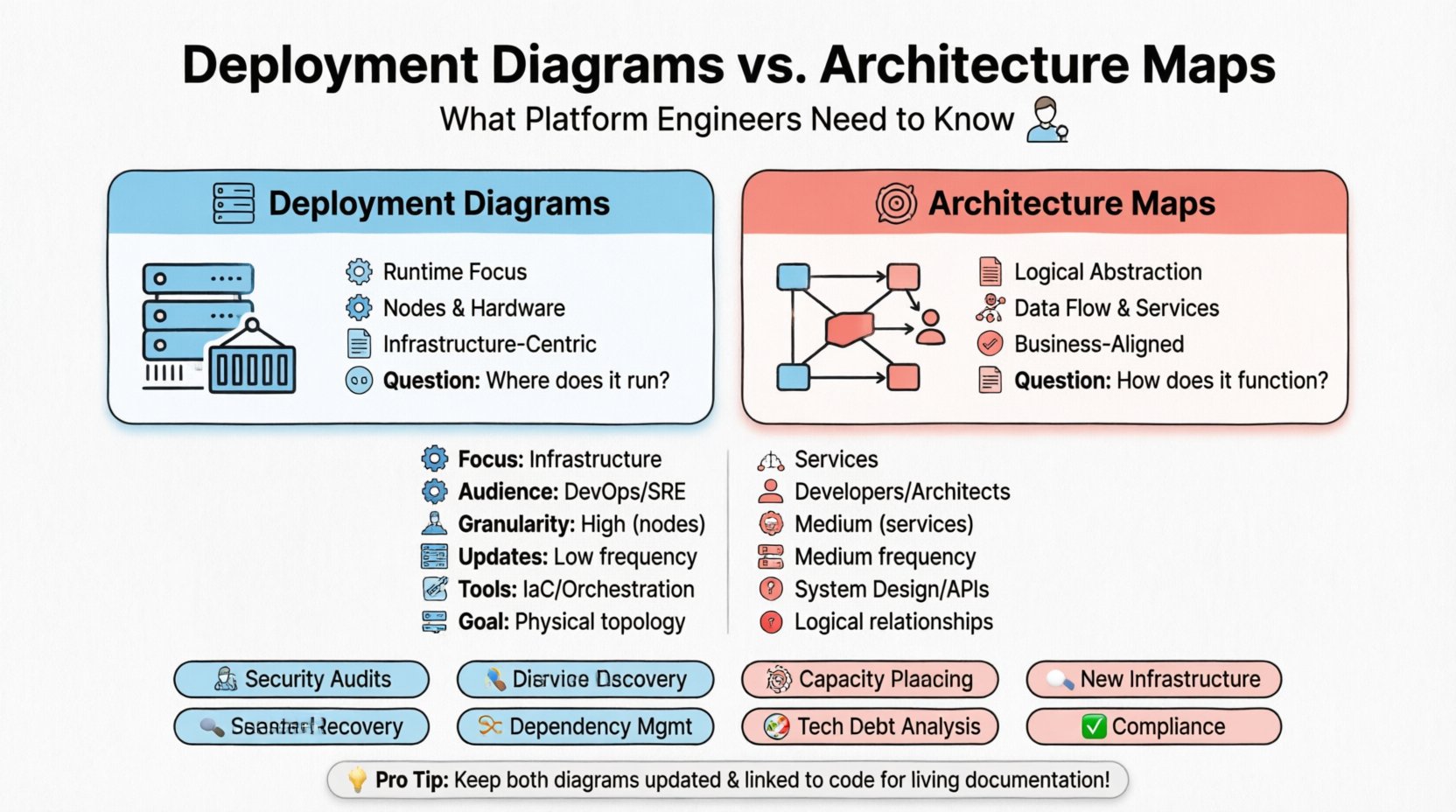
📦 Understanding Deployment Diagrams
A deployment diagram is a specific type of system diagram that describes the physical hardware and software architecture of a system. It focuses on the runtime environment. In the context of platform engineering, this artifact answers the question: “Where does the code actually run?”
These diagrams typically depict:
- Nodes: Physical or virtual computing devices (servers, containers, edge devices).
- Artifacts: Software components deployed onto the nodes (executables, libraries, configuration files).
- Connectivity: The communication protocols and network paths between nodes.
- Dependencies: How one deployed component relies on another at the infrastructure level.
When a platform engineer creates a deployment diagram, the goal is precision regarding the physical or logical topology of the runtime environment. It is less about business logic and more about the mechanics of execution.
Key Characteristics of Deployment Diagrams
- Focus on Runtime: They show the environment where the application is active.
- Hardware Agnostic: While they represent hardware, they often abstract the specific vendor details unless relevant to the infrastructure constraints.
- Static Snapshot: They represent the state of the system at a specific point in time.
- Infrastructure Centric: They are crucial for capacity planning and network configuration.
Consider a scenario where a new database cluster is being provisioned. A deployment diagram would illustrate the database server nodes, the load balancer in front of them, and the connection strings required for the application layer to reach the database. This level of detail is essential for the operations team to configure firewalls, DNS records, and routing tables.
🌐 Understanding Architecture Maps
An architecture map is a broader concept. It represents the high-level design of a system, often encompassing business logic, data flow, service boundaries, and organizational structure. It answers the question: “How does the system work as a whole?”
While a deployment diagram zooms in on the nodes, an architecture map zooms out to show the relationships between services, data stores, and external systems. It is often used to communicate with non-technical stakeholders or to onboard new developers to the system’s overall design.
Key Characteristics of Architecture Maps
- Logical Abstraction: They focus on services and components rather than physical machines.
- Data Flow: They emphasize how data moves through the system, often showing inputs, processing, and outputs.
- Service Boundaries: They define where one service ends and another begins, crucial for microservices environments.
- Business Alignment: They often map technical components back to business capabilities.
For a platform engineer, the architecture map is a tool for governance and standardization. It helps ensure that new services adhere to the defined patterns and that data sovereignty rules are respected across different logical boundaries.
⚖️ Key Differences at a Glance
Understanding the distinction is vital for choosing the right tool for the job. The table below outlines the core differences between deployment diagrams and architecture maps.
| Feature | Deployment Diagram | Architecture Map |
|---|---|---|
| Primary Focus | Physical/Logical Infrastructure | Logical Services & Data Flow |
| Target Audience | DevOps, SRE, Infrastructure Teams | Developers, Architects, Product Owners |
| Granularity | High (Nodes, Networks, Hardware) | Medium (Services, APIs, Data Stores) |
| Update Frequency | Low (Infra changes are rare) | Medium (Services evolve frequently) |
| Tooling Context | Infrastructure as Code, Orchestration | System Design, API Specifications |
| Question Answered | “Where does it run?” | “How does it function?” |
🛠️ Strategic Application in Platform Engineering
Platform engineers must know when to create or update each artifact. Using the wrong diagram for a specific task can lead to confusion and inefficiency.
When to Use Deployment Diagrams
- Onboarding New Infrastructure: When provisioning a new region or cloud account, a deployment diagram helps visualize the network topology.
- Security Audits: Security teams need to see exactly which nodes expose which ports and how data is encrypted in transit between physical points.
- Disaster Recovery Planning: Knowing the physical layout helps determine failover paths and backup locations.
- Capacity Planning: Understanding the hardware requirements for specific nodes allows for accurate resource allocation.
When to Use Architecture Maps
- Service Discovery: New developers need to understand which service provides which function without needing to know the underlying server IP.
- Dependency Management: Understanding how Service A depends on Service B helps in versioning and API contract management.
- Technical Debt Analysis: Identifying monolithic sections or tightly coupled services that need refactoring.
- Compliance and Governance: Ensuring data does not cross certain logical boundaries defined by regulatory requirements.
🔄 Maintenance and Lifecycle Management
One of the biggest challenges in platform engineering is keeping documentation in sync with reality. Infrastructure is dynamic; services are spun up and torn down constantly. Static diagrams become obsolete quickly.
Drift Detection
Drift occurs when the actual infrastructure state diverges from the documented diagram. To mitigate this:
- Automated Discovery: Use tools that query the infrastructure directly to generate current topology data.
- Version Control: Store diagram definitions in the same repository as the infrastructure code.
- Change Management: Link diagram updates to deployment tickets. If a ticket is approved, the diagram must be updated.
- Alerting: Set up alerts for unauthorized changes to critical nodes or network configurations.
The Cost of Outdated Diagrams
Outdated documentation is dangerous. If an incident occurs and the team relies on a deployment diagram that shows a server as active when it has been decommissioned, troubleshooting time increases significantly. Similarly, an architecture map that misses a critical dependency can lead to cascading failures during a deployment.
🤖 Automation Strategies
Manual diagramming is prone to error and rarely scales. Platform engineers should aim to automate the generation of these artifacts where possible.
Infrastructure as Code (IaC)
IaC templates define the infrastructure structure. By parsing these templates, platform engineers can generate deployment diagrams automatically. This ensures that the diagram is always a reflection of the code that provisions the environment.
- Parse IaC Files: Read Terraform, CloudFormation, or similar definitions.
- Render Topology: Convert resource definitions into node and connection representations.
- Integrate with CI/CD: Run diagram generation as part of the pipeline to update documentation on every commit.
Service Mesh and Observability
Modern service meshes provide rich telemetry data. This data can be used to build dynamic architecture maps that reflect the actual runtime traffic patterns rather than just the intended design.
- Trace Data: Use distributed tracing to show actual call paths between services.
- Metrics: Visualize load and latency to highlight bottlenecks in the architecture.
- Health Checks: Integrate health status into the map to show which parts of the system are degraded.
🗣️ Communication and Stakeholder Alignment
Platform engineers act as translators between business goals and technical implementation. The choice of diagram influences how effectively this translation happens.
Talking to Engineering Teams
Developers often prefer architecture maps. They need to know how to integrate their code into the broader system. They care about APIs, data schemas, and service contracts. A deployment diagram is often too low-level for this audience, obscuring the logical relationships they need to understand.
Talking to Operations Teams
Operations and SRE teams require deployment diagrams. They need to know where the logs are stored, where the metrics are collected, and how to patch the operating systems. An architecture map is often too abstract, hiding the specific hardware constraints they must manage.
Talking to Leadership
Executive stakeholders need both, but simplified. Architecture maps are better for strategic planning, showing how the system supports business capabilities. Deployment diagrams are rarely necessary for this audience unless discussing cost or specific infrastructure risks.
📉 Common Pitfalls to Avoid
Even with the best intentions, creating these diagrams can lead to common mistakes. Being aware of these pitfalls helps maintain high-quality documentation.
- Over-Engineering: Trying to show every single connection can make a diagram unreadable. Focus on the critical paths and high-level flows.
- Ignoring Latency: In deployment diagrams, network latency between nodes is a critical factor. Ignoring this can lead to performance issues in production.
- Static vs. Dynamic: Assuming the architecture map never changes is a mistake. Services are added and removed regularly. The documentation process must reflect this reality.
- Tool Lock-in: Using proprietary tools that do not export data easily can make migration difficult. Prefer formats that are open or widely supported.
- Single Source of Truth: Avoid maintaining diagrams in multiple places. If one is updated, others must follow. Centralize the source of truth.
🚀 Future Trends in Infrastructure Visualization
The landscape of platform engineering is evolving. As systems become more distributed and complex, the way we visualize them must adapt.
Real-Time Visualization
Static images are becoming less common. Interactive dashboards that update in real-time are gaining traction. These tools allow engineers to click on a node in the map and see live metrics, logs, and recent deployments.
AI-Assisted Diagramming
Artificial intelligence is beginning to assist in generating and maintaining diagrams. AI can analyze code repositories and infrastructure logs to suggest architectural improvements or flag inconsistencies in the current design.
Graph Databases
Graph databases are well-suited for storing architecture data. They allow for complex queries about relationships, such as “Show me all services that depend on this database.” This data model is more flexible than traditional relational databases for representing system topology.
🔧 Best Practices for Platform Engineers
To ensure your diagrams serve their purpose effectively, follow these best practices.
- Define Standards: Create a style guide for your diagrams. Use consistent colors, shapes, and labels.
- Keep it Simple: A diagram that is too complex is useless. Aim for clarity over completeness.
- Review Regularly: Schedule periodic reviews of your diagrams with the engineering team to ensure accuracy.
- Link to Code: Where possible, link diagram elements to the actual code repositories or configuration files.
- Document Assumptions: If a diagram relies on a specific assumption (e.g., “All traffic is encrypted”), document it explicitly.
📊 Integrating with CI/CD Pipelines
Integration with continuous integration and continuous deployment pipelines ensures that documentation keeps pace with development.
- Pre-Deployment Checks: Run a validation step that checks if the new infrastructure matches the deployment diagram.
- Post-Deployment Verification: After a deployment, automatically verify that the live environment matches the expected state.
- Rollback Triggers: If the live environment deviates significantly from the diagram, trigger an alert or rollback.
- Documentation Generation: Generate the architecture map as a step in the release process to ensure it is up to date before the release is marked as complete.
🎯 Conclusion on Visualization Strategy
Choosing between a deployment diagram and an architecture map is not a binary decision. It depends on the context, the audience, and the specific problem being solved. Platform engineers who master both artifacts can communicate more effectively, reduce operational risk, and build more resilient systems.
The key is to understand that these are living documents, not static artifacts. They must evolve as the system evolves. By automating where possible and maintaining strict standards, platform engineers can ensure that their infrastructure remains visible, understandable, and manageable throughout its lifecycle.
Investing time in accurate visualization pays dividends in reduced downtime, faster onboarding, and clearer decision-making. Whether you are mapping out a new cloud region or refactoring a legacy service, having the right view of your system is the first step toward success.