In modern software engineering, clarity is currency. When a system spans multiple servers, cloud instances, and edge devices, understanding the physical topology is crucial for stability and security. A deployment diagram serves as the map for this infrastructure. Without it, teams navigate by guesswork, leading to deployment errors, security vulnerabilities, and costly downtime. This guide provides a structured approach to interpreting and constructing these diagrams with precision, ensuring every node and connection is accounted for.
Whether you are an architect designing a new cloud-native application or a developer troubleshooting a production issue, mastering the visual representation of your system’s runtime environment is essential. We will move beyond simple sketches to create robust documentation that reflects the actual state of your infrastructure.
🔍 What is a Deployment Diagram?
A deployment diagram is a specific type of structure diagram in system modeling. It illustrates the physical hardware and software components of a system. Unlike component diagrams, which focus on logical relationships, deployment diagrams focus on the execution environment. They show how software artifacts are mapped to physical nodes.
Key characteristics include:
- Physicality: It depicts actual machines, virtual servers, or network devices.
- Execution: It shows where software runs, not just how it is structured logically.
- Connectivity: It defines the communication paths between different nodes.
- Deployment: It represents the physical configuration of the software release.
These diagrams are vital for operations teams to understand resource allocation, for security teams to audit network boundaries, and for developers to visualize how their code interacts with the underlying hardware.
⚙️ Core Elements Explained
To read or create a deployment diagram effectively, you must understand the standard building blocks. Every element has a specific semantic meaning that dictates how the system behaves.
1. Nodes (Computational Resources)
Nodes represent the physical or virtual computing resources where artifacts reside. They are the containers for your software. There are several types of nodes you will encounter:
- Device: A generic hardware component, such as a router, switch, or mobile phone. Often represented as a 3D cube or a simple box with a specific label.
- Execution Environment: A software environment that hosts components, such as a container runtime or a specific operating system.
- Server: A dedicated computer that provides services to other systems. This could be a physical rack server or a virtual machine instance.
- Cloud: A logical container for multiple nodes, often representing a cloud provider region or availability zone.
2. Artifacts (Software Components)
Artifacts are the physical pieces of software that are deployed onto the nodes. They are the deliverables of the development process. Common artifacts include:
- Executable Files: The compiled code that runs directly on the processor.
- Libraries: Shared code packages required by the executable.
- Data Stores: Databases or file systems that persist information.
- Configuration Files: Scripts or files that define how the software behaves.
An artifact is usually depicted as a rectangle with a folded corner. It must be associated with a node to indicate where it lives.
3. Associations (Connections)
Connections define how nodes communicate. These are not just lines; they represent network protocols or physical links. Key connection types include:
- Communication Pathways: Standard network connections like TCP/IP, HTTP, or HTTPS.
- Physical Links: Cables, fiber optics, or wireless signals (Wi-Fi, 5G).
- Dependency: A logical link indicating that one node relies on another to function, even if data does not flow directly between them in a request-response cycle.
📖 How to Read a Deployment Diagram
Reading a deployment diagram requires a systematic approach. You cannot simply scan from left to right; you must analyze the topology to understand data flow and dependency chains.
Step 1: Identify the Entry Point
Look for the node that interacts with the external world. This is often a load balancer, a firewall, or an API gateway. This node acts as the traffic cop for the system. Identify the protocols it uses to accept incoming traffic.
Step 2: Trace the Data Flow
Follow the lines connecting the nodes. Ask yourself:
- Where does the data go after leaving the entry point?
- Does it go to a single server or multiple instances?
- Are there loops or redundant paths?
Understanding the flow helps identify potential bottlenecks. If all traffic must pass through a single database server, that node is a critical point of failure.
Step 3: Analyze Security Boundaries
Check for partitions or firewalls drawn within the diagram. These often separate public-facing components from internal databases. Verify that sensitive artifacts are not placed on public nodes. A secure architecture ensures that data stores are never directly exposed to the internet.
Step 4: Verify Artifact Placement
Ensure every software component has a home. If you see a library without an associated node, the diagram is incomplete. Every artifact must be deployed somewhere.
🛠️ Creating Your Own Diagrams
Building a deployment diagram from scratch requires discipline. The goal is accuracy, not artistic flair. Follow these steps to ensure your documentation remains useful.
Step 1: Inventory Your Infrastructure
Before drawing, list all the resources. This includes:
- Physical servers or VMs.
- Network devices (routers, switches).
- External services (payment gateways, email providers).
- Storage solutions (block storage, object storage).
Step 2: Define Abstraction Levels
Do not try to draw every single microservice on one page. Create levels of detail:
- Level 1 (High-Level): Shows major regions, clouds, and critical services. Useful for executives and high-level planning.
- Level 2 (Regional): Shows nodes within a specific data center or cloud region. Useful for DevOps teams.
- Level 3 (Node Detail): Shows specific containers or processes on a single server. Useful for debugging specific instances.
Step 3: Use Standard Notation
Consistency is key. If you use a specific icon for a database in one diagram, use it everywhere. This reduces cognitive load for anyone reading your documentation. Ensure labels are descriptive.
Step 4: Validate Against Reality
A diagram that does not match the running system is worse than no diagram. Periodically compare the diagram with the actual infrastructure. If you have added a new server, update the diagram immediately. Treat the diagram as a living document.
📊 Element Comparison Table
To clarify the distinctions between common elements, refer to this comparison.
| Element | Represents | Example | Visual Style |
|---|---|---|---|
| Node | Hardware or Virtual Machine | Web Server Instance | 3D Cube or Box |
| Artifact | Software Package | Compiled Application | Rectangle with folded corner |
| Association | Network Connection | TCP/IP Link | Solid Line with Label |
| Component | Logical Software Unit | User Service Module | Box with «component» label |
🚧 Common Pitfalls to Avoid
Even experienced architects make mistakes when documenting infrastructure. Avoid these common errors to maintain diagram quality.
- Over-Abstraction: Removing too much detail makes the diagram useless for troubleshooting. Keep enough detail to understand dependencies.
- Missing Dependencies: Failing to show that Node A needs Node B to function can lead to deployment failures where services are started in the wrong order.
- Inconsistent Naming: Calling a server “Server 1” in one place and “Prod-DB” in another causes confusion.
- Ignoring Network Protocols: Drawing a line without specifying the protocol (HTTP vs. Database Query) hides critical security and performance constraints.
- Static Representation of Dynamic Systems: In cloud environments, nodes spin up and down. A static diagram may misrepresent the system. Use logical groupings to represent dynamic fleets.
☁️ Handling Cloud and Virtualized Environments
Modern infrastructure is rarely just physical boxes. It is virtualized, containerized, and distributed across multiple regions. This introduces complexity into deployment diagrams.
Containerization
When dealing with containers, the node is often a host machine running an orchestration engine. The artifact might be a container image. You should represent the host as the node and the container as the artifact within that node. If multiple containers run on one host, show them grouped.
Serverless Architectures
In serverless environments, you do not manage the nodes. The provider manages them. Your diagram should focus on the functions or triggers rather than the underlying hardware. You might represent the provider as a generic cloud node and your code as the artifact inside it.
Hybrid Environments
Many systems run partially on-premise and partially in the cloud. Clearly mark the boundary. Use a dashed line or a distinct border to separate the on-premise infrastructure from the cloud infrastructure. This highlights where network latency and security controls change.
🔄 Keeping Diagrams Current
Infrastructure changes constantly. A diagram created six months ago may be obsolete. To maintain accuracy:
- Integrate with CI/CD: Link diagram updates to deployment pipelines. If a new server is provisioned via code, trigger a documentation update.
- Assign Ownership: Designate a team member responsible for diagram maintenance. This ensures accountability.
- Automate Discovery: Where possible, use tools that scan the infrastructure and generate diagrams. This reduces manual effort and human error.
- Review Cycles: Schedule quarterly reviews of the architecture documentation to ensure it aligns with current business needs.
🔗 Integration with Other Models
A deployment diagram does not exist in isolation. It connects to other diagrams in your system design.
- Component Diagram: The component diagram shows logical structure. The deployment diagram shows where those components run. Ensure the artifacts in the deployment diagram match the components in the logical diagram.
- Sequence Diagram: The sequence diagram shows interaction over time. The deployment diagram shows the static nodes involved in that interaction. Use the deployment diagram to verify that the nodes in the sequence diagram are actually available in the architecture.
- Class Diagram: While less directly related, the class diagram defines the code. The deployment diagram defines the environment where that code executes. Ensure the runtime environment supports the language features used in the class diagram.
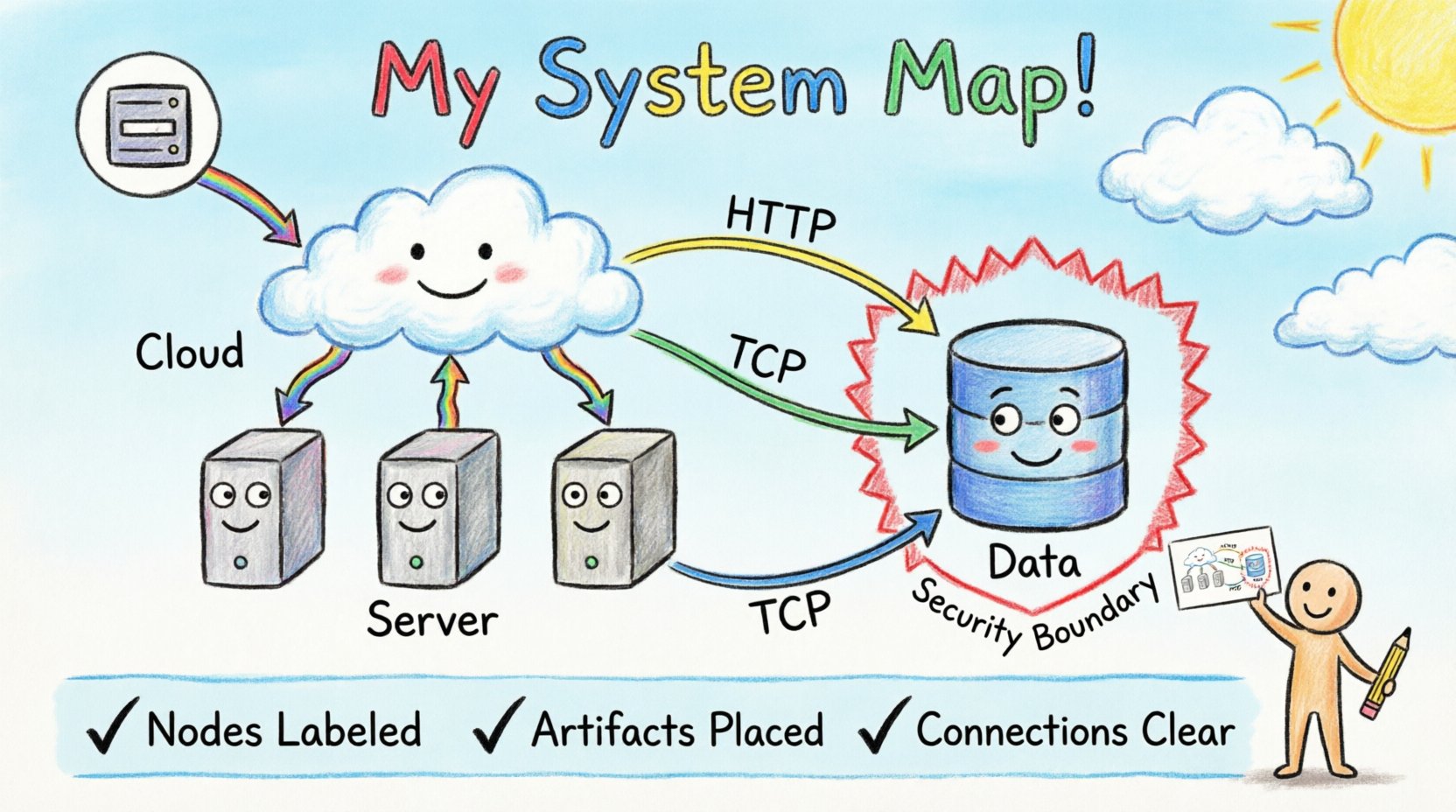
✅ Summary Checklist
Before finalizing a deployment diagram, run through this checklist to ensure completeness and accuracy.
- ☑️ Are all nodes labeled clearly?
- ☑️ Are all artifacts placed on a specific node?
- ☑️ Are connection protocols specified?
- ☑️ Are security boundaries (firewalls, DMZ) visible?
- ☑️ Does the diagram reflect the current production environment?
- ☑️ Are external dependencies (third-party services) included?
- ☑️ Is the level of abstraction appropriate for the audience?
By adhering to these standards, you create a resource that empowers your team to build, deploy, and maintain systems with confidence. Accurate diagrams reduce risk, improve communication, and streamline the deployment process.