Creating clear documentation is a cornerstone of successful software development. Among the various modeling tools available, the UML Interaction Overview Diagram (IOD) plays a critical role in visualizing the flow of control between interaction diagrams. However, many teams struggle to utilize this specific notation effectively. When an Interaction Overview Diagram is poorly constructed, it does more than just look messy; it introduces ambiguity that stalls decision-making and prolongs the development lifecycle.
This guide addresses the specific pitfalls that lead to confusion. By understanding these common errors, you can ensure your diagrams serve their intended purpose: communication. We will explore the structural elements, the logical flow, and the human factors involved in creating effective models. The goal is not just to draw boxes and lines, but to create a blueprint that stakeholders can read and trust.
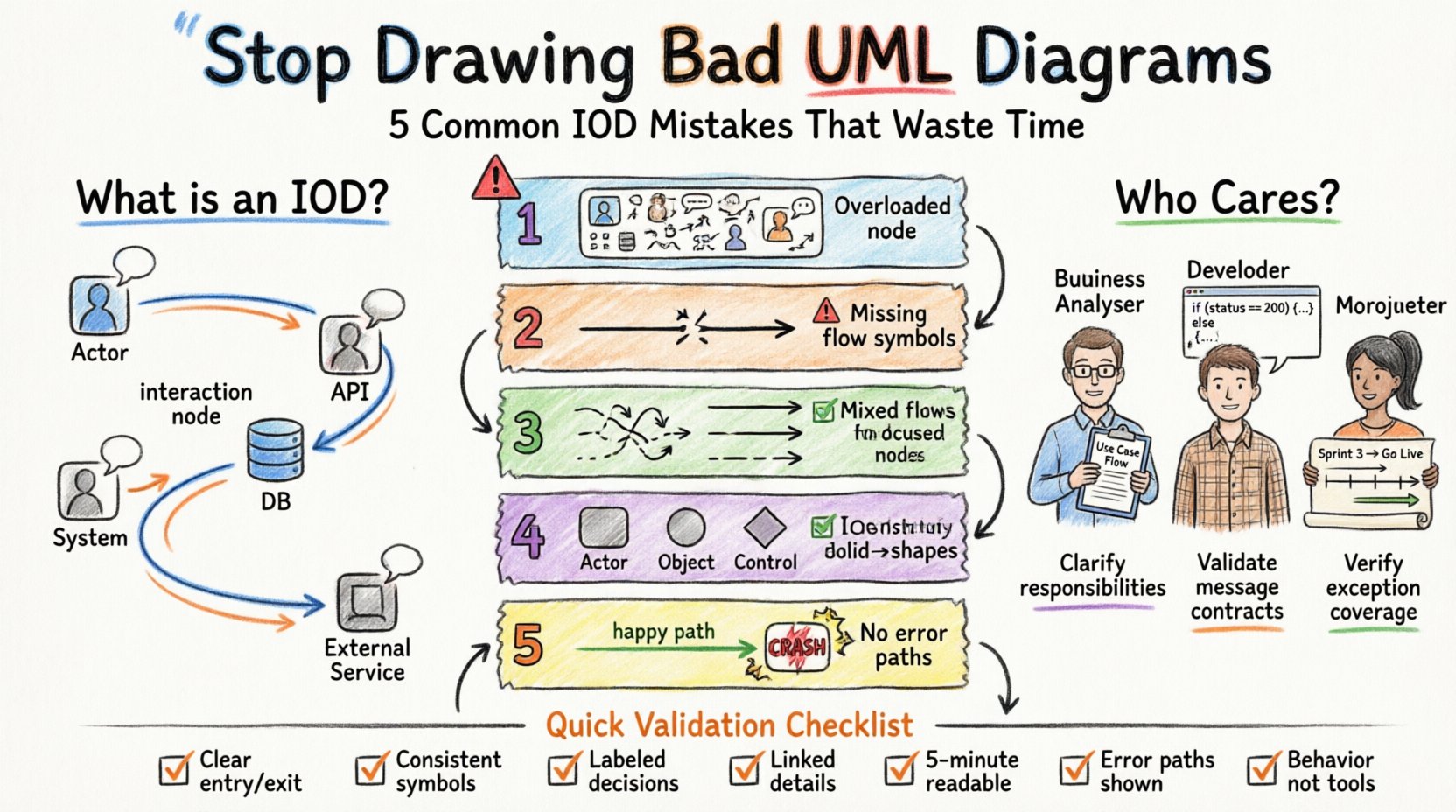
🤔 What is an Interaction Overview Diagram?
Before identifying the errors, it is necessary to define the tool. An Interaction Overview Diagram is a type of activity diagram that contains interaction nodes. These nodes represent entire interaction diagrams, such as Sequence Diagrams or Communication Diagrams. The IOD acts as a high-level controller, showing how these detailed interactions are sequenced and combined.
Think of the IOD as a map of a journey, where each stop on the map is a complex conversation between objects. It answers the question: “How do these different interactions connect to achieve a specific user goal?”
- Control Flow: Defines the order in which interactions occur.
- Decision Nodes: Introduce branching logic based on conditions.
- Interaction Nodes: Encapsulate detailed behavior into a single symbol.
- Object Flows: Show data passing between interactions.
When used correctly, this diagram bridges the gap between high-level process flows and low-level object interactions. When used incorrectly, it becomes a source of frustration.
🛑 Common Mistakes That Waste Time
Many teams treat Interaction Overview Diagrams as a direct translation of Sequence Diagrams. This is a fundamental error. An IOD has its own syntax and purpose. Below are the most frequent mistakes observed in professional settings.
1. Overloading a Single Node with Too Much Logic
One of the most common errors is creating an interaction node that represents too much behavior. If an interaction node contains complex logic, loops, or extensive message exchanges, it defeats the purpose of the overview.
Why this happens: Modelers often want to show everything in one place to avoid creating too many separate diagrams.
The Consequence: When a stakeholder looks at the IOD, they cannot see the high-level flow. They get lost in the details of the nested interaction. It forces them to drill down into a Sequence Diagram to understand the context of the flow.
Best Practice: Keep interaction nodes atomic. Each node should represent a single, coherent interaction focused on one specific aspect of the system. If the logic is complex, split it into multiple interaction nodes and connect them with control flows.
2. Ignoring Control Flow Symbols
An Activity Diagram relies heavily on control flow to indicate sequence. In an IOD, ignoring the standard control flow symbols (such as initial nodes, final nodes, and decision nodes) leads to ambiguity.
Why this happens: Some modelers assume that the left-to-right layout is enough to define order.
The Consequence: Readers are left guessing the execution path. Does the flow go to the next node immediately? Is there a loop? Is there a condition? Without explicit control flow tokens, the diagram is speculative.
Best Practice: Use standard Activity Diagram symbols to connect interaction nodes. Ensure every interaction node has a clear entry and exit point unless it is the final node. Use decision diamonds explicitly to show branching logic.
3. Mixing Object Flow and Control Flow
UML distinguishes between control flow (execution order) and object flow (data movement). A frequent mistake is using arrows interchangeably or labeling data transfer as execution flow.
Why this happens: The visual representation of a line with an arrowhead looks similar for both types, leading to confusion.
The Consequence: Stakeholders cannot distinguish between “this step happens next” and “this data is passed here”. This ambiguity can lead to implementation errors where data is expected but not passed, or steps are executed out of order.
Best Practice: Reserve solid arrows for control flow. Use dashed lines or specific stereotypes for object flow if your tooling supports it. Clearly label the flow type if there is any doubt.
4. Inconsistent Notation and Symbol Usage
Consistency is key to readability. Some teams use different shapes for the same concept, or they mix UML 2.0 notation with older UML 1.x symbols.
Why this happens: Different team members may have been trained on different standards or use different modeling tools without a unified style guide.
The Consequence: Cognitive load increases. The reader has to re-learn what a symbol means every time they look at a different part of the diagram. This slows down the review process and increases the likelihood of misinterpretation.
Best Practice: Establish a style guide for your project. Define which shapes represent specific interaction types. Stick to UML 2.0 standards for all diagrams to ensure industry-standard compatibility.
5. Failing to Account for Exception Paths
Most diagrams show the happy path—the scenario where everything goes right. An Interaction Overview Diagram that ignores error handling is incomplete.
Why this happens: It is easier to model the success scenario than to anticipate every failure mode.
The Consequence: Developers assume the happy path is the only path. When exceptions occur in production, the system may crash because the diagram did not indicate how to handle the failure. This leads to reactive debugging rather than proactive design.
Best Practice: Include decision nodes that represent error checks. Show where the flow moves if a validation fails or a service is unavailable. Even if the detail is in a separate diagram, the IOD must indicate that a path exists.
📊 Comparison: Effective vs. Ineffective IODs
To clarify the differences, the following table contrasts common mistakes with their corrected counterparts.
| Feature | Ineffective Diagram ❌ | Effective Diagram ✅ |
|---|---|---|
| Node Complexity | One large node handles login, validation, and database save. | Three separate nodes: Validate, Save Data, Confirm Login. |
| Flow Direction | Lines cross randomly with no clear start or end. | Top-to-bottom or left-to-right flow with clear Initial and Final nodes. |
| Decision Logic | Implicit branching based on text labels. | Explicit decision diamonds with labeled guards (e.g., [Valid?]). |
| Notation Consistency | Some nodes are rectangles, others are circles. | All interaction nodes use the same UML 2.0 shape. |
| Exception Handling | No paths for errors or timeouts. | Dedicated paths for error states leading to rollback or user notification. |
| Context | No indication of which Sequence Diagram is referenced. | Interaction nodes clearly link to specific Sequence Diagrams via labels. |
👥 Stakeholder Confusion: The Human Element
A diagram is only as good as the people who read it. If stakeholders are confused, the diagram has failed, regardless of its technical accuracy. Understanding who reads these diagrams helps tailor the design.
1. The Business Analyst
BAs focus on process logic and requirements. They care less about object lifecycles and more about the sequence of events. If your IOD is too technical, they will disengage.
- Focus: Ensure the business process is clear.
- Avoid: Overloading with technical constraints unless relevant.
2. The Developer
Developers need to know the implementation details. They look for the specific interactions between objects within the nodes.
- Focus: Clear links to Sequence Diagrams.
- Avoid: Ambiguous control flow that requires guessing.
3. The Project Manager
Managers need to understand dependencies and timing. They look at the flow to identify bottlenecks or complex paths.
- Focus: High-level overview of the workflow.
- Avoid: Micro-details that obscure the overall timeline.
🛠 Improving the Workflow
Once you identify the mistakes, the next step is to implement a workflow that prevents them. This involves a combination of process and discipline.
Step 1: Define the Scope Early
Before drawing, define the boundaries. What is the specific use case this diagram covers? Is it the entire system or a specific module? Limiting the scope prevents the “overloading” mistake mentioned earlier.
Step 2: Create a Style Guide
Document the rules. How should decision nodes be labeled? What colors (if any) should be used for specific types of nodes? Consistency reduces the cognitive load for everyone involved.
Step 3: Peer Review Process
Implement a review step where a colleague checks the diagram for clarity. Ask them specifically: “Can you trace the path from start to finish without asking me questions?” If they cannot, the diagram needs refinement.
Step 4: Link to Detailed Models
Ensure every interaction node has a reference. This could be a hyperlink in digital documentation or a clear label pointing to a specific Sequence Diagram file. This ensures the overview remains an overview and does not become a substitute for detail.
📉 The Cost of Ambiguity
Why does this matter? The cost of a bad diagram is not just the time spent drawing it. It is the cost of rework.
- Development Rework: Developers implementing based on a vague diagram may build the wrong logic. Fixing this requires refactoring code.
- Testing Gaps: If exception paths are missing, testers may not cover those scenarios, leading to bugs in production.
- Communication Breakdown: If stakeholders cannot understand the diagram, they cannot validate requirements. This leads to scope creep or missed features.
Investing time in a clean Interaction Overview Diagram is an investment in risk reduction. It acts as a contract between the design team and the implementation team.
✅ Checklist for Diagram Validation
Before sharing an Interaction Overview Diagram with the team, run it through this checklist. It ensures that common pitfalls have been avoided.
- Clarity: Is the entry and exit point obvious?
- Consistency: Are all symbols following the same standard?
- Completeness: Are decision nodes labeled with guards?
- Connectivity: Are interaction nodes linked to their detailed Sequence Diagrams?
- Readability: Can a new team member understand the flow within 5 minutes?
- Exceptions: Are error paths represented?
- No Software Specifics: Does the diagram describe behavior, not tool implementation?
🔄 Continuous Improvement
Diagramming is a skill that improves with practice. Teams that regularly review their models tend to produce higher quality documentation over time. Encourage feedback. If a stakeholder asks a question about the diagram, it is a signal that the diagram was not clear enough. Use that feedback to update the model.
Remember, the diagram is a communication tool, not a showcase of drawing ability. Its value is measured by how much it reduces ambiguity. By avoiding the common mistakes outlined in this guide, you contribute to a more efficient development process and a clearer understanding among all parties involved.
Focus on the logic, respect the standards, and prioritize the reader. When you do this, the Interaction Overview Diagram becomes a powerful asset rather than a source of confusion.