Modern e-commerce platforms handle transactions that are far more complex than simple buy-now buttons. A single checkout flow often involves inventory checks, fraud detection, multiple payment gateways, tax calculations, and loyalty point redemption. When development teams, QA engineers, and product owners discuss these flows, ambiguity often creeps in. One stakeholder imagines a synchronous process; another assumes an asynchronous background task. This disconnect leads to bugs, delayed releases, and frustrated users.
To bridge this gap, we utilized the UML Interaction Overview Diagram (IOM). Unlike standard Sequence Diagrams or Activity Diagrams, the IOM offers a unique blend of control flow logic and interaction detail. This guide details how we applied this modeling technique to a high-volume checkout scenario, ensuring every team member shared the same mental model of the system behavior.
📊 What is an Interaction Overview Diagram?
The Interaction Overview Diagram is a type of activity diagram that combines the high-level control flow of activity modeling with the detailed interaction sequences of message exchange. It is particularly useful when a system has multiple alternative paths, complex decision logic, or requires coordination between several lifelines.
Here are the core characteristics that define this diagram type:
- Control Flow Focus: It shows the order in which different interaction sequences occur.
- Sub-Flow Integration: It can reference specific sequence diagrams as activity nodes.
- Decision & Merge Points: It clearly visualizes branching paths based on system states.
- Object Flow: It can show how data objects move between activities.
In our case, we needed to visualize not just the happy path, but the failure modes. A standard sequence diagram struggles to show the “loop back” logic when a payment fails. The IOM handles this elegantly.
🏗️ The Case Study Context: E-Commerce Checkout
We were tasked with redesigning the checkout process for a major retail platform. The goal was to reduce cart abandonment and ensure data consistency across services. The system architecture was distributed, meaning the checkout process was not a monolith but a series of microservices communicating over a network.
The complexity arose from the following factors:
- Multiple Payment Providers: Users could choose between credit cards, digital wallets, or buy-now-pay-later services.
- Inventory Locking: Items had to be reserved immediately to prevent overselling.
- Geolocation Rules: Shipping costs and tax rates changed based on user IP address and billing details.
- Idempotency: Users might accidentally double-click the “Pay” button, requiring the system to handle duplicate requests safely.
A simple text document describing these steps proved insufficient. Engineers needed to see the control flow. We decided to model this using an Interaction Overview Diagram.
🔍 Step-by-Step Modeling Process
Building the diagram required a structured approach. We did not start by drawing lines; we started by understanding the business rules.
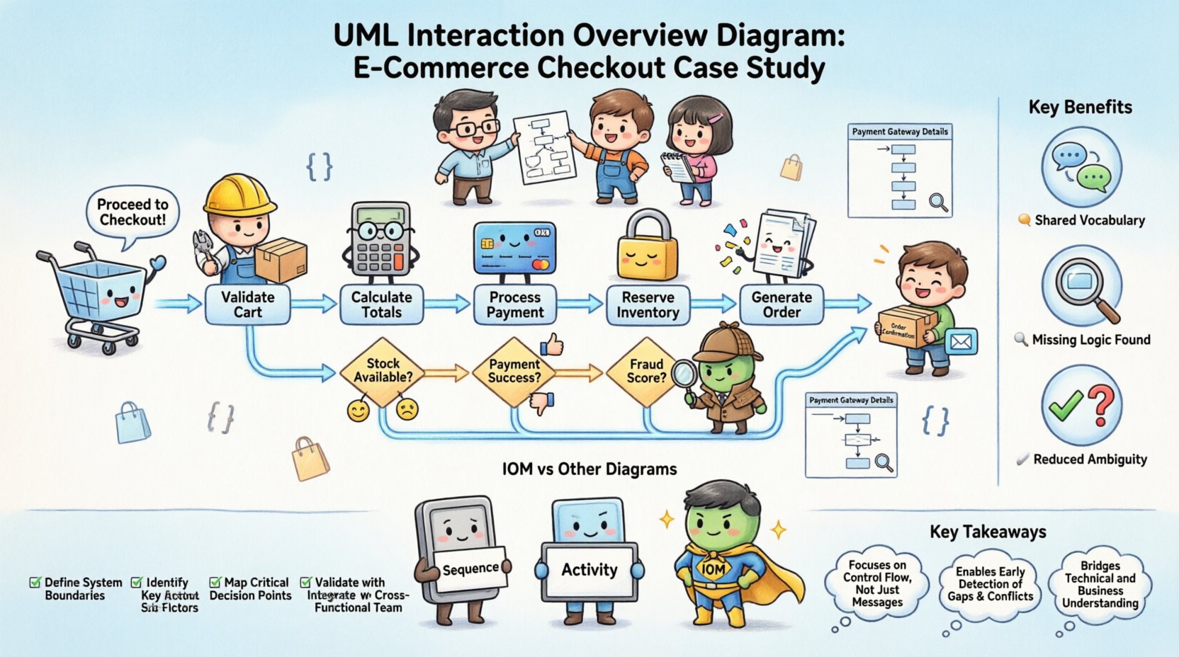
1. Identifying the Entry and Exit Points
Every interaction overview must have a clear start and finish. In our case:
- Initial Node: The user clicks “Proceed to Checkout” from the cart summary.
- Final Node: The system displays the “Order Confirmation” page and sends the receipt email.
By defining these boundaries, we prevented scope creep where unrelated features (like account creation) were accidentally included in the flow.
2. Defining Activity Nodes
We broke the checkout process into discrete activities. Each activity represents a distinct phase of the process. We grouped them logically:
- Validate Cart: Check if items are still in stock and prices are current.
- Calculate Totals: Apply taxes, shipping, and discounts.
- Process Payment: Engage the payment gateway API.
- Reserve Inventory: Lock stock for the duration of the transaction.
- Generate Order: Create the persistent record in the database.
3. Mapping Decision Nodes
Decision nodes are diamonds that represent binary or multi-way branching. In a checkout flow, these are critical for handling exceptions.
We identified three key decision points:
- Stock Availability: Is the item available? If no, redirect to cart.
- Payment Success: Did the gateway approve the charge? If no, show error.
- Fraud Score: Does the transaction exceed risk thresholds? If yes, require manual review.
4. Creating Sub-Flows (Sequence Diagrams)
One of the most powerful features of the IOM is the ability to reference a Sequence Diagram as a single activity node. Instead of cluttering the overview with thousands of message arrows, we created detailed sequence diagrams for specific services.
For example, the Process Payment node in the IOM linked to a detailed sequence diagram showing the handshake between the API Gateway, the Fraud Service, and the Payment Provider. This kept the high-level overview clean while allowing engineers to drill down into technical specifics when needed.
⚠️ Handling Complex Scenarios and Exceptions
The true value of the Interaction Overview Diagram emerged when we modeled the failure paths. In many systems, the error handling logic is an afterthought. Here, we integrated it into the main flow.
Scenario A: Payment Gateway Timeout
If the payment provider does not respond within 30 seconds, the system must not hang indefinitely. We modeled a decision node that checks the timeout status.
- If Timeout: Log the request and trigger a “Pending” order state.
- If Response: Proceed to inventory reservation.
This logic was visually represented by a merge node that combined the timeout path and the success path into a single subsequent activity.
Scenario B: Inventory Conflict
Two users might attempt to buy the last item simultaneously. The IOM helped us visualize the concurrency control.
- Activity: Reserve Inventory.
- Decision: Was reservation successful?
- Yes: Proceed to Payment.
- No: Roll back payment and notify user.
By placing the inventory check before the payment charge, we avoided charging users for items we could not fulfill. The diagram made this sequence undeniable.
🤝 Benefits for Team Alignment
The primary goal of this modeling effort was alignment. When the diagram was presented during sprint planning, several benefits became immediately apparent.
1. Shared Vocabulary
Before the diagram, developers, testers, and product managers used different terms for the same steps. The diagram standardized the language. A “Decision Node” was no longer just “what if it fails”; it was a specific architectural pattern requiring a specific database transaction rollback strategy.
2. Identification of Missing Logic
During the review, QA engineers pointed out gaps in the visual flow that developers had overlooked. For instance, the diagram revealed that there was no path defined for a user who logs out mid-checkout. This led to the creation of a new activity node for session validation.
3. Reduced Ambiguity in Documentation
Text-based requirements often leave room for interpretation. A visual flow leaves little doubt. If a line goes from A to B, the system must move from state A to state B. This reduced the number of clarification questions during the development phase.
📉 Comparison: IOM vs. Other Diagrams
To understand why we chose the Interaction Overview Diagram, it helps to compare it with alternatives we considered.
| Diagram Type | Strengths | Weaknesses | Best Use Case |
|---|---|---|---|
| Sequence Diagram | Excellent for detailed message exchange between objects. | Struggles with high-level control flow and loops. | API integration details. |
| Activity Diagram | Great for showing the flow of control and data. | Lacks specific interaction context between lifelines. | Business process workflows. |
| Interaction Overview Diagram | Combines control flow with interaction depth. | Can become complex if overused. | Complex system orchestration (like checkout). |
As shown in the table, the IOM sat in the middle ground. It provided the structure of an activity diagram but retained the interaction context of a sequence diagram. This made it the ideal choice for our distributed microservices architecture.
🛠️ Best Practices for Maintaining IOMs
Once the diagram is created, it becomes a living document. If it is not maintained, it becomes a liability. Here are the practices we adopted to keep the documentation accurate.
- Version Control: We stored the diagram files alongside the code in the repository. Any change to the code required a corresponding update to the diagram.
- Link to Code: We tagged diagram nodes with the relevant microservice repository paths. This allowed developers to jump from a node to the implementation.
- Review Gates: The diagram was a required artifact in the code review process. If the code changed the flow, the diagram had to change first.
- Simplify: We avoided making the diagram too dense. If a section became too complex, we split it into sub-diagrams rather than adding more lines to the main view.
🚀 Implementation Checklist
Before starting your own Interaction Overview Diagram modeling, use this checklist to ensure you cover the essentials.
- ☑️ Define Actors: Identify all users and external systems involved.
- ☑️ Map Entry/Exit: Clearly mark the start and end of the interaction.
- ☑️ Identify Decisions: List every point where the flow can branch.
- ☑️ Define Data Objects: Specify what data is passed between activities.
- ☑️ Create Sub-Flows: Isolate complex interactions into separate sequence diagrams.
- ☑️ Review with Stakeholders: Walk through the diagram with non-technical team members.
- ☑️ Update Regularly: Schedule quarterly reviews to ensure accuracy.
💡 Lessons Learned from the Project
The project was successful, but we encountered challenges along the way. The most significant lesson was that diagrams are not just for documentation; they are for thinking.
We found that the act of drawing the IOM forced the team to resolve conflicts in logic before writing a single line of code. For example, we discovered that the fraud check was happening after the inventory lock in our initial draft. This would have resulted in charged inventory that might be rejected later. Catching this in the diagram saved weeks of refactoring.
Another lesson involved tooling. While specific software tools exist for creating diagrams, the principle remains the same regardless of the application. Focus on the logic, not the aesthetics. The diagram must be readable by humans, not just machines.
🔗 Summary of Key Takeaways
- Clarity: The IOM provides a clear view of control flow that text descriptions lack.
- Alignment: It serves as a single source of truth for developers, testers, and product owners.
- Complexity Management: It allows you to handle complex branching and sub-flows without visual clutter.
- Early Detection: Logic errors are found during the modeling phase, not the testing phase.
- Maintainability: Keeping diagrams in sync with code ensures long-term system health.
By adopting the UML Interaction Overview Diagram for our e-commerce checkout, we transformed a chaotic set of requirements into a structured, verifiable blueprint. The result was a faster release cycle and a more reliable system for our customers. This approach can be applied to any complex system where multiple components must coordinate, making it a valuable asset in your technical documentation toolkit.