


In the fast-paced world of software development, code is often treated as the primary artifact. Developers write logic, test it, and push it to repositories. However, code does not exist in a vacuum. It runs on infrastructure, which is equally complex and dynamic. When the written code diverges from the actual infrastructure, chaos ensues. This is where deployment diagrams become essential. They serve as the blueprint that connects abstract logic to concrete resources.
Many engineering teams overlook these diagrams in favor of Infrastructure as Code (IaC) scripts. While scripts are powerful, they are procedural and often lack the visual context needed to understand system topology. A deployment diagram provides a high-level view of hardware and software components. It answers critical questions: Where does the application live? How do services communicate? What are the security boundaries? Without this visual alignment, teams often find themselves debugging environment issues that could have been spotted on a map.
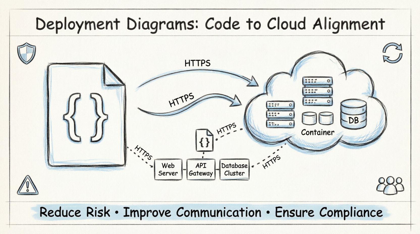
This guide explores the critical role of deployment diagrams in modern cloud architectures. We will examine how they bridge the gap between development and operations, reduce operational risks, and improve team communication. By understanding the mechanics of these diagrams, you ensure that your software behaves predictably across all environments.
What is a Deployment Diagram? 📐
A deployment diagram is a specific type of diagram used in the modeling of software systems. It describes the physical deployment of artifacts on the hardware. Unlike a sequence diagram which shows interactions over time, or a class diagram which shows structure, a deployment diagram focuses on the topology of the system.
It represents the runtime architecture. This includes:
- Nodes: These represent the physical or virtual hardware. They can be processing units, storage devices, or network components.
- Artifacts: These are the software units deployed on the nodes. Examples include executables, libraries, scripts, and configuration files.
- Connections: These show the communication pathways between nodes. They define protocols and network types.
By visualizing these elements, architects can see the physical distribution of the application. This is crucial for cloud-native environments where resources are ephemeral and distributed across multiple regions.
The Gap Between Code and Infrastructure 📉
There is often a significant disconnect between what developers write and what operations teams provision. This phenomenon is known as environment drift. When the code assumes a specific configuration that differs from the production environment, failures occur.
Consider the following common scenarios where diagrams prevent issues:
- Network Latency: Code might assume services are on the same local network. A deployment diagram reveals if they are actually across different availability zones.
- Resource Constraints: Developers might write logic that requires high memory. The diagram shows if the allocated nodes have sufficient RAM.
- Security Zones: Sensitive data might be processed on a node that is publicly accessible in the diagram, revealing a security vulnerability before deployment.
- Scalability Limits: The diagram shows the number of load balancers and backend instances, helping teams understand scaling bottlenecks.
Without a deployment diagram, these assumptions remain hidden until a production incident occurs. The diagram acts as a contract between the software and the hardware.
Core Components Explained 🧩
Understanding the specific elements of a deployment diagram is vital for accurate modeling. Each element serves a distinct purpose in the architecture. The table below outlines the primary components and their functions.
| Component | Description | Example Usage |
|---|---|---|
| Node | A physical or virtual execution environment. | Server instance, Container Host, Database Cluster |
| Artifact | A physical representation of a software component. | Executable binary, Docker Image, Static Website |
| Interface | A point of access for communication. | API Gateway, HTTP Port, Database Connection String |
| Communication Pathway | The medium through which data travels. | HTTP, TCP/IP, SSL/TLS, Private Network |
| Device | Network hardware connecting nodes. | Router, Firewall, Load Balancer |
When constructing these diagrams, precision matters. Labeling a node as a “Server” is vague. Specifying it as a “Compute Instance with 4 vCPU and 8GB RAM” provides actionable data. Similarly, defining the communication pathway as “Encrypted HTTPS” adds security context that “TCP” does not.
Why Alignment Reduces Risk 🛡️
Alignment between code and infrastructure is not just about convenience; it is a risk management strategy. In complex systems, a single misconfiguration can cascade into a total outage. Deployment diagrams help identify these risks early in the design phase.
1. Identifying Single Points of Failure
Visualizing the topology makes it easy to spot dependencies. If a database node is the only storage backend, the diagram highlights the risk. Teams can then plan for redundancy, such as adding a replica node. This proactive planning prevents downtime caused by hardware failure.
2. Clarifying Network Boundaries
Network segmentation is critical for security. A diagram clarifies which nodes are in the public subnet and which are in the private subnet. Developers can ensure that sensitive microservices are not exposed to the public internet, adhering to security best practices.
3. Optimizing Resource Allocation
Cost is a major factor in cloud architecture. By mapping artifacts to nodes, teams can see if they are over-provisioning resources. For instance, if a diagram shows multiple high-compute nodes running low-traffic services, it signals an opportunity to consolidate and save costs.
4. Facilitating Disaster Recovery
When a disaster occurs, recovery time is the priority. A clear deployment diagram serves as an immediate reference for rebuilding the infrastructure. It lists the necessary components and their relationships, reducing the time engineers spend guessing the architecture.
Integrating Diagrams into DevOps Pipelines ⚙️
DevOps aims to automate the delivery of software. However, automation without visualization can lead to blind automation. Integrating deployment diagrams into the pipeline ensures that infrastructure changes are reviewed and validated.
Here is how to incorporate these diagrams into the workflow:
- Design Phase: Create the diagram during the initial architecture review. This sets the baseline for the infrastructure team.
- Code Review: Include the diagram as an attachment when submitting pull requests that affect infrastructure. Reviewers can check if the code changes match the visual plan.
- Automated Validation: Use tools to generate diagrams from Infrastructure as Code scripts. Compare the generated diagram with the design document to detect drift automatically.
- Incident Response: Keep the diagram updated in the incident management system. During a crisis, access to the current topology is faster than digging through logs.
This integration creates a feedback loop. The diagram informs the code, and the code updates the diagram. This cycle maintains accuracy over time.
Security and Compliance Considerations 🔒
Security teams require a clear view of the system to perform audits. Deployment diagrams provide this visibility. They show where data resides and how it moves.
Key security aspects to highlight in the diagram include:
- Encryption in Transit: Mark connections that use encryption protocols. This ensures compliance with standards that require data protection.
- Authentication Points: Indicate where authentication occurs. For example, show if a load balancer handles SSL termination or if the backend services handle it.
- Data Sovereignty: If regulations require data to stay in specific regions, the diagram must show the geographical location of each node.
- Access Control: Label nodes with their access levels. Distinguish between nodes accessible by the public and those restricted to internal networks.
By embedding these details into the visual model, security audits become more efficient. Instead of asking developers for network maps, auditors can review the diagram to verify compliance.
Keeping Diagrams Current 🔄
A deployment diagram that is outdated is worse than no diagram at all. It creates a false sense of security. Teams often struggle with maintenance because infrastructure changes frequently. To solve this, adopt a maintenance strategy.
Follow these guidelines to keep the diagrams accurate:
- Version Control: Store diagram files in the same repository as the code. This ensures that changes to the architecture are committed alongside code changes.
- Trigger Updates: Define rules that require diagram updates. For example, if a new microservice is added, the diagram must be updated before the feature is merged.
- Automated Generation: Where possible, use tools that parse the infrastructure configuration and generate the diagram. This reduces manual effort and human error.
- Regular Reviews: Schedule quarterly reviews of the architecture. Verify that the physical infrastructure matches the logical design.
Maintaining diagrams is an investment in stability. It ensures that the team always has a reliable map of the system, regardless of how many times it has evolved.
Communication Across Teams 🗣️
Software development involves multiple disciplines. Developers, operations engineers, security analysts, and product managers all need to understand the system. A deployment diagram acts as a universal language.
It bridges the gap between technical and non-technical stakeholders. Product managers can see where the application is hosted without understanding the underlying code. Operations teams can plan capacity based on the visual layout. Security teams can identify exposure points quickly.
Effective communication relies on clarity. A diagram that is cluttered or overly complex fails its purpose. Use standard notation to ensure everyone interprets symbols the same way. Avoid proprietary symbols unless they are well-documented within the organization.
Common Pitfalls to Avoid ⚠️
Even with good intentions, teams often make mistakes when creating deployment diagrams. Being aware of these pitfalls helps improve the quality of the models.
- Overcomplicating: Do not try to show every single variable or configuration file. Focus on the high-level topology. Too much detail obscures the main structure.
- Ignoring Dynamic Behavior: Static diagrams do not show scaling. Use annotations or separate views to indicate how the system scales during peak loads.
- Disconnecting from Reality: Do not draw a perfect system that does not exist. Document the actual state, even if it is imperfect. This highlights areas that need improvement.
- Neglecting Dependencies: Ensure that external services are included. If the application relies on a third-party API, show that dependency clearly.
Final Thoughts on Infrastructure Visualization 🌟
Deployment diagrams are more than just pictures. They are strategic tools that align technical execution with business goals. By visualizing the physical reality of your software, you reduce ambiguity, enhance security, and streamline operations.
In an era where cloud environments are complex and dynamic, relying solely on code or scripts is insufficient. The visual context provided by deployment diagrams offers a level of understanding that is critical for success. When you align your diagrams with your infrastructure, you create a resilient system capable of withstanding change.
Start by auditing your current architecture. Create a diagram for your production environment. Compare it with your code. Identify the gaps. Then, take steps to close them. The effort required to maintain these diagrams pays dividends in stability and efficiency.
Remember, the goal is not perfection. The goal is clarity. A clear map allows teams to navigate the complexities of cloud computing with confidence. By prioritizing these diagrams, you build a foundation for sustainable software delivery.