


When designing complex software systems, visualizing how code meets hardware is critical. A deployment diagram provides this view. It maps the physical architecture of a solution. This guide addresses the most common inquiries regarding this UML artifact. We will cover components, relationships, and best practices without relying on specific vendor tools. Let’s dive into the mechanics of deployment visualization.
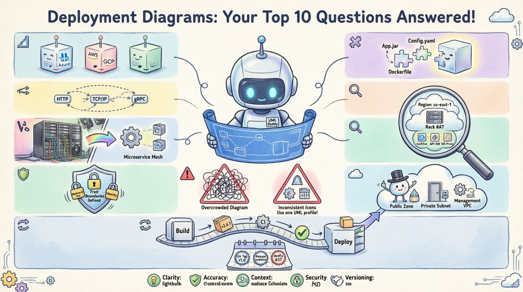
1. What exactly is a deployment diagram? 📐
A deployment diagram is a type of UML (Unified Modeling Language) diagram. It illustrates the physical runtime environment. This environment hosts the software artifacts. It shows how hardware and software interact during operation.
- Physical View: It represents tangible resources like servers, routers, and devices.
- Software Placement: It maps where specific code modules or executables reside.
- Connectivity: It defines the communication pathways between nodes.
Unlike class diagrams which show static structure, deployment diagrams focus on the runtime infrastructure. They are essential for DevOps teams and system architects. They ensure the software has the necessary environment to function correctly.
2. What are the main components I need to know? 🧩
Understanding the building blocks is the first step to creating accurate diagrams. There are two primary categories of elements used in this context.
Deployment Nodes
A node represents a computational resource. It is a processing element that can host artifacts. Common examples include:
- Hardware Devices: Physical servers, routers, firewalls, or mobile devices.
- Software Execution Environments: Virtual machines, containers, or runtime environments.
- Processors: CPUs or microprocessors within a device.
Artifacts
Artifacts are the physical pieces of code or data. They are deployed onto the nodes. Examples include:
- Executable Files: Binary programs or scripts.
- Database Files: Schema definitions or data stores.
- Web Resources: HTML pages, CSS stylesheets, or JavaScript files.
Every deployment diagram needs a balance of these two. Nodes provide the capacity; artifacts provide the function.
3. How do nodes communicate with each other? 🔗
Communication paths define how data moves through the system. These are represented by lines connecting different nodes. The lines often carry a label describing the protocol or technology.
- Standard Communication: Represented by a simple line.
- Network Protocols: Labels like HTTP, TCP/IP, or SSH clarify the method.
- Dependencies: Dashed lines often indicate a logical dependency rather than a direct network connection.
It is important to distinguish between physical connections and logical dependencies. A physical connection implies a wire or wireless link. A logical dependency implies that one node requires another to function, even if the link is indirect.
4. Is this the same as a component diagram? 🆚
Many confuse deployment diagrams with component diagrams. While related, they serve different purposes.
| Feature | Deployment Diagram | Component Diagram |
|---|---|---|
| Focus | Physical Infrastructure | Logical Software Structure |
| Elements | Nodes, Servers, Artifacts | Interfaces, Packages, Modules |
| Context | Runtime Environment | Design-Time Structure |
| Detail | Hardware/OS specifics | APIs and Dependencies |
A component diagram looks inside the software. A deployment diagram looks at where the software lives. You often use both together to get a complete picture of the system.
5. How do I decide the level of detail? 🔍
One of the most frequent challenges is determining granularity. A diagram can be too high-level to be useful, or too low-level to be readable.
- High Level: Shows clusters of servers or cloud regions. Good for executive summaries.
- Medium Level: Shows individual application servers and databases. Good for system architects.
- Low Level: Shows specific containers, microservices, or configuration files. Good for engineering teams.
There is no single correct level. It depends on the audience. If you are explaining the budget to stakeholders, a high-level view suffices. If you are debugging a network issue, you need a low-level view. Always align the detail with the goal of the document.
6. Why are deployment diagrams critical for security? 🛡️
Security cannot be an afterthought. Visualizing the infrastructure helps identify risks early.
- Perimeter Definition: You can clearly mark where the firewall sits.
- Trust Boundaries: Zones can be drawn to show which nodes are public and which are private.
- Access Control: Labels can indicate authentication requirements for specific nodes.
By mapping the deployment, you can see if sensitive data nodes are exposed to the internet. You can verify if redundant systems exist for disaster recovery. Security audits often rely on these diagrams to verify compliance with infrastructure standards.
7. How do I represent cloud infrastructure? ☁️
Modern systems often run in the cloud. This adds a layer of abstraction to the deployment model. Instead of physical boxes, you often see logical groupings.
- Regions and Zones: Use nodes to represent geographic locations.
- Managed Services: Represent database services or caching layers as distinct nodes.
- Load Balancers: These are critical nodes that distribute traffic.
When drawing cloud diagrams, clarity is key. Avoid mixing physical server icons with cloud service icons without distinction. Use specific shapes or labels to denote virtual resources versus physical hardware. This prevents confusion during migration planning.
8. What are common mistakes to avoid? ⚠️
Even experienced architects make errors. Being aware of pitfalls saves time later.
- Overcrowding: Putting too many nodes on one page makes it unreadable. Split the diagram into sub-diagrams.
- Inconsistent Notation: Ensure every node type looks the same. Use a consistent legend.
- Missing Labels: Every line needs a protocol label. Every node needs a clear name.
- Static Representation: Deployment diagrams change. Failing to update them leads to technical debt.
A messy diagram is worse than no diagram. If the information is unclear, stakeholders cannot trust the architecture. Prioritize readability over completeness in early drafts.
9. How does this relate to CI/CD pipelines? 🔄
Continuous Integration and Continuous Deployment rely on accurate infrastructure maps. The deployment diagram serves as the source of truth for automation scripts.
- Provisioning: Scripts read the diagram to know which nodes to create.
- Configuration: Artifacts in the diagram map to configuration files.
- Validation: Automated tests verify that the deployed state matches the diagram.
If the diagram is out of date, the pipeline may fail. This is why infrastructure-as-code tools often generate diagrams automatically. This ensures the visual representation matches the actual state of the environment.
10. How do I maintain these diagrams over time? 📅
A diagram is a living document. It requires maintenance to remain useful. The best practice is to treat it like code.
- Version Control: Store the diagram file in a repository.
- Change Logs: Document every significant architectural change.
- Review Cycles: Include diagram updates in sprint reviews.
- Automation: Use tools that sync with the codebase where possible.
When a new server is added or a protocol changes, update the diagram immediately. This ensures that future team members have accurate information. An outdated diagram creates confusion and delays during troubleshooting.
Summary of Key Takeaways 📝
Deployment diagrams bridge the gap between software design and physical reality. They are not just drawings; they are maps for engineers. By understanding nodes, artifacts, and connections, you can plan robust systems.
- Clarity: Use clear labels and consistent symbols.
- Accuracy: Keep the diagram synced with the actual infrastructure.
- Context: Choose the right level of detail for your audience.
- Security: Use the diagram to identify and mitigate risks.
Investing time in creating these diagrams pays off during troubleshooting and scaling. They provide a shared language for developers, operations staff, and stakeholders. With a solid understanding of deployment modeling, you can ensure your systems are built on a foundation of clarity.
Further Reading & Resources 📚
To deepen your knowledge, explore documentation on UML standards. Review case studies on system architecture design. Look into best practices for infrastructure mapping in cloud environments. These resources will help you refine your skills further.
Remember that every system is unique. Adapt these principles to fit your specific organizational needs. The goal is always effective communication and reliable system operation.