


In the landscape of modern software engineering, the architecture of a system is not just a blueprint; it is the foundation of reliability and performance. When organizations grow, their infrastructure often becomes complex, hidden, and difficult to manage. This is where deployment diagrams become essential tools. They translate abstract code into tangible infrastructure, allowing teams to visualize how software artifacts interact with hardware nodes and network components.
This article explores a real-world scenario where a mid-sized enterprise struggled with system scalability. By constructing precise deployment diagrams, the engineering team identified bottlenecks, optimized resource allocation, and established a clear path for future growth. We will examine the components, the challenges, and the methodical process used to achieve a robust system topology.
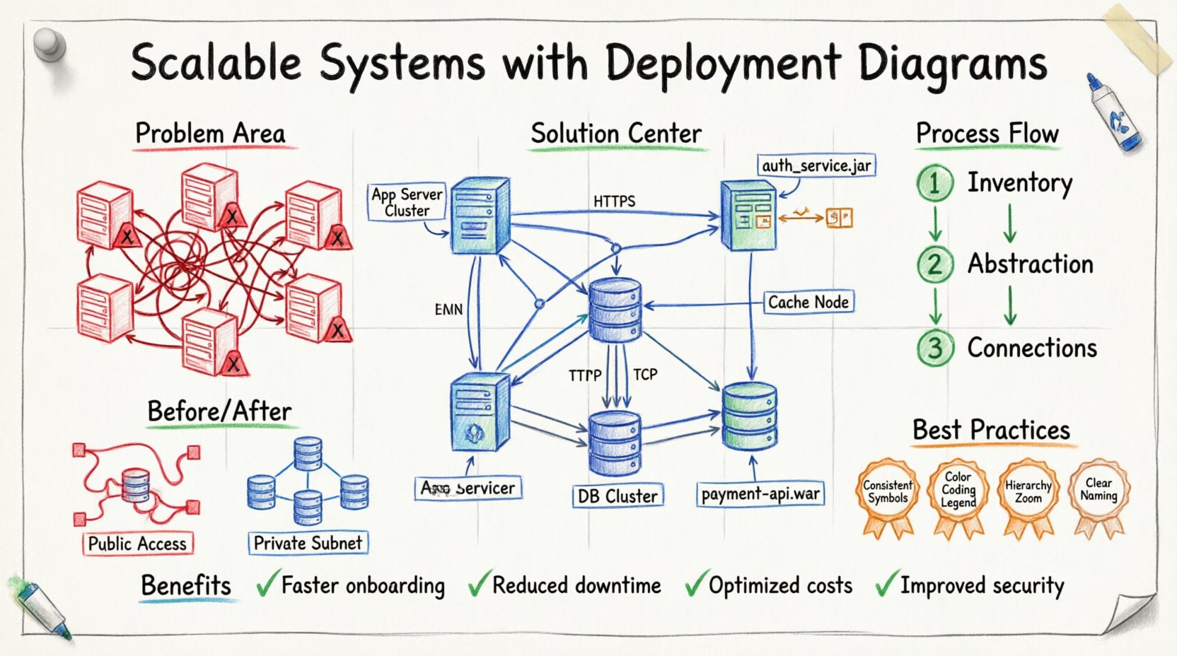
The Scenario: A Growing Enterprise 🏢📉
Consider a hypothetical organization, Global Logistics Solutions, which manages supply chain data across multiple continents. Initially, the system operated as a monolithic application hosted on a single virtual machine. As user demand increased, the team migrated to a distributed architecture. However, without a clear visual representation of the infrastructure, several issues emerged:
- Unclear Dependencies: Developers did not know which services relied on specific database instances.
- Resource Contention: High-traffic services were often placed on underpowered nodes.
- Security Gaps: Sensitive data flows were not mapped against firewall rules.
- Onboarding Delays: New engineers spent weeks navigating physical server rooms and network configurations instead of writing code.
The engineering leadership recognized that the code was well-written, but the infrastructure documentation was missing. They decided to rebuild the deployment strategy, starting with a comprehensive set of deployment diagrams. The goal was not merely documentation for the sake of documentation, but to create a living map that guided deployment and scaling decisions.
Understanding Deployment Diagrams 🔍🖼️
A deployment diagram is a type of Unified Modeling Language (UML) diagram that shows the physical deployment of artifacts on hardware. It illustrates the hardware nodes, software components, and the connections between them. Unlike a class diagram that focuses on logic, or a sequence diagram that focuses on time, the deployment diagram focuses on location and topology.
Key elements typically include:
- Nodes: Physical or virtual devices where software runs. This includes servers, routers, and mobile devices.
- Artifacts: The software packages deployed on the nodes, such as executable files, libraries, or configuration scripts.
- Communication Paths: The network connections linking nodes, indicating protocols like HTTP, TCP/IP, or SSH.
- Dependencies: Relationships showing which artifact requires another to function.
By standardizing these elements, the Global Logistics team created a shared language between operations, development, and security teams.
Step-by-Step: Creating the Diagram 🛠️📝
The process of designing the deployment diagrams was iterative. It began with discovery and ended with validation. Here is the workflow followed during the project.
1. Inventory and Discovery 🔎
Before drawing anything, the team had to know what existed. They audited the current infrastructure. This involved:
- Listing all active servers and their specifications (CPU, RAM, Storage).
- Identifying the software running on each server (Web servers, Application servers, Database engines).
- Mapping network zones (Public, Private, DMZ).
- Documenting external dependencies (Third-party APIs, Payment gateways).
2. Abstraction and Layering 🧱
Attempting to draw every single cable and port would result in a cluttered diagram. Instead, the team used abstraction. They grouped similar hardware into nodes. For example, instead of drawing five individual physical servers, they represented them as a single Compute Cluster Node capable of horizontal scaling.
This layering approach allowed the diagram to remain readable while preserving critical information. The diagrams were split into levels:
- Level 1: High-level topology (Regions, Availability Zones).
- Level 2: Service grouping (Frontend, Backend, Data Layer).
- Level 3: Specific component mapping (Load Balancers, Application Instances).
3. Defining Connections and Protocols 🔗
Visualizing how data moves is critical for performance tuning. The team specified the protocols used between nodes. For instance:
- Client to Gateway: HTTPS (Secure Web Traffic).
- Gateway to App Server: Internal TCP (Low Latency).
- App Server to Database: Encrypted SQL Traffic.
Labeling these paths helped the security team verify that no sensitive data was traversing unencrypted channels.
Component Analysis: The Core of Scalability 🚀⚙️
Once the diagram was drafted, the team analyzed specific components to ensure they supported the scalability goals. The following table outlines the key infrastructure components and their roles in the new architecture.
| Component | Function | Scalability Strategy | Diagram Representation |
|---|---|---|---|
| Load Balancer | Distributes incoming traffic across multiple servers. | Automatic scaling based on CPU usage. | Node with incoming arrows splitting to multiple nodes. |
| Application Server | Executes business logic. | Stateless design allows easy replication. | Multiple instances connected to the Load Balancer. |
| Database Cluster | Stores persistent data. | Master-Slave replication for read scaling. | One primary node with arrows pointing to secondary nodes. |
| Cache Layer | Reduces database load. | In-memory storage distributed across nodes. | Separate node connected to Application Servers. |
| Message Queue | Asynchronous processing. | Decouples services to handle peak loads. | Node acting as a buffer between producers and consumers. |
Addressing Scalability Challenges 💪📊
During the review of the deployment diagrams, several critical challenges were identified. The diagrams made these issues visible, which was the first step to solving them.
1. Single Point of Failure 💥
Initially, the diagram showed a single database node. If this node went down, the entire system stopped. The visual representation made this risk undeniable.
The Fix: The diagram was updated to show a redundant database cluster. Traffic paths were added to route read operations to secondary nodes, ensuring availability even during maintenance.
2. Network Latency 🐢
The initial layout placed the data center in one region and the application servers in another. The diagram highlighted long connection lines between them, indicating high latency.
The Fix: The deployment plan was adjusted to colocate the application servers closer to the database within the same availability zone. The diagram was updated to reflect the new topology, showing reduced hop counts.
3. Security Zoning 🔒
The diagram revealed that internal administrative tools were accessible from the public network. This was a security violation.
The Fix: A DMZ (Demilitarized Zone) was added to the diagram. Administrative access paths were moved to a private network node, isolated from public traffic. The connections were labeled with specific security protocols (SSH over Private IP).
The Role of Documentation in DevOps 🔄📄
In a DevOps environment, the deployment diagram is not a static image saved in a folder. It is a dynamic artifact that evolves with the code. The team implemented a process where the diagram was version-controlled alongside the infrastructure code.
Key practices included:
- Diagram as Code: Using tools to generate diagrams from configuration files to ensure accuracy.
- Regular Audits: Monthly reviews to ensure the visual map matches the running environment.
- Change Management: Any infrastructure change required an update to the diagram before deployment.
This approach prevented the “documentation drift” where the written plan no longer matches reality. Engineers could trust the diagram because it was part of the deployment pipeline.
Best Practices for Clear Diagrams 🎨✅
Based on the case study, several principles emerged for creating effective deployment diagrams. These guidelines help teams communicate complex systems without confusion.
1. Consistency in Symbols 📐
Use standard shapes for standard components. A cube might always represent a server, while a cylinder always represents a database. Inconsistent shapes lead to misinterpretation. Consistency reduces cognitive load for anyone reading the diagram.
2. Color Coding for Context 🎨
While avoiding unnecessary decoration, color can convey critical status. For example:
- Green: Active, Healthy Services.
- Red: Critical Services or Alerts.
- Gray: Deprecated or Disabled Components.
- Blue: External Dependencies.
This visual cue allows operators to scan a diagram and immediately identify potential issues.
3. Hierarchy and Zoom Levels 🔍
Do not try to fit the entire infrastructure into one view. Create a hierarchy. A high-level view shows the global architecture. Clicking a node reveals the internal structure of that specific service. This keeps the main diagram clean while allowing deep dives when necessary.
4. Naming Conventions 🏷️
Labels should be descriptive and standardized. Avoid generic names like “Server 1”. Instead, use App-Server-Prod-01. This immediately tells the reader the role, environment, and instance number. Standardized naming ensures that the diagram can be used by scripts and automation tools without ambiguity.
Maintaining the Diagram Over Time 🕒🔄
Systems are living entities. They change as features are added, bugs are fixed, and hardware is upgraded. A deployment diagram that is accurate today may be obsolete tomorrow. To combat this:
- Automated Discovery: Implement agents that report infrastructure status back to a central system, which can update the diagram metadata.
- Owner Assignment: Assign a specific engineer as the “Diagram Owner” for each major service. They are responsible for keeping their section accurate.
- Integration with CI/CD: Trigger a diagram validation step in the Continuous Integration pipeline. If the infrastructure code changes, the diagram must be updated to pass the build.
By treating the diagram as a critical part of the system, rather than an afterthought, the team ensured that the visual representation remained a reliable source of truth.
Conclusion: The Value of Visualization 💡🌟
The journey from a chaotic infrastructure to a scalable, well-documented system began with a simple decision: to draw it. Deployment diagrams provided the clarity needed to make architectural decisions. They turned abstract problems into visible patterns.
For the Global Logistics Solutions team, the benefits were tangible:
- Faster Onboarding: New engineers understood the system in days, not months.
- Reduced Downtime: Clear visibility into dependencies prevented accidental outages.
- Optimized Costs: Identifying underutilized nodes allowed for right-sizing resources.
- Improved Security: Network flows were mapped and secured systematically.
Scalability is not just about adding more servers; it is about understanding how those servers interact. A clear deployment diagram is the map that guides that growth. It empowers teams to build systems that are robust, secure, and ready to expand. In the absence of such a map, even the best code can lead a team astray. With it, the path forward becomes clear.
When planning your next system architecture, prioritize the visual representation of your deployment. Invest the time to create accurate, maintainable diagrams. They are not just drawings; they are the blueprint for your system’s longevity and performance.