


Deployment diagrams often sit in the middle of the architectural documentation landscape, caught between high-level conceptual models and low-level code implementations. For many teams, these visual representations are treated as static artifacts created once during a planning phase and then forgotten until a crisis occurs. This approach leads to a significant disconnect between what the diagram says and how the actual infrastructure operates. To build resilient systems, we must move beyond the notion that a diagram is merely a picture. Instead, it should serve as a living contract between development, operations, and security stakeholders.
When we strip away the noise of modern tooling trends, the core purpose of a deployment diagram remains constant: it defines the physical or logical topology of hardware and software components. However, the execution of this task is rife with misconceptions. Some believe these diagrams are too technical for business stakeholders, while others think they are too abstract to be useful for engineers. Neither view is entirely correct. The truth lies in a practical balance that prioritizes clarity, maintainability, and accuracy over aesthetic perfection.
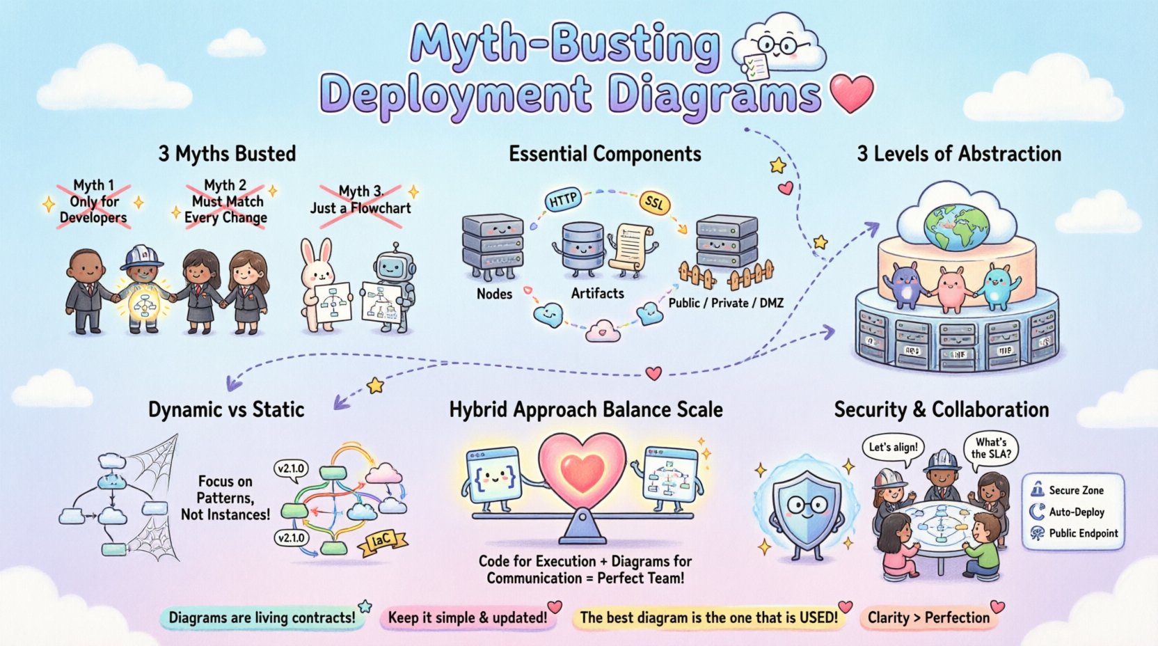
In this guide, we will dissect common misconceptions, outline the essential elements required for a useful model, and provide strategies for keeping these diagrams relevant in a dynamic environment. We will explore how to align visual documentation with real-world infrastructure constraints without getting bogged down in unnecessary detail.
Understanding the Core Misconceptions 🤔
Before we can build effective diagrams, we must identify what prevents them from working in practice. Several persistent myths hinder the adoption of deployment modeling across organizations. These myths often stem from a lack of understanding regarding the relationship between software design and physical hardware.
Myth 1: Deployment Diagrams Are Only for Developers 💻
One of the most damaging beliefs is that deployment diagrams are purely technical artifacts intended for the engineering team. This perspective limits their utility significantly. In reality, infrastructure diagrams serve as a critical communication tool for operations, security, finance, and management.
- Operations Teams: Need to understand load balancing, redundancy, and network topology to manage outages effectively.
- Security Officers: Require visibility into data flow, trust zones, and encryption boundaries to assess risk.
- Management: Needs high-level views to estimate costs, resource allocation, and scalability requirements.
If a diagram is too dense with code-level details, it becomes unreadable for non-technical stakeholders. Conversely, if it is too abstract, engineers cannot use it for troubleshooting. The goal is a model that bridges these gaps.
Myth 2: The Diagram Must Match Every Configuration Change 🔄
There is a pressure to keep diagrams perfectly synchronized with the live environment at all times. In modern infrastructure, changes happen rapidly. Infrastructure as Code (IaC) pipelines can deploy hundreds of instances in minutes. The belief that a static diagram must be updated manually after every change is a recipe for obsolescence.
Instead, diagrams should represent the architecture pattern, not the specific instance count at a given second. For example, a diagram showing a load balancer distributing traffic to a cluster of application nodes is more valuable than one showing exactly five nodes running at 2 PM. The topology remains the same even if the scale fluctuates. Focusing on the pattern allows the diagram to remain valid through scaling events.
Myth 3: It Is Just a Flowchart 📈
Many people confuse deployment diagrams with data flow diagrams or process flowcharts. While they share some visual similarities, their intent differs fundamentally. A flowchart describes the logic of a process. A deployment diagram describes the physical placement of components.
| Feature | Flowchart | Deployment Diagram |
|---|---|---|
| Focus | Logic and Decision Paths | Hardware and Runtime Environment |
| Key Elements | Actions, Decisions, Start/End | Nodes, Devices, Networks, Artifacts |
| Usage | Business Process Modeling | System Deployment and Hosting |
Confusing these two leads to documentation that explains what happens but not where it happens. For infrastructure planning, knowing where data is stored and processed is as critical as knowing how it is processed.
Anatomy of a Practical Deployment Diagram 🏗️
To create a diagram that withstands the test of time, it must include specific elements that reflect the reality of the infrastructure. A robust diagram goes beyond simple boxes and lines. It captures relationships, boundaries, and constraints.
Essential Components
- Nodes and Artifacts: Nodes represent computing resources (servers, containers, virtual machines). Artifacts represent the software deployed on them (executables, libraries, databases).
- Communication Paths: Lines connecting nodes represent network connections. These should specify protocols (HTTP, TCP, SSL) to indicate security and performance characteristics.
- Deployment Zones: Distinct areas should be marked to represent security boundaries, such as public, private, and DMZ zones. This helps visualize data sensitivity.
- Dependencies: Clear indication of which components rely on others. This is vital for impact analysis during maintenance.
Level of Abstraction
The level of detail should match the audience and the phase of the project. During initial design, a high-level view is appropriate. During troubleshooting, a detailed view is necessary. It is often better to have a suite of diagrams at different levels rather than one massive, confusing image.
- Level 1 (Strategic): Shows the entire ecosystem, including external systems, cloud regions, and major services.
- Level 2 (Logical): Focuses on the application architecture, showing microservices, databases, and middleware.
- Level 3 (Physical): Details specific hardware, IP addresses, and network configurations (used sparingly for security audits).
Why Static Models Fail Dynamic Systems ⚡
Traditional deployment diagrams are static. They capture a snapshot in time. However, modern infrastructure is dynamic. Auto-scaling groups spin up and down based on demand. Serverless functions are ephemeral. Container orchestration platforms move pods around the cluster constantly.
When a diagram claims to show “The System,” but the system is constantly changing, the diagram becomes a source of confusion. Engineers will stop trusting the documentation because it does not match the live environment. This leads to a culture where diagrams are ignored.
Strategies for Dynamic Environments
- Focus on Patterns: Describe the rules of deployment rather than the state. For example, “All database instances are read-replicas behind a load balancer” is more durable than drawing five specific database boxes.
- Tagging and Metadata: Use metadata to link diagrams to the actual infrastructure definitions. If using IaC, the diagram should ideally be generated from the code, not maintained separately.
- Versioning: Treat diagrams as code. Store them in version control alongside the application. This ensures history is preserved and changes are tracked.
By acknowledging the fluidity of the environment, we shift the goal from capturing a perfect image to defining a reliable structure.
Infrastructure as Code vs. Visual Modeling 📝
There is a growing debate between maintaining visual diagrams and relying solely on Infrastructure as Code (IaC). Proponents of IaC argue that the code is the single source of truth, making diagrams redundant. While IaC is essential for reproducibility, it often lacks the high-level context that visual models provide.
Code is dense and linear. It is difficult for a new team member to grasp the overall topology by reading configuration scripts. Visual diagrams provide a mental map that aids in understanding relationships that code might obscure.
When to Rely on Code
- Configuration details (IP ranges, ports, credentials).
- Automated provisioning logic.
- Dependency management.
When to Rely on Diagrams
- Onboarding new team members.
- Security audits and compliance reviews.
- High-level capacity planning.
- Stakeholder communication.
The most effective approach is a hybrid one. Use code for execution and diagrams for communication. Ensure the diagrams are derived from the code to minimize drift, but do not expect the code to replace the visual abstraction entirely.
Security and Compliance Mapping 🔒
Security is not an afterthought; it is a fundamental requirement of the deployment structure. A deployment diagram is one of the primary tools used to demonstrate compliance to auditors and to identify security gaps during design reviews.
Key Security Considerations
- Trust Boundaries: Clearly mark where data moves from one trust level to another (e.g., from the public internet to the internal network). This highlights where encryption is mandatory.
- Data Storage: Indicate where sensitive data resides. This helps in applying data residency regulations and access control policies.
- Network Segmentation: Show how network segments are isolated. This is critical for preventing lateral movement in case of a breach.
- Authentication Points: Identify where identity verification occurs. Is it at the load balancer, the application gateway, or the service level?
Without these visual cues, security teams must reverse-engineer the architecture from logs or configuration files, which is time-consuming and prone to error. A well-documented diagram accelerates the security review process.
Collaboration Across Teams 🤝
Infrastructure is a shared responsibility. Developers write the code, but operations deploy it. Security monitors it. Finance pays for it. A deployment diagram acts as the common language that unifies these perspectives.
Building a Shared Vocabulary
When teams use a consistent notation, misunderstandings decrease. For example, if a developer says “database,” does that mean a local file, a SQL server, or a managed cloud service? The diagram clarifies this intent.
- Standardized Symbols: Adopt a standard notation (such as UML) so that everyone interprets the symbols the same way.
- Role-Based Views: Provide different views of the same system for different roles. The security team sees the firewalls; the developers see the APIs.
- Review Cycles: Include diagram updates in the code review process. If the architecture changes, the diagram must change. This keeps the documentation alive.
Maintenance Strategies 🛠️
Documentation decays. This is an inevitability. To fight this, you need a maintenance strategy that fits the team’s workflow.
Best Practices for Longevity
- Automate Generation: Where possible, generate diagrams from the IaC templates or the application manifest. This removes the manual step.
- Assign Ownership: Designate a specific role (e.g., Site Reliability Engineer or Architect) to own the integrity of the diagrams.
- Schedule Reviews: Conduct quarterly reviews of the diagrams to ensure they match the current state.
- Keep it Simple: If a diagram takes too long to update, no one will update it. Simplicity is a feature, not a bug.
By integrating diagram maintenance into the standard operating procedures, you reduce the friction of keeping them accurate.
Cost and Resource Optimization 💰
Infrastructure diagrams are not just technical; they are financial. They help visualize resource consumption and cost drivers. By mapping components to their physical locations, teams can identify inefficiencies.
Identifying Cost Drivers
- Data Transfer: Diagrams show how data moves between regions. Cross-region traffic often incurs higher costs and latency.
- Compute Over-provisioning: Visualizing the relationship between services and instances helps identify if resources are allocated efficiently.
- Redundancy Costs: Showing active-passive vs. active-active setups helps management understand the cost of availability.
When stakeholders can see the cost implications of the architecture, they can make better trade-off decisions regarding performance versus budget.
Common Pitfalls to Avoid ⚠️
Even with good intentions, teams often fall into traps that render deployment diagrams useless. Recognizing these pitfalls is the first step to avoiding them.
- Over-Engineering: Trying to draw every single microservice and container can create a “spaghetti diagram” that is impossible to read. Abstract away the noise.
- Ignoring Non-Functional Requirements: Focusing only on functionality and ignoring latency, throughput, or durability requirements in the diagram leads to performance surprises later.
- Using Outdated Notation: Stick to standard conventions. If you invent your own symbols, the diagram will not be understood by new hires.
- Isolation: Creating diagrams in silos without sharing them with other teams. The diagram should be accessible to everyone involved in the project.
When to Use (and When Not To) 📅
Not every project requires a detailed deployment diagram. In small startups or proof-of-concept projects, the overhead might outweigh the benefits. However, as systems grow in complexity, the need for clarity increases.
Indicators You Need a Diagram
- Multiple teams are working on the system.
- The system spans multiple environments (Dev, Stage, Prod).
- There are complex security or compliance requirements.
- Onboarding new engineers is taking too long.
Indicators You Might Skip It
- The system is a single monolithic script.
- The architecture is trivial and self-explanatory.
- The team is small and communicates daily.
The Future of Infrastructure Visualization 🔮
As technology evolves, so does the way we visualize it. We are moving towards dynamic, interactive diagrams that update in real-time. Instead of a static image, future diagrams might be live dashboards that reflect the current state of the infrastructure.
This shift will reduce the maintenance burden and increase accuracy. However, the fundamental principles of clarity, abstraction, and purpose will remain unchanged. The goal is always to reduce cognitive load and improve decision-making.
Final Thoughts on Practical Infrastructure Needs 🎯
Deployment diagrams are a tool, not a destination. Their value lies in the understanding they generate, not in the image itself. By focusing on practical needs, avoiding common myths, and maintaining a balance between detail and abstraction, teams can create documentation that actually helps them build better systems.
Remember, the best diagram is the one that is used. If it sits in a folder and is never opened, it is not serving its purpose. Prioritize usability, collaboration, and accuracy. This approach will ensure that your infrastructure documentation remains a reliable asset throughout the lifecycle of your projects.