


Deployment diagrams serve as the architectural blueprints for software systems. They map out the physical hardware, software components, and network connections required to run an application. For decades, these diagrams focused on servers, clusters, and database nodes. However, the infrastructure landscape has shifted dramatically. The rise of serverless computing and edge distribution challenges traditional modeling conventions. Architects must now represent dynamic scaling, geographic dispersion, and abstracted infrastructure layers.
This guide explores how to adapt deployment diagrams for modern architectures. We examine the visual language required to capture the nuances of Function-as-a-Service (FaaS) and distributed edge nodes. The goal is to maintain clarity while reflecting the complexity of current cloud environments. By updating your modeling standards, you ensure that documentation remains useful for engineering teams and stakeholders alike.
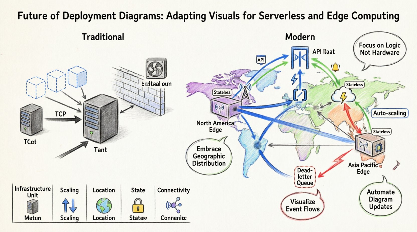
Understanding the Shift from Static to Dynamic 🔄
Traditional deployment diagrams relied on static representations. A node represented a physical machine or a virtual instance. Connections indicated network paths. This model worked well when applications resided on fixed hardware with predictable capacity. Modern infrastructure introduces elasticity and abstraction. The physical location of the code is often irrelevant to the developer. The infrastructure scales automatically based on demand. This dynamic nature complicates the visual representation of the system.
When modeling today, you must account for the following changes:
- Infrastructure Abstraction: The diagram should not necessarily show the underlying physical servers. It should focus on the logical services and their interactions.
- Dynamic Scaling: Nodes are no longer fixed counts. A single diagram might represent hundreds of transient instances.
- Geographic Distribution: Data residency and latency requirements dictate where code executes. Location is now a first-class citizen in the architecture.
- Event-Driven Flows: Triggers replace constant polling. Visual cues must indicate how events initiate processing.
Ignoring these factors leads to documentation that diverges from reality. Engineers might rely on diagrams that suggest fixed resources, leading to capacity planning errors. Visual accuracy supports better decision-making regarding cost, latency, and reliability.
Modeling Serverless Architectures 🛠️
Serverless computing changes how we view the “server” in a deployment diagram. In this context, the server is managed by a provider. The diagram focuses on the functions, triggers, and data stores rather than the host machine. Representing this requires a shift in symbols and grouping strategies.
Representing Functions and Services
Instead of drawing a generic server box, use specific shapes to denote compute functions. These represent discrete units of execution. Each function handles a specific task. In a diagram, these should be grouped by domain or business capability. This helps stakeholders understand the logical boundaries of the system.
Consider the following best practices for function representation:
- Use Distinct Icons: Differentiate between compute functions, database nodes, and storage buckets. Use standard shapes like cylinders for data and rectangles for logic.
- Label State: Indicate if a function is stateless. This is a critical characteristic of serverless environments. Visual cues can include a small tag or label next to the node.
- Show Cold Starts: If relevant to the architecture, note that execution may have latency upon initialization. This impacts how you design the data flow lines.
Mapping Triggers and Events
Serverless relies heavily on event triggers. A request to an API, a file upload, or a scheduled cron job can initiate a function. In a deployment diagram, these triggers are the starting points of your flow. Use directional arrows to show the relationship between the event source and the function.
Key considerations for event mapping include:
- Source Identification: Clearly label the source. Is it an HTTP request, a message queue, or a database change?
- Concurrency: Indicate if the function can handle multiple events simultaneously. This is vital for understanding throughput limits.
- Failure Handling: Show where dead-letter queues or error logs reside. This provides a complete picture of the system’s resilience.
Visualizing Edge Computing Locations 🌍
Edge computing brings processing closer to the end user. Instead of a central cloud region, data is processed at distributed nodes. This adds a geographic dimension to the deployment diagram. You must now visualize not just what the system does, but where it runs.
Geographic Grouping
Traditional diagrams often imply a single region. Edge architectures require multiple regions or specific location markers. Use grouping containers to represent geographic zones. Label these zones with region names or generic identifiers like “North America Edge” or “Asia Pacific Edge”.
When drawing these connections:
- Latency Indication: Use line thickness or color to represent latency. Thicker lines might indicate high-speed links, while thinner lines suggest longer distances.
- Data Synchronization: Show how data moves between edge nodes and the central region. This is crucial for understanding consistency models.
- Failover Paths: Indicate how traffic reroutes if an edge node fails. This visualizes the redundancy strategy.
Device Representation
Edge computing often involves interaction with local devices. Sensors, gateways, and user terminals are part of the deployment. Do not omit these from the diagram. They are the source of the data and the recipients of the processed output.
Include the following in your edge model:
- Local Processing: Show where computation happens on the device versus the cloud.
- Connectivity Types: Label connections as Wi-Fi, 5G, or Ethernet. This affects reliability assumptions.
- Offline Capabilities: If the system works without internet, indicate this state in the node description.
Data Flow and Connectivity in Modern Systems 📡
The way data moves through a system has changed. It is no longer a simple request-response cycle. Data streams, batch processing, and asynchronous queues are common. Your deployment diagram must reflect these pathways accurately.
Asynchronous Communication
Many modern systems rely on message brokers. Functions do not call each other directly. They publish messages to a topic. Visualize this using queue icons. Show the flow from the producer to the queue, and then to the consumer function.
Key elements to include:
- Queue Names: Label each queue to identify its purpose.
- Backpressure: Indicate if the queue has limits. This informs capacity planning.
- Ordering: Show if messages must be processed in a specific order. This influences the choice of message service.
API Gateways
API gateways act as the entry point for most cloud-native applications. They handle authentication, rate limiting, and routing. In a deployment diagram, the gateway is a critical node. It sits between the external world and the internal functions.
When modeling the gateway:
- Security Layers: Indicate where SSL termination occurs.
- Routing Rules: Show which functions handle specific paths or methods.
- Monitoring: Note where logging and metrics are aggregated.
Comparison: Traditional vs. Modern Deployment Models
To clarify the differences, consider the comparison below. This table highlights how the visual elements change based on the architecture type.
| Feature | Traditional Monolithic | Serverless & Edge |
|---|---|---|
| Infrastructure Unit | Physical Server or VM | Function Instance or Edge Node |
| Scaling | Manual or Auto-Scaling Groups | Automatic per Request |
| Location | Centralized Data Center | Distributed Regions |
| State | Often Stateful | Stateless by Design |
| Connectivity | Direct TCP/IP Calls | Event-Driven / API Gateway |
| Diagram Complexity | Hardware Focused | Service & Flow Focused |
This comparison underscores the need for updated notation. A diagram that looks like a traditional server rack will not convey the behavior of a serverless system. Focus on the logical flow and the service boundaries rather than the physical box.
Best Practices for Maintenance and Iteration 📝
Once you have adapted your diagrams, maintaining them becomes a priority. Modern architectures change rapidly. Code is deployed frequently. If the diagram does not update, it becomes a liability.
Version Control for Diagrams
Treat your diagrams like code. Store them in version control systems. This allows you to track changes over time. You can see how the architecture evolved. This is especially useful for audits and compliance checks.
- Commit Messages: Explain why a node was added or removed.
- Branching: Use branches for experimental architectures.
- Review Process: Include diagram updates in code review pull requests.
Automation and Integration
Manual drawing is prone to errors. Many modeling tools support importing configuration files. Use Infrastructure as Code (IaC) templates to generate the diagram automatically. This ensures the visual matches the actual deployed environment.
Steps to automate:
- Parse Config Files: Write scripts to read your deployment configuration.
- Generate Visuals: Output the diagram in a standard format.
- CI/CD Pipeline: Run this generation during the build process.
Automation reduces the gap between documentation and reality. It ensures that stakeholders always see the current state of the system.
Challenges in Standardization 🛑
There is no single standard for modeling serverless or edge systems. Different teams use different notations. This can lead to confusion when onboarding new engineers. Consistency is key to effective communication.
To manage this:
- Create a Legend: Define what every shape and line means in your organization.
- Documentation Standards: Write a style guide for your diagrams.
- Tooling Consistency: Ensure all teams use the same modeling platform.
Without a standard, diagrams become personal art projects rather than technical documentation. A unified approach ensures that a diagram drawn by one team is understood by another.
Future Considerations for Diagramming 🚀
As technology evolves, so will the requirements for diagrams. We are moving towards systems that are self-healing and self-optimizing. The diagram might need to show not just the static state, but the dynamic behavior.
Emerging trends to watch:
- Real-Time Visualization: Dashboards that update the diagram as the infrastructure changes.
- Cost Integration: Showing the cost implications of each node directly on the diagram.
- Security Zones: Highlighting compliance boundaries and data protection levels visually.
Staying ahead of these trends ensures your documentation remains relevant. It allows you to communicate complex system behaviors effectively to non-technical stakeholders.
Summary of Visual Adaptations 📐
Adapting deployment diagrams for serverless and edge computing requires a mindset shift. You move from modeling hardware to modeling behavior and distribution. The following points summarize the essential changes:
- Shift Focus: Move from physical servers to logical functions and services.
- Embrace Distribution: Use geographic grouping to represent edge locations.
- Visualize Flow: Emphasize event triggers and asynchronous queues.
- Automate Updates: Link diagrams to configuration files to maintain accuracy.
- Standardize Notation: Create and enforce a consistent visual language.
By implementing these strategies, your diagrams will serve as accurate, actionable guides for your infrastructure. They will help teams understand the system’s behavior, cost, and resilience. This clarity is essential for building robust, scalable applications in a modern cloud environment.