


In the landscape of software engineering, the transition from abstract logic to physical reality often presents significant challenges. Developers write code, architects design systems, and operations teams manage infrastructure. Bridging the gap between these distinct roles requires a shared language. The deployment diagram serves as this critical interface. It provides a static view of the physical hardware and software components, illustrating how software artifacts are mapped onto the underlying infrastructure. This visual representation is not merely a drawing; it is a blueprint that guides deployment, troubleshooting, and scaling efforts. By standardizing how system architecture is depicted, teams ensure that everyone understands the physical topology of the application.
Understanding the Core Purpose of Deployment Diagrams 🎯
A deployment diagram belongs to the family of Unified Modeling Language (UML) diagrams, specifically categorized under structural diagrams. Unlike a class diagram that focuses on code structure or a sequence diagram that focuses on behavior, a deployment diagram focuses on the environment in which the system runs. It answers fundamental questions regarding the physical nature of the system. Where does the software live? How do the components interact across the network? What hardware resources are required to support the runtime environment?
These diagrams are essential during the design phase and remain valuable throughout the operational lifecycle. They help identify potential bottlenecks in hardware allocation. They clarify the boundaries between internal systems and external services. Furthermore, they serve as a reference for security audits, ensuring that data flow complies with network topology requirements. Without this visual documentation, infrastructure decisions often rely on tribal knowledge, which introduces risk and inconsistency.
Key Components of a Deployment Diagram 🧩
Constructing an accurate deployment diagram requires a clear understanding of its building blocks. Each element carries specific meaning and constraints. The following sections detail the primary components found in these diagrams.
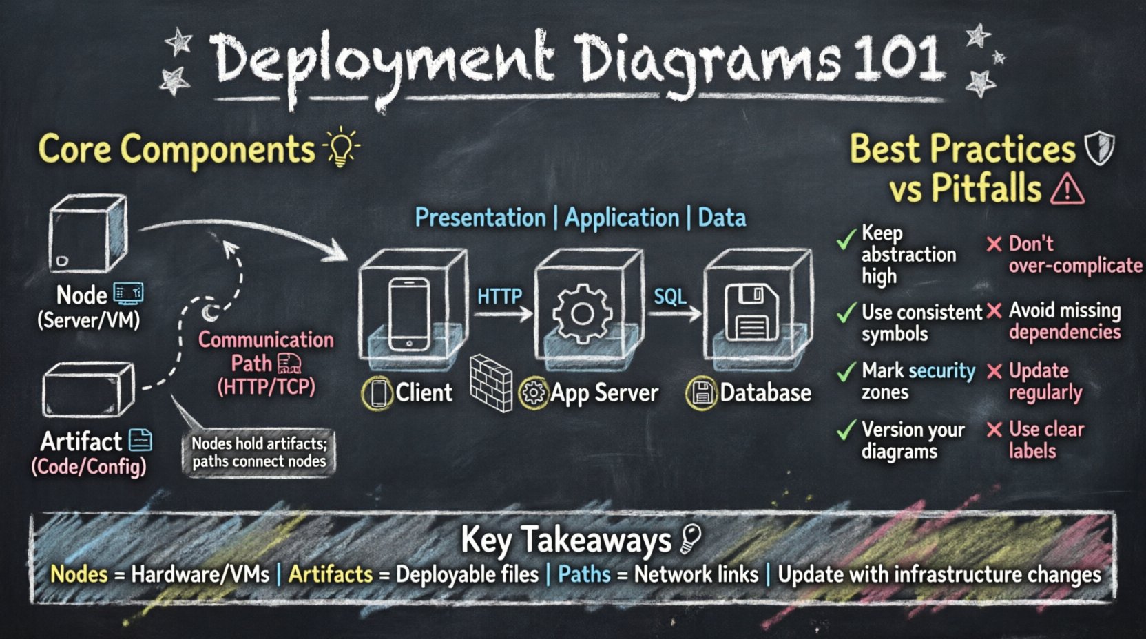
1. Nodes: The Physical Foundation 🖥️
Nodes represent the physical or virtual computing resources where software artifacts are deployed. They are the containers that hold the logic of the application. A node can be a physical device, such as a server or a router, or a logical abstraction, such as a virtual machine or a cloud instance.
There are two main types of nodes:
- Device Nodes: These represent physical hardware. They might include web servers, database servers, load balancers, or firewalls. In a diagram, these are typically depicted as 3D cubes.
- Execution Environments: These represent the runtime environment within a device. Examples include operating system instances, container runtimes, or application servers. They are often shown as rectangles attached to the device node.
When modeling a system, it is crucial to distinguish between the physical hardware and the logical environment. A single physical server might host multiple execution environments, each running different parts of the application stack.
2. Artifacts: The Deployable Units 📦
Artifacts represent the physical implementation of a software component. They are the files or packages that are transferred and installed onto the nodes. An artifact is the concrete manifestation of the code. It could be a compiled binary, a configuration file, a database schema, or a container image.
Artifacts are linked to nodes to show where they reside. This linkage is often called a “deployment.” For example, a specific binary file might be deployed to a web server node, while a database schema is deployed to a database server node. Understanding the lifecycle of an artifact is vital. It must be versioned, tested, and then moved to the target environment.
3. Communication Paths: The Network Connections 🌐
Nodes do not exist in isolation. They communicate with each other to exchange data and process requests. Communication paths represent the network connections between nodes. These paths define the flow of information across the architecture.
Common types of connections include:
- Direct Network Connections: Represented by lines, often labeled with the protocol used (e.g., HTTP, TCP/IP, HTTPS).
- Logical Connections: These show that a relationship exists without necessarily implying a direct physical wire, often used in cloud architectures where the physical network is abstracted.
- Firewalls and Security Zones: Special nodes or boundaries that restrict traffic flow. These are critical for visualizing security boundaries.
Relationships and Associations 🔗
Just as nodes and artifacts are the nouns of the diagram, relationships are the verbs. They define how the components interact. Properly modeling these relationships ensures the diagram conveys the dynamic nature of the system.
Association Relationships
Association relationships indicate a structural link between nodes. For instance, a web server node might be associated with a database server node. This implies that the web server can reach the database server over the network. This is a critical dependency. If the database node is unavailable, the web server node cannot fulfill its role.
Dependency Relationships
Dependency relationships are more specific than associations. They indicate that one node requires another to function. For example, an execution environment might depend on a specific version of an operating system. If the operating system changes, the execution environment may fail.
Realization Relationships
Realization relationships are used when an artifact realizes a component. This shows that the software artifact is the implementation of a specific logical component. It bridges the gap between the design model and the physical deployment.
How to Create a Deployment Diagram 📝
Creating a deployment diagram is a systematic process. It requires gathering information from various sources and translating it into a visual format. The following steps outline the standard procedure for building these diagrams.
- Identify the Scope: Determine the boundaries of the system. Which parts of the infrastructure are internal, and which are external? This helps in defining the nodes that need to be included.
- List the Hardware: Inventory the physical devices. Identify servers, routers, and storage units. Group them by function if possible.
- Map the Software: Identify the software components that need to be deployed. Determine which artifact goes to which node.
- Define the Connections: Draw the network paths between the nodes. Specify the protocols and security requirements.
- Review and Validate: Check the diagram against the actual infrastructure. Ensure that all dependencies are accounted for.
Common Architectural Patterns 🏛️
Certain patterns recur frequently in software architecture. Understanding these patterns helps in creating standardized deployment diagrams.
The Three-Tier Architecture
This is a classic model where the system is divided into three logical layers: Presentation, Application, and Data.
- Presentation Tier: The client side, often a web browser or mobile device.
- Application Tier: The server side where business logic runs.
- Data Tier: The storage layer where data is persisted.
In a deployment diagram, this is visualized as a client node connecting to an application server node, which connects to a database server node. This separation allows for scaling individual layers independently.
The Microservices Pattern
In modern cloud-native environments, systems are often broken down into small, independent services. Each service runs in its own container or execution environment.
- Service Nodes: Each microservice is deployed to its own node or cluster.
- Service Mesh: A dedicated layer handles communication between services.
- Orchestration: A central manager handles the deployment and scaling of these services.
The Edge Computing Pattern
As data processing moves closer to the source, edge nodes become important. This pattern is common in IoT scenarios.
- Edge Nodes: Devices located near the data source.
- Cloud Nodes: Centralized servers for heavy processing and storage.
- Synchronization: Data flows from edge to cloud.
Best Practices for Modeling 🛡️
To ensure the deployment diagram remains useful and accurate, adhere to the following best practices.
1. Maintain Abstraction Levels
Do not attempt to show every single wire or cable. Focus on the logical topology. If a cluster of servers acts as a single unit, represent it as one node with a label indicating it is a cluster. This keeps the diagram readable.
2. Use Consistent Notation
Ensure that all team members use the same symbols and conventions. If a cube represents a server, do not switch to a rectangle later. Consistency reduces cognitive load when reading the diagram.
3. Include Security Boundaries
Clearly mark the internal network versus the external network. Use firewalls or DMZ zones to show where public traffic enters the system. This is vital for security reviews.
4. Version the Diagrams
Infrastructure changes over time. A deployment diagram from six months ago may not reflect the current state. Treat the diagram as a living document that is updated alongside code changes.
Common Pitfalls to Avoid ⚠️
Even experienced engineers can make mistakes when creating these diagrams. Being aware of common pitfalls helps in producing high-quality artifacts.
| Pitfall | Impact | Mitigation |
|---|---|---|
| Over-complication | Diagram becomes unreadable | Focus on key nodes and connections only |
| Missing Dependencies | Deployment failures | Review with the operations team |
| Outdated Information | Confusion during incidents | Integrate with CI/CD pipelines |
| Vague Labels | Unclear responsibilities | Use specific server names or roles |
One frequent error is conflating logical architecture with physical architecture. A logical diagram shows how components interact conceptually, while a deployment diagram shows where they physically reside. Mixing these concepts can lead to confusion about where specific code runs.
Integration with Development Workflows 🔧
Deployment diagrams should not exist in isolation. They are most effective when integrated into the broader development and operations workflow.
Infrastructure as Code (IaC)
Many teams use Infrastructure as Code to manage their environments. The deployment diagram can serve as a high-level view of the IaC templates. When a template is updated, the diagram should be reviewed to ensure it matches the new infrastructure state.
Monitoring and Observability
Monitoring tools often visualize the topology of the system. The deployment diagram can be used to validate the data seen in monitoring dashboards. If the dashboard shows a node that does not exist in the diagram, there is a discrepancy that needs investigation.
Documentation Standards
Organizations should have a standard for how deployment diagrams are stored and accessed. They should be part of the system repository, not hidden in personal files. This ensures that new team members can access the current architecture immediately.
Advanced Considerations for Cloud Environments ☁️
As organizations move to cloud platforms, the definition of a node changes. Physical hardware is abstracted away, and virtual resources become the norm. This introduces new challenges for deployment diagrams.
Region and Availability Zones: Cloud providers offer multiple geographic regions. A deployment diagram should indicate which region a node resides in. This is crucial for latency planning and disaster recovery strategies.
Auto-Scaling Groups: Nodes in the cloud are often dynamic. They scale up and down based on load. A deployment diagram should represent a typical state or an average state, noting that the number of nodes may vary.
Managed Services: Many cloud providers offer managed databases, queues, and storage. These are often external nodes in the diagram. They are not owned by the team but are critical dependencies.
Maintaining Diagram Accuracy Over Time 🔄
The primary challenge with deployment diagrams is obsolescence. Infrastructure evolves rapidly. Servers are replaced, network paths change, and new services are added. To maintain accuracy, teams should adopt specific strategies.
Automated Discovery: Some tools can scan the infrastructure and generate diagrams automatically. While these are not perfect, they provide a baseline that can be corrected manually.
Change Management: Link diagram updates to the change management process. If a server is decommissioned, the diagram update should be part of the same ticket or request.
Regular Audits: Schedule periodic reviews of the diagrams. Have the architecture team walk through the infrastructure and compare it against the documentation. This ensures that the visual blueprint matches reality.
Conclusion on Visualizing Infrastructure 📐
The deployment diagram is a fundamental tool for communicating system architecture. It translates technical specifications into a visual format that stakeholders can understand. By focusing on nodes, artifacts, and connections, teams can plan deployments with confidence. Avoiding common pitfalls and integrating these diagrams into the development workflow ensures they remain relevant. Whether managing a monolithic application or a distributed cloud system, a clear deployment blueprint is essential for success. It reduces risk, improves communication, and supports the long-term health of the software system.
Summary of Key Takeaways 📌
- Deployment diagrams show the physical topology of a system.
- Nodes represent hardware or virtual environments.
- Artifacts are the software files deployed to nodes.
- Connections define the network paths between components.
- Accuracy depends on regular updates and integration with workflows.
- Cloud environments require specific attention to regions and managed services.
By adhering to these principles, engineering teams can create deployment diagrams that serve as reliable references for the entire lifecycle of the software. This ensures that the technical vision remains aligned with the physical reality.