


In modern software delivery, the gap between development and operations is often bridged by clear, shared understanding. One of the most effective tools for achieving this clarity is the deployment diagram. While often overshadowed by code or configuration files, these visual representations provide a critical map of how software components interact with physical or virtual infrastructure. This guide explores how deployment diagrams function, why they are essential for DevOps workflows, and how to maintain them effectively without adding bureaucratic overhead.
Understanding the Deployment Diagram 🗺️
A deployment diagram is a static view that describes the physical architecture of a system. Unlike sequence diagrams which focus on time and interaction, or class diagrams which focus on structure, this specific diagram type maps software artifacts to the hardware or runtime environments that execute them. It answers fundamental questions: Where does the application live? What servers handle the traffic? How are databases connected to the web tier?
For DevOps teams, this visual context is vital. It moves the conversation from abstract code to tangible resources. When a deployment fails, the diagram helps pinpoint whether the issue lies in the application code, the network configuration, or the resource constraints of the target node. It serves as a single source of truth for the infrastructure topology.
Core Components of the Diagram 🧩
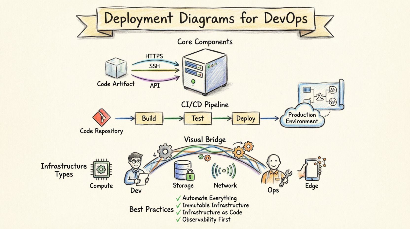
To build a useful deployment diagram, one must understand the standard elements used to construct it. These components are standardized across modeling languages, ensuring that architects and engineers share a common vocabulary. The primary building blocks include nodes, artifacts, and connections.
- Nodes: These represent the physical or virtual computing resources. A node can be a server, a database engine, a mobile device, or an embedded system. Nodes are often categorized by their type, such as processing nodes or storage nodes.
- Artifacts: These represent the software components deployed onto the nodes. An artifact could be an executable file, a library, a configuration file, or a container image. The diagram shows what is placed where.
- Connections: These define the communication paths between nodes. They illustrate the protocols used, such as HTTP, TCP/IP, or proprietary message queues. Connections can be logical or physical.
By defining these elements clearly, teams avoid ambiguity. For instance, stating that a web server connects to a database is helpful, but specifying the connection protocol and the node type (e.g., Linux virtual machine vs. managed database service) adds necessary precision.
Visualizing Infrastructure Types 🏗️
Modern infrastructure is diverse. It is not enough to simply show a box labeled “Server.” The diagram must reflect the reality of the hosting environment. Below is a breakdown of common node types and their characteristics.
| Node Type | Characteristics | Common Use Case |
|---|---|---|
| Compute Node | Processes logic, handles requests | Web servers, application servers |
| Storage Node | Stores data, manages persistence | File servers, database clusters |
| Network Device | Routes traffic, manages security | Load balancers, firewalls, routers |
| Edge Device | Processes data near the source | IoT gateways, mobile clients |
Understanding these distinctions ensures that the diagram accurately reflects capacity planning and resource allocation. A compute node requires different scaling strategies than a storage node. By visualizing these differences, operations teams can provision resources more efficiently.
Integration with Continuous Integration and Deployment 🔄
The true power of deployment diagrams emerges when integrated into the automated delivery pipeline. In a DevOps environment, code moves from a repository to production through a series of stages. The deployment diagram acts as the blueprint for these stages.
When an automated build process completes, it should verify that the artifacts match the intended topology. If the diagram specifies three application nodes behind a load balancer, the deployment script should automatically provision and configure exactly that. This alignment reduces configuration drift, where the actual infrastructure diverges from the documented architecture.
- Pipeline Triggers: The diagram defines the target environments. Development pipelines might deploy to a single node, while production pipelines target a cluster.
- Validation Steps: Before promoting a build, the system can check if the target nodes meet the requirements defined in the diagram (e.g., specific OS versions or memory limits).
- Rollback Strategies: If a deployment fails, the diagram helps identify which nodes need to be reverted. It provides a clear map of the dependencies.
This integration ensures that automation is not blind. The scripts know the topology, and the topology is documented in the diagram. This creates a feedback loop where changes to infrastructure are immediately reflected in the visual model.
Mapping Logic to Physical Resources 🧠
One of the most challenging aspects of system design is mapping logical components to physical resources. A logical component might be a “Payment Service,” but physically, this could be split across multiple containers or even multiple availability zones. The deployment diagram bridges this gap.
Consider a microservices architecture. Logically, you have an Order Service, a User Service, and an Inventory Service. Physically, these might run on a cluster of containers. The diagram should show:
- The specific container instances for each service.
- The network policies allowing the Order Service to talk to the Inventory Service.
- The shared resources, such as a message broker or a caching layer.
Without this mapping, developers might assume a service is co-located with another when it is actually distributed across a wide area network. This can lead to latency issues or security vulnerabilities. Explicitly drawing the physical separation helps engineers design for distance and network reliability.
Maintaining Diagram Integrity 📝
A deployment diagram is only useful if it is accurate. In fast-paced environments, infrastructure changes frequently. Servers are replaced, versions are updated, and services are migrated to new cloud regions. If the diagram does not reflect these changes, it becomes a liability rather than an asset.
To maintain integrity, consider the following strategies:
- Version Control: Treat the diagram files like code. Store them in the same version control system as the application. This allows you to track changes to the architecture over time.
- Automated Generation: Where possible, generate diagrams from Infrastructure as Code (IaC) definitions. Tools can parse Terraform or CloudFormation templates to create the visual representation automatically. This ensures the diagram is always in sync with the code.
- Review Cycles: Include diagram updates in the definition of done for architectural changes. No pull request that alters infrastructure topology should be merged without updating the diagram.
- Simplification: Avoid over-detailing. A diagram showing every single log file location is less useful than one showing the logging service architecture. Focus on the critical paths and dependencies.
Common Pitfalls to Avoid ⚠️
Even experienced teams make mistakes when modeling deployment architectures. Being aware of these common pitfalls can save significant time and reduce confusion.
| Pitfall | Consequence | Mitigation |
|---|---|---|
| Static Snapshots | Diagram becomes outdated quickly | Use dynamic generation or strict review policies |
| Over-Complexity | Diagram is too hard to read | Use layers; show high-level view first |
| Missing Dependencies | Deployment failures due to unknown links | Map all network connections explicitly |
| Ignoring Security | Unsecured paths between nodes | Indicate encryption and authentication methods |
For example, omitting the network firewall between the internet and the application server can lead to security gaps. Similarly, showing a single node for a system that actually requires a cluster can lead to performance bottlenecks during peak traffic.
Advanced Scenarios and Patterns 🚀
As systems grow, the deployment models become more complex. Here are a few advanced patterns that should be represented in your diagrams.
High Availability Clusters: When a system must remain operational despite node failures, the diagram should show redundant nodes. These are often connected to a load balancer. The diagram should indicate that if one node fails, traffic is routed to another. This visual cue helps operations teams understand the resilience of the system.
Hybrid Environments: Many organizations run workloads across both on-premise data centers and public cloud providers. The diagram should clearly distinguish between these environments. Use different shapes or colors for cloud nodes versus local nodes. This helps visualize data sovereignty and latency implications.
Event-Driven Architectures: In systems where services communicate via events rather than direct requests, the diagram should include event buses or message brokers. These are critical infrastructure components that act as the backbone of the system. Showing where the events are produced and consumed helps debug data flow issues.
Collaboration Between Development and Operations 👥
One of the primary benefits of a standardized deployment diagram is improved collaboration. Developers often think in terms of code and logic, while operations teams think in terms of servers, networks, and capacity. The deployment diagram serves as the translation layer between these two perspectives.
During planning sessions, developers can point to the diagram to ask, “If we add a new service, which node does it go on?” Operations can respond, “That node is already at capacity; we need to provision a new cluster.” This discussion is grounded in a shared visual reference, reducing misunderstandings.
Furthermore, on-call engineers benefit from the diagram during incidents. When an alert fires, the engineer can look at the diagram to see which nodes are affected. If the diagram shows that a specific database node is critical for all user sessions, the engineer knows to prioritize its recovery.
Measuring the Value of the Diagram 📊
How do you know if the effort spent on creating and maintaining deployment diagrams is worth it? There are several metrics and indicators that suggest the diagrams are adding value.
- Reduced Deployment Time: If the diagram is accurate, automated pipelines can configure infrastructure faster without manual checks.
- Fewer Incidents: Clear visualization of dependencies helps prevent configuration errors that lead to outages.
- Faster Onboarding: New team members can understand the system architecture quickly by reviewing the diagrams.
- Improved Security Audits: Security teams can verify that all communication paths are encrypted and that sensitive data does not traverse unsecured nodes.
If the team spends less time guessing where things are and more time building features, the diagrams are succeeding. The goal is not to document for documentation’s sake, but to facilitate action.
Future Considerations 🌐
As technology evolves, so do the requirements for deployment modeling. Serverless computing, for instance, abstracts away much of the infrastructure. In these cases, the deployment diagram might focus less on servers and more on functions and triggers. However, the need to understand the flow of data remains. Even in a serverless environment, you need to know which function calls which database and where the data is stored.
Additionally, the rise of edge computing means that deployment diagrams may need to account for thousands of distributed nodes. Visualizing this at scale requires abstraction. Instead of drawing every edge device, the diagram might show a region with a note indicating the distribution pattern. The principles remain the same, but the level of detail adapts to the scale of the system.
Final Thoughts on Architecture Visualization 🎯
Creating deployment diagrams is an exercise in clarity. It forces the team to make decisions about where code lives and how it communicates. In a complex DevOps workflow, this clarity is not just helpful; it is necessary. By avoiding software-specific jargon and focusing on the structural relationships, these diagrams remain relevant across different tools and platforms.
Remember that a diagram is a living document. It should evolve as the system evolves. By integrating it into the daily workflow, treating it with the same respect as code, and keeping it free from unnecessary complexity, teams can leverage it to build more reliable, scalable, and secure systems. The effort invested in visualizing the infrastructure pays dividends in stability and speed.