


Modern software delivery relies heavily on the seamless interaction between two distinct groups: the developers who write the code and the infrastructure teams who ensure it runs. Often, a disconnect occurs here. Code changes happen rapidly, while infrastructure provisioning moves at a different pace. This friction can lead to environment mismatches, deployment failures, and security vulnerabilities. To bridge this gap, architects and engineers turn to a fundamental modeling tool: the deployment diagram.
A deployment diagram is not just a static picture; it is a contract. It represents the physical or logical architecture of a system, showing how software artifacts are distributed across hardware nodes. When used effectively, it aligns the expectations of the coding team with the reality of the hosting environment. This guide explores the critical role of deployment diagrams in modern system design, how they facilitate communication between teams, and the best practices for maintaining them in a dynamic landscape. 🏗️
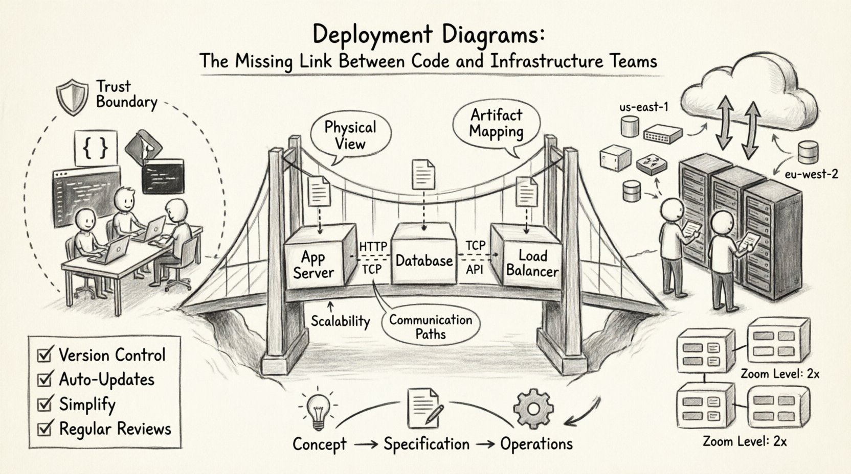
📐 Understanding the Deployment Diagram
At its core, a deployment diagram visualizes the runtime environment. It maps the abstract software components built by developers to the concrete execution nodes managed by infrastructure teams. While other diagrams like sequence or class diagrams focus on logic and behavior, the deployment diagram focuses on topology and resource allocation.
Key Characteristics
- Physical View: It depicts servers, networks, and devices rather than just code structures.
- Artifact Mapping: It shows where specific files, executables, or containers reside.
- Communication: It illustrates the network connections and protocols between nodes.
- Scalability: It can represent load balancers, clusters, or single instances to show redundancy.
Without this visual representation, infrastructure teams often rely on implicit knowledge or outdated documentation. This leads to the “it works on my machine” syndrome, where the local environment differs significantly from the production environment. A deployment diagram standardizes this view. 📊
🔗 Bridging the Dev-Ops Divide
The separation between development and operations, often called a “silo,” is a common source of inefficiency. Developers optimize for feature velocity, while operations prioritize stability and security. Deployment diagrams serve as a shared language that allows both groups to discuss system behavior without needing to understand the other’s specific tooling stack.
Common Friction Points
- Environment Mismatch: Differences in OS versions, middleware configurations, or network latency.
- Dependency Confusion: Unclear requirements for libraries or runtime versions.
- Resource Allocation: Uncertainty regarding CPU, memory, and storage requirements.
- Security Zones: Misunderstanding of firewall rules or network segmentation.
When a deployment diagram is updated and shared, it becomes a single source of truth. The operations team can verify that the hardware meets the requirements defined by the software team. Conversely, developers can understand the constraints imposed by the network architecture. This shared visibility reduces handoff errors. ⚙️
🧩 Anatomy of a Deployment Diagram
To create an effective diagram, one must understand the standard elements used to construct it. These elements map directly to real-world resources. Using standard notation ensures that anyone on the team can interpret the diagram regardless of their specific background.
Core Components
- Nodes: Represent physical or virtual computing devices. These can be application servers, database servers, or client devices.
- Artifacts: The software items deployed onto the nodes. This includes executables, scripts, configuration files, or container images.
- Communication Paths: The connections between nodes. These represent network links, APIs, or message queues.
- Interfaces: The specific points where components interact with the node or other components.
Component Mapping Table
| Diagram Element | Real-World Equivalent | Owner Responsibility |
|---|---|---|
| Node | VM, Container Host, Physical Server | Infrastructure / Cloud Ops |
| Artifact | Binary, JAR, Docker Image, Script | Development / Build Team |
| Association | Network Link, Port, Protocol | Network / Security Team |
| Dependency | Service Dependency, Library Reference | Development Team |
By maintaining this mapping, teams avoid ambiguity. For instance, specifying a “Node” as a “High-Performance Compute Instance” is more actionable than simply calling it a “Server”. This level of detail ensures that the infrastructure team provisions the correct resources from the start. 🛡️
☁️ Deployment Diagrams in Modern Cloud Environments
The shift to cloud-native architectures has changed how deployment diagrams are constructed. Traditional on-premise diagrams focused on racks and physical switches. Modern cloud diagrams focus on logical regions, availability zones, and managed services. The principles remain the same, but the granularity changes.
Cloud-Specific Considerations
- Elasticity: Diagrams should indicate where auto-scaling groups exist to show capacity planning.
- Regions: Data sovereignty and latency requirements often dictate where nodes are placed geographically.
- Managed Services: Instead of drawing a database server, the diagram might show a managed database instance provided by the cloud vendor.
- Serverless: Functions may run without explicit server nodes, requiring a shift in how compute is represented.
In a distributed system, the diagram becomes a map of trust. It shows which nodes can talk to which other nodes. This is critical for security compliance. If a database node is marked as “internal only”, the diagram enforces that boundary visually. This prevents accidental exposure of sensitive data to public-facing components. 🔗
🔄 Integration with Infrastructure as Code
One of the most powerful applications of deployment diagrams is their alignment with Infrastructure as Code (IaC). While diagrams are often static images, the underlying infrastructure is defined in code. Keeping these two in sync is vital for reliability.
The Synchronization Strategy
- Diagram as Source: The diagram defines the desired state. The IaC code implements that state.
- Code as Source: The IaC code is the truth. The diagram is generated from the code to ensure accuracy.
- Hybrid Approach: Manual updates to the diagram trigger reviews, while IaC handles the provisioning.
When the diagram and the code diverge, drift occurs. Drift leads to configuration errors where the live environment does not match the design. By treating the deployment diagram as a living document that informs the IaC scripts, teams can reduce manual configuration errors. This is particularly important in large organizations where multiple teams manage different parts of the stack. 📜
⚠️ Common Pitfalls and Best Practices
Creating a diagram is easy; maintaining it is hard. Many teams create a diagram once during the design phase and never update it again. This leads to “diagram rot,” where the visual representation becomes completely inaccurate. To avoid this, specific practices must be followed.
Best Practices for Maintenance
- Version Control: Store diagram files in the same repository as the source code. This ensures changes are tracked and reviewed.
- Automated Updates: If possible, use tools that generate diagrams from the code or IaC configurations to reduce manual effort.
- Simplification: Do not clutter the diagram with every single microservice. Focus on the boundaries and critical paths.
- Contextual Views: Create different diagrams for different audiences. Developers need API details; operations need network topology.
- Regular Reviews: Include diagram updates in the pull request process. If the architecture changes, the diagram must change.
What to Avoid
- Over-Engineering: Drawing every single line of code or minor configuration detail.
- Ignoring Security: Failing to show encryption points or firewall boundaries.
- Static Snapshots: Treating the diagram as a one-time deliverable rather than a continuous artifact.
- Tool Lock-in: Using proprietary formats that prevent collaboration across different platforms.
📈 Lifecycle Management of Diagrams
Just like software, deployment diagrams have a lifecycle. They start as rough sketches during the concept phase, evolve into detailed technical specifications, and eventually become operational runbooks. Understanding this progression helps teams manage the complexity of the documentation.
Phase 1: Conceptual Design
At this stage, the focus is on high-level components. Which services are needed? What are the major data flows? The diagram is used to gain stakeholder buy-in and estimate costs. Precision is less important than clarity. 🧠
Phase 2: Technical Specification
Here, the diagram becomes detailed. Specific protocols, ports, and resource types are defined. This is the version used by the development and operations teams to begin implementation. It must be accurate enough to guide the build process. 🛠️
Phase 3: Operational Reference
Once deployed, the diagram serves as a troubleshooting guide. When a service goes down, the diagram helps identify which node or connection is failing. It should be kept up to date to remain useful in incident response scenarios. 🚨
🤝 Facilitating Collaboration
The ultimate value of a deployment diagram is not the visual itself, but the conversations it sparks. It forces teams to ask difficult questions before code is written. For example, “Does this service need to talk to that database directly, or should it go through a proxy?”
Workshop Strategy
- Joint Design Sessions: Bring developers and ops engineers together to draw the diagram in real-time.
- Walkthroughs: Use the diagram to explain deployment pipelines and rollback procedures.
- Onboarding: Use the diagram to train new team members on the system architecture quickly.
- Incident Post-Mortems: Update the diagram after an incident to reflect new security measures or architectural changes.
This collaborative approach ensures that the infrastructure supports the code, and the code respects the infrastructure. It shifts the culture from “throwing over the wall” to “building together”. 🤝
🔍 Analyzing Diagrams for Optimization
A well-drawn deployment diagram can also reveal inefficiencies. By visualizing the flow of data, teams can spot bottlenecks or unnecessary hops. For example, if every request must pass through three different proxies before reaching the database, the diagram highlights this latency risk.
Optimization Areas
- Network Hops: Minimizing the number of nodes data must traverse.
- Data Locality: Ensuring data processing happens near the storage location to reduce transfer costs.
- Redundancy: Checking if all critical nodes have backup paths defined.
- Cost: Identifying high-cost nodes that might be over-provisioned or under-utilized.
This analysis turns the diagram into a strategic asset for cost management and performance tuning. It allows leadership to make informed decisions about resource allocation based on visual evidence rather than assumptions. 💰
🔐 Security and Compliance Visualization
In regulated industries, deployment diagrams are often required for audits. They provide proof that security controls are in place. A diagram can explicitly show encryption in transit, isolation between environments, and access control points.
Security Markers
- Trust Boundaries: Clearly marking where data moves from a secure zone to a less secure zone.
- Authentication Points: Showing where API keys or certificates are required.
- Data Classification: Labeling nodes that handle sensitive information differently.
- Network Segmentation: Visualizing VLANs or subnets to ensure compliance with network policies.
When these elements are clearly visible, auditors can quickly verify compliance. Developers can also see where security controls are enforced, reducing the likelihood of introducing vulnerabilities during coding. This transparency is key to building secure systems from the ground up. 🔒
🔄 Evolving with Microservices
As systems move towards microservices, the complexity of deployment diagrams increases exponentially. A monolithic application might have one node; a microservices platform might have hundreds. Managing the diagram at this scale requires abstraction.
Abstraction Techniques
- Grouping: Aggregate similar services into logical clusters.
- Zoom Levels: Create a high-level overview diagram and detailed drill-down diagrams for specific domains.
- Service Mesh: Represent the control plane separately from the data plane to clarify traffic management.
- Dynamic Labels: Use labels to indicate scaling policies rather than drawing every single instance.
This approach keeps the diagram readable while preserving the necessary detail for operations. It allows the team to manage complexity without losing sight of the overall architecture. 🌐
📝 Summary of Implementation Steps
To integrate deployment diagrams into your workflow effectively, follow this structured approach:
- Identify Stakeholders: Determine who needs to see the diagram and at what level of detail.
- Define Standards: Establish a notation standard so all team members understand the symbols used.
- Start Simple: Begin with a high-level overview and add detail as the project progresses.
- Integrate with CI/CD: Include diagram validation in the build pipeline to catch drift early.
- Review Regularly: Schedule periodic reviews to ensure the diagram matches the live environment.
By following these steps, teams can create a robust documentation culture that supports both innovation and stability. The diagram becomes less of a burden and more of a navigational tool for the entire organization. 🧭