


Understanding how software moves from a development environment into a live production setting is crucial for modern infrastructure. A deployment diagram provides a static snapshot of the hardware and software architecture, showing how applications are physically realized. In the context of cloud computing, these diagrams become even more critical due to the dynamic nature of virtual resources.
This guide explores the fundamentals of deployment diagrams, focusing on cloud environments. It covers the essential components, best practices for creation, and strategies for maintaining accuracy over time. By the end, you will have a clear understanding of how to map your system architecture effectively.
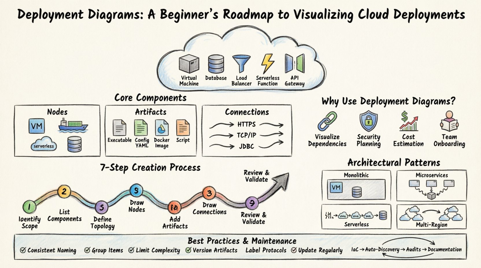
What is a Deployment Diagram? 📐
A deployment diagram is a type of UML (Unified Modeling Language) diagram used to describe the physical deployment of artifacts on hardware nodes. Unlike logical diagrams that focus on functionality, deployment diagrams focus on the infrastructure. They illustrate:
- Nodes: Physical or virtual computing resources.
- Artifacts: Software components, files, or executables.
- Connections: Communication paths between nodes.
When applied to cloud environments, these diagrams shift from on-premise servers to virtual instances, managed services, and network configurations. They serve as a blueprint for DevOps teams and system architects.
Core Components of Cloud Deployment Diagrams ☁️
To create an accurate diagram, you must understand the building blocks. Each element represents a specific part of your infrastructure stack. Below is a breakdown of the primary elements.
1. Nodes (Compute Resources)
A node represents a processing element. In a cloud context, this is rarely a physical box. Instead, it is a logical representation of a compute instance. Types include:
- Virtual Machines (VMs): General-purpose compute instances.
- Containers: Lightweight, isolated environments for running applications.
- Serverless Functions: Event-driven compute without managing servers.
- Managed Databases: Dedicated nodes for data storage and retrieval.
2. Artifacts (Deployable Units)
Artifacts are the tangible files deployed to the nodes. They represent the actual software being installed. Examples include:
- Executables: Binary files that run on the node.
- Configuration Files: YAML, JSON, or XML files defining environment settings.
- Docker Images: Packaged applications with dependencies.
- Scripts: Automation scripts for initialization.
3. Connections (Network Paths)
Connections define how nodes communicate. These lines indicate data flow and protocol usage. Important connection types include:
- HTTP/HTTPS: Standard web communication.
- TCP/IP: Low-level network protocols.
- Database Drivers: Specific connections for data access.
- Load Balancers: Distribution paths for incoming traffic.
Why Use Deployment Diagrams for Cloud Infrastructure? 📊
Cloud environments introduce complexity that is not present in monolithic server setups. Resources scale up and down, and services are often distributed across different regions. A deployment diagram helps manage this complexity.
Visualizing Dependencies
It becomes difficult to track which microservice relies on which database instance when dealing with dozens of services. A diagram clarifies these relationships, preventing accidental downtime during refactoring.
Security Planning 🔒
Security groups and firewall rules depend on network topology. By visualizing the deployment, architects can identify exposed endpoints and ensure sensitive data nodes are not directly accessible from the public internet.
Cost Estimation
Different nodes have different costs. A virtual machine instance might be cheaper than a managed database service. Visualizing the ratio of resources helps in budget forecasting and optimization.
Onboarding New Team Members
When a new engineer joins the team, a diagram provides immediate context. They can see the high-level architecture without needing to read through every configuration file.
Mapping Cloud Services to Diagram Symbols 🗺️
Since cloud providers offer many specific services, a standardized approach to symbols is necessary. While specific tools may have their own icons, general UML conventions should be maintained for clarity.
The table below outlines common cloud elements and their standard diagram representations.
| Cloud Element | Diagram Symbol | Description |
|---|---|---|
| Virtual Machine | Cube / Box | Represents a standard compute instance. |
| Load Balancer | Cone / Funnel | Represents traffic distribution. |
| Database | Cylinder | Represents persistent storage. |
| Object Storage | Cylinder (Stacked) | Represents file storage buckets. |
| API Gateway | Gateway / Gate | Represents the entry point for API requests. |
| External System | Stick Figure / Actor | Represents users or third-party services. |
Step-by-Step Creation Process 🛠️
Creating a deployment diagram requires a systematic approach. Rushing this process often leads to missing connections or incorrect resource types. Follow these steps to build a robust diagram.
1. Identify the Scope
Decide what you are diagramming. Is it a single application? The entire platform? A specific region? Defining the boundary prevents scope creep. Start with the core application and expand outward.
2. List All Components
Write down every server, database, and service involved. Do not rely on memory. Check your infrastructure configuration files or cloud console to ensure accuracy.
3. Define the Network Topology
Determine how these components are connected. Are they in the same Virtual Private Cloud (VPC)? Are they connected via public internet? Are there private subnets? This step defines the security posture.
4. Draw the Nodes
Place the boxes representing your compute resources. Arrange them logically. Front-end services should be near the load balancer, while databases should be grouped together.
5. Add Artifacts
Drag and drop the software components onto the nodes. Ensure the version numbers are correct. This is particularly important for compliance and auditing purposes.
6. Draw Connections
Connect the nodes using lines. Label the lines with the protocol (e.g., HTTPS, SSH, JDBC). This clarifies the data flow and port requirements.
7. Review and Validate
Walk through the diagram as if you are deploying the system. Does every service have a path to the database? Are there any single points of failure? Validate the diagram against the actual running environment.
Common Architectural Patterns 🏗️
Cloud deployments often follow established patterns. Recognizing these patterns helps in creating diagrams quickly and accurately.
Monolithic Deployment
In this pattern, a single application handles all functions. The diagram typically shows one node hosting the application server and one node for the database. Connections are internal and direct.
Microservices Architecture
Here, the application is split into smaller, independent services. The diagram becomes more complex. You will see multiple nodes for different services, all communicating with a central load balancer. Service discovery mechanisms are often implied.
Serverless Architecture
This pattern minimizes infrastructure management. The diagram focuses on functions and triggers rather than persistent nodes. You might see an event source connected to multiple function nodes, which then connect to storage.
Multi-Region Deployment
For high availability, systems are deployed across multiple geographic regions. The diagram must show distinct regions, often separated by lines indicating cross-region traffic. This adds complexity regarding latency and data synchronization.
Best Practices for Clarity and Accuracy 📝
A diagram that is hard to read is useless. Adhere to these guidelines to ensure your deployment diagrams serve their purpose.
- Use Consistent Naming: Name all nodes and artifacts clearly. Avoid generic names like “Server 1”. Use descriptive names like “API-Node-01”.
- Group Related Items: Use bounding boxes to group components that belong to the same service or environment (e.g., “Production Environment”).
- Limit Complexity: If a diagram becomes too crowded, split it. Create a high-level view for management and detailed views for engineering teams.
- Include Versioning: Specify the software version on the artifacts. This is vital for troubleshooting and rollback procedures.
- Label Protocols: Always label connection lines with the communication protocol. This helps security teams understand port requirements.
- Update Regularly: A diagram is only as good as its current state. Update it whenever infrastructure changes occur.
Troubleshooting Common Diagram Issues 🔧
Even experienced architects make mistakes. Below are common issues and how to resolve them.
Missing Connections
Issue: Two nodes that must communicate are not linked.
Fix: Review the network security groups. If a connection is missing in the diagram, it might be blocked in production. Add the connection and verify firewall rules.
Incorrect Node Types
Issue: A database is drawn as a generic server.
Fix: Use specific symbols for managed services. This distinguishes between self-managed and provider-managed infrastructure, which impacts cost and maintenance.
Overcrowding
Issue: Too many lines crossing each other.
Fix: Use layers. Place the presentation layer at the top, the logic layer in the middle, and the data layer at the bottom. Use arrows to reduce visual clutter.
Outdated Artifacts
Issue: The diagram shows version 1.0, but production runs 2.0.
Fix: Integrate diagram updates into the deployment pipeline. Whenever a new build is tagged, the diagram should be reviewed or updated automatically.
Maintaining Diagrams Over Time 🔄
Infrastructure is dynamic. Servers are replaced, versions change, and new services are added. Keeping the diagram current requires a process.
Infrastructure as Code (IaC)
Use IaC tools to generate diagrams from your configuration files. This ensures the diagram is derived from the source of truth rather than manual drawing.
Automated Discovery
Implement tools that scan your cloud environment and update the diagram. This reduces human error and ensures the map matches the territory.
Regular Audits
Schedule quarterly reviews of the diagram with the operations team. Walk through the infrastructure together and verify that the visual representation matches reality.
Documentation Integration
Link the diagram to your technical documentation. When a service is documented, reference the specific part of the deployment diagram that covers it. This creates a cohesive knowledge base.
Conclusion 🏁
Deployment diagrams are essential tools for visualizing cloud architecture. They bridge the gap between abstract code and physical infrastructure. By understanding the core components, following a structured creation process, and adhering to best practices, you can create diagrams that are accurate and useful.
Remember that a diagram is a living document. It should evolve as your system evolves. Regular updates and clear communication ensure that the entire team remains aligned on the infrastructure landscape. With a solid deployment diagram, you gain clarity, security, and confidence in your cloud deployments.