


In modern software engineering, the architecture of a system is often invisible until it breaks. Visualizing how software components interact with the underlying hardware and network environments is critical for stability and scalability. A deployment diagram serves as the blueprint for this physical structure, mapping the software artifacts to the infrastructure nodes that execute them. This guide explores the mechanics of deployment diagrams within cloud contexts, focusing on clarity, reliability, and maintainability.
🏗️ Understanding the Core Purpose
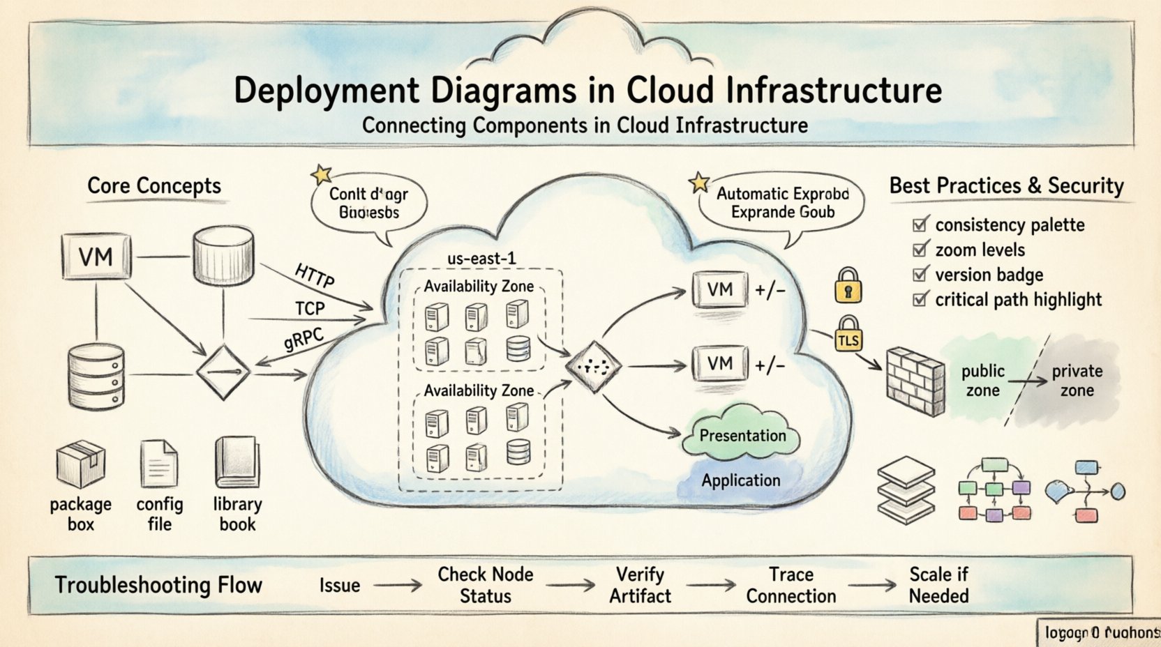
A deployment diagram illustrates the physical realization of a system architecture. While a class diagram shows logical structure and a sequence diagram shows dynamic behavior, the deployment diagram answers the question: Where does this run?
- Static View: It captures the state of the system at a specific point in time.
- Infrastructure Focus: It highlights servers, devices, networks, and cloud instances.
- Artifact Mapping: It links code packages, libraries, and binaries to execution environments.
Without this visual representation, teams often face configuration drift, where the actual deployed environment diverges from the intended design. In cloud environments, where resources are ephemeral and scalable, maintaining an accurate diagram is a strategic necessity rather than a bureaucratic task.
🔗 Key Components of a Deployment Diagram
To construct an effective diagram, one must understand the fundamental building blocks. These elements work together to define the topology of the infrastructure.
1. Deployment Nodes ☁️
A deployment node represents a computational resource. In a cloud context, these are rarely physical boxes but rather virtualized instances. They fall into several categories:
- Compute Nodes: Virtual machines or containers that run application logic.
- Storage Nodes: Dedicated resources for data persistence, such as object storage or block volumes.
- Network Devices: Routers, firewalls, and load balancers that direct traffic.
- Cloud Regions: Geographically distinct locations where nodes are provisioned.
Each node typically has an associated specification, including CPU, memory, and operating system type. Labeling these nodes correctly ensures that developers and operations teams understand the requirements for each part of the system.
2. Artifacts 📦
Artifacts are the deployable units of software. They are the files or packages that reside on the nodes. Common examples include:
- Executables: Compiled binaries or scripts.
- Web Applications: WAR files, JAR files, or container images.
- Configuration Files: YAML manifests, environment variables, or scripts.
- Libraries: Shared dependencies required by the application.
Linking artifacts to nodes shows exactly what is running where. This clarity is vital during troubleshooting, as it prevents the common error of assuming a component exists on a node where it has not been deployed.
3. Connections and Associations 🔗
The lines connecting nodes and artifacts define the relationships between them. These are not just visual aids; they represent communication paths and dependencies.
- Communication Paths: Represent network protocols (e.g., HTTP, TCP, gRPC).
- Deployment Dependencies: Show that one artifact requires another to function.
- Physical Connections: Indicate direct hardware links or network topology.
When drawing these lines, it is essential to specify the direction of data flow. A unidirectional arrow implies a producer-consumer relationship, while a bidirectional line suggests a request-response or peer-to-peer interaction.
🌐 Deployment Diagrams in Cloud Infrastructure
Traditional on-premise diagrams often focused on rack-level physicality. Cloud diagrams must account for elasticity, virtualization, and distributed systems. The abstraction layer changes the meaning of a node significantly.
Virtualization and Abstraction 🔄
In the cloud, a single physical server can host multiple virtual nodes. A deployment diagram should reflect the logical nodes rather than the physical hardware. This prevents the diagram from becoming obsolete when the underlying hardware changes. Focus on the logical service boundaries, such as the application tier, data tier, and presentation tier.
Scalability and Elasticity 📈
One of the primary advantages of cloud infrastructure is the ability to scale. A static deployment diagram can be misleading if it implies a fixed number of nodes. To address this, use notation or labels that indicate scaling behavior.
- Auto-scaling Groups: Indicate that a node type can replicate based on load.
- Load Balancers: Show how traffic is distributed across multiple instances.
- Stateless vs. Stateful: Distinguish between nodes that retain data and those that do not.
By explicitly marking nodes as scalable, the diagram communicates the resilience of the system. It tells the reader that a failure in one instance does not necessarily halt the entire service.
Regions and Availability Zones 🌍
High availability often requires distribution across geographic locations. A deployment diagram should visualize the separation of resources into regions and availability zones.
| Level | Description | Diagram Notation |
|---|---|---|
| Region | A distinct geographic area | Large container box |
| Availability Zone | Isolated data center within a region | Sub-container box |
| Instance | Virtual machine or container | Small node shape |
This hierarchy helps teams understand failure domains. If a node fails, the diagram shows whether the impact is local to a zone or affects the entire region.
🛠️ Best Practices for Diagramming
Creating a diagram is an exercise in communication. If the diagram is confusing, the architecture is likely flawed. Adhere to these guidelines to ensure clarity.
1. Maintain Consistency 🎨
Use standard shapes and colors consistently throughout the document. For example, always represent databases with a cylinder shape and servers with a box. Consistency reduces the cognitive load on the reader, allowing them to focus on the connections rather than decoding symbols.
2. Limit Detail for Clarity ⚖️
A diagram that shows every microservice and container may be too complex to be useful. Group related components into clusters or sub-systems. Use zooming techniques where a high-level view shows major systems, and detailed views drill down into specific clusters.
3. Version Control Your Diagrams 📝
Just like code, architecture diagrams must be versioned. When the infrastructure changes, the diagram must be updated simultaneously. Treat the diagram as a living document that reflects the current state of the system.
4. Focus on Critical Paths 🎯
Highlight the most important data flows. Not every connection is equally critical. Use bold lines or different colors to emphasize the primary request paths and security boundaries.
🔒 Security Considerations in Diagrams
Security is often an afterthought in technical documentation, but a deployment diagram is a perfect place to visualize security boundaries. It helps identify where encryption, authentication, and authorization are applied.
Network Segmentation 🛡️
Show the separation between public-facing services and internal resources. Use shaded areas or dashed lines to represent network security groups or firewalls. This helps stakeholders understand which parts of the system are exposed to the internet and which are protected.
Encryption Points 📡
Indicate where data is encrypted in transit. Labels such as HTTPS or TLS on communication lines provide immediate insight into the security posture. Similarly, mark where data is encrypted at rest on storage nodes.
🔄 Common Deployment Patterns
While every system is unique, certain patterns recur frequently in cloud architectures. Recognizing these patterns helps in creating standard diagrams that are easily understood by new team members.
1. The Three-Tier Architecture
This classic pattern separates concerns into presentation, logic, and data layers. It is widely used for web applications.
- Presentation Tier: Web servers or content delivery networks.
- Application Tier: Business logic servers or microservices.
- Data Tier: Database servers and caching layers.
2. Microservices
Microservices decompose applications into small, independent services. The diagram becomes dense with nodes. Grouping services by domain (e.g., Billing, User Management) helps manage this complexity.
- Service Mesh: Represent the infrastructure layer that handles service-to-service communication.
- API Gateways: Show the entry point for external traffic.
3. Serverless Computing
In serverless models, the infrastructure is abstracted away. The diagram focuses on functions and event triggers rather than servers.
- Functions: Represented as discrete execution units.
- Event Sources: Triggers such as queue messages or API calls.
- Storage: Where the function writes output.
📊 Troubleshooting with Diagrams
When a system fails, the deployment diagram is the first place to look. It helps narrow down the scope of the problem.
- Is the node up? Check the diagram to see if the node is marked as active.
- Is the artifact deployed? Verify that the correct version of the software is linked to the node.
- Is the connection broken? Trace the communication lines to see if a firewall or network policy might be blocking traffic.
- Is there a bottleneck? Identify nodes with high traffic concentration that might need scaling.
By correlating runtime logs with the diagram, engineers can quickly identify if an issue is configuration-related or infrastructure-related.
🛠️ Maintenance and Evolution
Infrastructure evolves. Features are added, old services are retired, and nodes are migrated. A deployment diagram that is not maintained becomes a source of misinformation.
Automated Updates 🤖
Where possible, generate diagrams from infrastructure code. Tools that parse configuration files can render the diagram automatically. This ensures the diagram is always in sync with the actual environment.
Review Cycles 🔄
Establish a regular review process. During design reviews, update the diagram alongside the code changes. This habit ensures that the documentation remains a trusted source of truth.
📝 Checklist for Effective Diagrams
Before finalizing a deployment diagram, run through this checklist to ensure quality and accuracy.
- Are all nodes labeled? Every box should have a clear name.
- Are artifacts linked? Every piece of software should be connected to a node.
- Are connections clear? Lines should not cross unnecessarily and should indicate direction.
- Is the scope defined? Clearly show what is included and what is external.
- Are security zones marked? Indicate firewalls and trusted networks.
- Is the version current? Ensure the diagram matches the deployed state.
🔍 Conclusion
A deployment diagram is more than a drawing; it is a contract between the design and the operations team. It provides the necessary context for building, deploying, and maintaining software in complex cloud environments. By focusing on clarity, accuracy, and consistency, teams can reduce errors and improve system reliability. As infrastructure becomes more abstract and dynamic, the value of a well-maintained diagram only increases. It remains the most effective tool for communicating the physical reality of a digital system.
Investing time in creating and updating these diagrams pays dividends in faster onboarding, easier troubleshooting, and more robust architecture. Treat the diagram with the same rigor as the code itself, and it will serve as a foundation for long-term success.